| Image |
Comment |
| 07/24/2006 02:09:38 AM |
|
 Photographer found comment helpful. Photographer found comment helpful. |
| 07/20/2006 04:48:31 AM |
(I) [] []by tngrndreamComment: Trading Post Comment
I like the simplicity of the photo and the use of white on black in a color image (seems this would work in one of the upcoming challenges too). The focus seems a bit off and the arrangement of candles seems a bit haphazard to me. I certainly don't think this shot deserved all the 1,2 and 3s. Voters can be pretty rugged on DPC.
I would spend some more time on the basic idea to see if I could improve upon the arrangement if I were you. I think this is worth developing. Message edited by author 2006-07-20 04:49:01. |
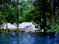
| 07/20/2006 04:40:01 AM |
Tsunamiby KelliComment: I like the concept behind this photo and the visual cliff formed at waters edge. The colors are rich - the greens and blue are very compatible and pleasing. I do think that the site of this picture is busy because of all the trees. The simplicity of the water doesn't carry over into the background. Now I realize that you can't go around changing trees, houses, and the like, but I do think it makes the concept harder to execute when there is so much going on in the background. This photo definitely has a unique perspective going for it. |
| Photographer found comment helpful. |
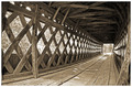
| 07/20/2006 04:32:36 AM |
Peering Through Timeby ericwooComment: Trading Post Comment
The texture and range of tones in this photo, in addition to the obvious perspective displayed, are bonuses for me. The sepia color adds to the notion of the passage of time. It lends a nice historical feel to the image.
I'm not wild about the use of the fisheye lens, but I wouldn't discount it either. For me, the circular hint created by the lens clashes with the long lean lines of the covered bridge. Maybe because I grew up in New England I am a bit too conventional in my response to old covered bridges. This observation is obviously opinion and it's yours that matters in the end.
The detail in the wood is very impressive. And I guess Matt Crowe will forever be memorialized on DPC because of the detail you captured. Message edited by author 2006-07-20 04:32:59. |
| Photographer found comment helpful. |
| 07/20/2006 04:19:37 AM |
Quiet Progressionby MelethiaComment: Trading Post Comment
Simplicity as beauty. What a wonderful concept and execution. I love the contrast between the barbed wire and the tender shoot. The DoF is excellent, highlighting the vine. Congratulations on your 11th place finish...and new addition to your five PB images.
Next time someone complains that they can't think of anything worth while to photograph I'll send them to this image and maybe they will get the idea that there is beauty in the simplest of things...if creatively conceived and marvelously executed. Well done and inspirational. |
| Photographer found comment helpful. |
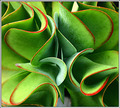
| 07/20/2006 04:09:19 AM |
Sherpets Perspectiveby timfythetooComment: Trading Post
I love the depth of this shot as the perspective draws me right into the center of this plant. The complementary colors are winning too, as is the focus and hint of DoF. The title is a clever turn...both in reference to Sherpet's well-known style and the double entendre evident in the use of the word "perspective". There is also a kind of rhythm in the curvature of the leaves and the way they relate to each other. I can't think of any way to improve upon it. Message edited by author 2006-07-20 04:09:58. |
| Photographer found comment helpful. |
| 07/19/2006 12:20:17 AM |
|
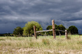
| 07/16/2006 01:37:24 AM |
Corner postsby MelethiaComment: Congrats on a top 50 finish. I like the dark clouds behind the posts and the colors in this image. I am not crazy about the composition because the posts appear to be cutting or blocking two significant trees. If it was possible to change position and have the posts line up between the trees or on the outer edge, I think I would have liked it better. I would have voted this a 7 as it is. |
| Photographer found comment helpful. |
| 07/16/2006 01:31:33 AM |
Double Breakby timfythetooComment: I voted 6 for this image because I liked the clarity and colors. The complementary green and red was a bonus as far as I am concerned. I would have preferred to have the people in the image too, as I think fireworks are even more dramatic when there is a frame of reference. I would not have added the frame, but I didn't mark down because of it. |
| Photographer found comment helpful. |
| 07/16/2006 01:27:23 AM |
Paper Patterns by timfythetooComment: Trading Post Comment
Congratulations (obviously) on your ribbon and 7+ score. What I especially like about this abstract photo is the negative space and the subtle color shift of the blue areas as you move out of the center (darker) to the edges (lighter). I also like the "fun" aspect of this photo...it's almost like looking at a maze (except there is no way out). I didn't vote in this challenge, but since I like abstracts I would have been right up there with the concensus of the voters. Well done. |
| Photographer found comment helpful. |
Home -
Challenges -
Community -
League -
Photos -
Cameras -
Lenses -
Learn -
Help -
Terms of Use -
Privacy -
Top ^
DPChallenge, and website content and design, Copyright © 2001-2025 Challenging Technologies, LLC.
All digital photo copyrights belong to the photographers and may not be used without permission.
Current Server Time: 08/06/2025 09:25:44 AM EDT.


![(I) [] []](https://images.dpchallenge.com/images_challenge/0-999/523/120/Copyrighted_Image_Reuse_Prohibited_359709.jpg)