| Image |
Comment |
| 02/12/2009 11:12:25 PM |
|
 Photographer found comment helpful. Photographer found comment helpful. |
| 02/10/2009 08:16:19 PM |
|
| Photographer found comment helpful. |
| 02/10/2009 08:14:47 PM |
Week 05by KenComment: This shot makes me want to laugh.... its so typical of kids fighting over the most mundane things, and by the sounds of it, this shot pretty much sums up that day. |
| Photographer found comment helpful. |
| 02/10/2009 08:13:07 PM |
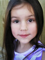
Week-3.jpgby joynimComment: I thought the original photo was very flat, and this edit really brings out the colour well. Your daughter is very cute, and makes for a nice photo. |
| Photographer found comment helpful. |
| 02/10/2009 08:07:37 PM |
Week 2.jpgby joynimComment: I like the editing, and the increased contrast in the photo. I wouldnt worry about the eyes and stray hairs, it gives a realism to the photos. Cloning out the hairs, and changing the eyes would rob the photo IMO. |
| Photographer found comment helpful. |
| 02/09/2009 09:37:04 PM |
|
| Photographer found comment helpful. |
| 02/08/2009 01:18:55 PM |
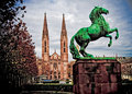
Horse and church 2by MelethiaComment: I like this one better :) There is better balance between the horse and the rest of the photo. |
| Photographer found comment helpful. |
| 02/08/2009 12:51:30 PM |
Church and horseby MelethiaComment: I like the sharpening and the contrast added to the shot, and the texture with the draganizer like preset it good. The only thing I find out of place is the colour of the horse, its a bit too saturated IMO. |
| Photographer found comment helpful. |
| 02/02/2009 10:44:05 PM |
3-jan 09 archive foto. sheepby rozComment: What an incredible, mystical quality to this shot. I am envious of your photo-shop skills.
Looking at the printscreen of photos used, though, I am also drawn to the original of the sheep. I love the fog in the background, and the desaturated look to the photo overall. Wouldnt mind seeing that original posted here. |
| Photographer found comment helpful. |
| 02/02/2009 10:41:52 PM |
Week 3: Canon G2 CRW3290 r720 Edited.jpgby NeilComment: I really like the perspective you chose on this, as well as your processing. The texture on the fence is really good, and the colours much stronger. The leading lines are very effective too.
Not a fan of the border though... though thats entirely a personal thing (and judging from my own portfolio, I havent been consistent with abandoning the borders myself). |
| Photographer found comment helpful. |
Home -
Challenges -
Community -
League -
Photos -
Cameras -
Lenses -
Learn -
Help -
Terms of Use -
Privacy -
Top ^
DPChallenge, and website content and design, Copyright © 2001-2025 Challenging Technologies, LLC.
All digital photo copyrights belong to the photographers and may not be used without permission.
Current Server Time: 08/14/2025 03:23:15 PM EDT.