|
|
|
Showing 311 - 320 of ~1171 |
| Image |
Comment |
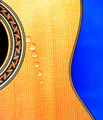
| 06/09/2006 09:49:41 PM | While My Guitar Gently Weepsby PurpleFireComment: Hi from the Critique Club!
I'm not a real Beatles fan, but I recently saw the tribute concert for George Harrison, where Eric Clapton and Harrison's son (who is the double of his father!!!) and others sing this song. It gave me goosebumps and brought a tear to my eye.
This is a bold and striking image.
I like the deep blue that contrasts well against the yellow. The blue could dominate here, but as you have made sure it only occupies less than a third of the image, it supports, rather than takes over. The sinuous shape of the guitar creates lovely negative space in that blue. The dark black highlights and echos the curve even more.
The box hole also creates a nice shape that compliments the curve on the other side, and the water droplets create yet another shape. So you have lovely colour and lovely shapes, that are both really easy on the eye.
The water droplets...reading the comments, it seems the voters wanted perfection! They wanted them to look like real tears...I think you could have invested hours, days or months trying to capture tears, ended up weeping yourself, and STILL someone would have said they are not realistic enough:))
I like the regularity of the drops, I like the line they follow as it gives a graphic feel. I like the orange hue they have taken on around the edge.
My only nitpik is that the top of the guitar seems a little overexposed losing a little detail in the texture of the wood.
A bold and creative image! |  Photographer found comment helpful. Photographer found comment helpful. |
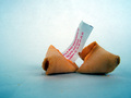
| 06/09/2006 09:15:25 PM | furtune cookieby LaMerryComment: Hi from the Critique Club!
This challenge has been really interesting because of the odd things people have chosen as their subject. Here is yet another unique choice.
I like the background and the way it changes from white to blue moving out from the center. It has an ice cool feel to it, so you almost feel something cold of frozen should be the subject. However I think the background is competing with the subject for attention, it's a little too dominant.
The red lettering on the fortune paper is nicely placed against the white part of the background, so that it stands out and also absorbs some of that blue. But the left part of the cookie is a little too much in the centre of the image.
The focus is fine on the lettering, but the cookies and crumbs are out of focus. These cookies should have a lovely texture, but all that detail is lost due to the aperture setting. F2.8 is a very shallow depth of field, and it also lets a lot of light in, hence the strong white of your background. A smaller aperture would ensure the whole of your subject was in focus and the highlights less harsh. The out of focus crumbs are a little distracting.
A nice idea!
|
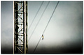
| 06/09/2006 01:26:45 PM | Change of Underwear Needed!by amberComment: Follow up - from this week:
Broken bearing at Pattaya Park Tower leaves tourist dangling 10-stories up
She passed out with fear before being rescued
Vichan Pladplueng
Twenty-three year old Suwannee Klairung from Ang-Thong Province fainted with fear last week when a broken bearing at Pattaya Park Tower left her dangling in the tower sling 10-stories above the ground.
It took technicians over 20 minutes to engage the manual override as horrified friends watched. It took another 10 minutes to safely get her to the ground.
Suwannee Klairung fainted with fear when a broken bearing at Pattaya Park Tower left her dangling in the tower sling 10-stories above the ground.
Surapon Chareonsuppon, the managing director of the Pattaya Park Hotel, said that the accident was caused by a ball bearing cartridge breaking, which caused the whole system to automatically stop.
He said the machine does have a manual system for safety reasons, which was put into effect during this crises. The reason for the 30 minutes delay in bringing the woman to the ground, he said, was that the engineering team wanted to take every precaution in ensuring her safety.
The next morning, May 28, Mayor Pairat Suttithamrongsawat took city engineering department officials with him to investigate the situation and found that the engineering team of the hotel had already replaced all damaged parts and conducted a thorough check to make sure it was up to required standards. Engineering staff rode the sling to test it.
The mayor then ordered officials of the hotel to provide him with a legal document from the engineering department of the company that makes the machine to prove it is safe, and stressed that engineers at the hotel should perform an annual check up. The mayor said he will come to witness the annual check up.
Mayor Pairat Suttithamrongsawat took city engineering department officials with him to investigate the situation and found that the engineering team of the hotel had replaced all damaged parts.
Before anyone can ride the sling, or either of the other two high-wire rides, he or she has to sign a waiver in both Thai and English releasing the hotel from any liability for injury or death caused by any type of accident on any of the three rides.
The victim, Suwannee Klairung, had come to Pattaya to have a holiday with four friends. Her friends said that things started out normally when Suwannee began her ride from the top of the tower, which is about 170 meters from the ground. Unfortunately at the half-way point things went horribly wrong when her ride stalled in the middle of the line. She was stuck in the air, unable to get to the ground or return to the starting point. Seeing her predicament, she fainted.
Thirty-minutes later when she was finally rescued, the rescue team whisked her off to an ICU unit at Memorial Hospital.
Noppadol Buathong, general manager of the Pattaya Park Hotel said that this is the first time anything like this has ever happened. He said the Tower rides have been drawing a huge number of tourists for over 5 years, and have never had a problem.
However, last October one of the elevators at the Pattaya Park Beach Hotel dropped five stories when its overload system malfunctioned. Seventeen passengers had squeezed into the elevator, which is only rated to hold eleven. No one was seriously hurt, but all 17 suffered various minor injuries.
--------------------------------------------------------------------------------
|
| 06/09/2006 12:35:24 PM | Orchidby littlebigmanComment: Hi from the Critique Club!
The lighting is the very first thing you notice about this image. The light focused on the middle Orchid alone, is very dramatic and effective. It's as if the flower was hiding from one of those Orchid hunters who want to find the perfect example and take it home, and suddenly his torch finds it!
There is a lovely diagonal going from bottom left to top right, which is natural and very difficult to find!
I am wondering why you chose to desaturate a flower that is traditionally very powerfully coloured? The colour is muted and nice but why?
The lighting on the middle orchid is a little harsh in places, losing a small amount of detail. The lighting on the other two, especially the top one, is really beautiful and subdued although less dramatic. The detail on the 'lip' of the middle orchid is also wonderful.
The black background is a wonderful contrast to the soft colours of the flowers and there is a nice balance between positive and negative space.
The depth of field is good.
A lovely delicate study...but I'd love to see the saturated version;) | | Photographer found comment helpful. |
| 06/09/2006 07:57:28 AM | Spoolsby HomeGrownComment: Hi from the Critique Club!
Well done on scoring so high with your first challenge entry:))
This is a simple, crisp, clean image; elements that always go down well with the voters.
The black background is ideal for showcasing the spools. However I think that the big expanse on the right is too big and keeps pulling the eye over to that area, trying to dominate the image. It feels like something is missing, that something should be there. The space is nearly equal in size to the space taken up by your subject, and divides the image in half. If you took away nearly half the negative space or used portrait instead of landscape, it would perhaps enhance your image even more.
The lighting has caught the silk thread just right, helping the colours to be luminous, whilst still managing to capture the details.
You have chosen the colours well as they blend well together and none stand out from the rest, creating nice harmony and balance.
You have used the classic triangle composition to your advantage, creating a pleasing composition, and the focus is spot on.
A really pleasing image. | | Photographer found comment helpful. |
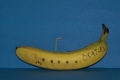
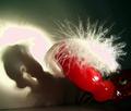
| 06/09/2006 04:26:09 AM | Yellow SubMarineby LionsitalyComment: Hi from the Critique Club!
Lucky you getting 18 comments:))
This image made me smile and most voters always react well to humour and creativity.
How could you have improved on this? Well the lighting is very flat and dull, try experimenting with various light sources, and positioning.
You could have upped the brightness/contrast in PS to give it a boost, but you would have made that blue background even noisier. You could have lightened and strengthened the yellow with selective colour.
Moving the banana forward would have given more depth to the image and lessened the distraction of the noisy background.
Your focus seems a little soft especially on the left-hand side. A Smaller aperture would have overcome this.
Thanks for the smile;) |
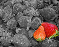
| 06/09/2006 03:43:39 AM | Strawberry Fields Foreverby jerseyjimComment: Hi from the Critique Club!
When I first learned how to do selective desat I was so pleased with the result that I applied it to every image I took:)) What I learned quickly is that not every subject suits selective desat and that you do indeed have to be 'selective' about when you use it.
In a challenge like this, Strawberry Fields was bound to be a popular choice, so you have to make your image stand out as you have done. But for me, it does not work here. First of all, it's very hard to make a good black and white of strawberries even without the sel.desat. They have little contrast in tones that you need to make a good B&W. Secondly, the brain reacts strangely to black/grey fruit - some primeval leftover warning system that tells us not to eat grey/black food as it is usually bad or rancid and therefore might kill us. So unconsciously the voter is feeling odd about this fruit.
Thirdly, the two strawberries you have chosen to colour are not the most appealing, healthy looking ones I've seen. The one on the left looks washed out and orange...whether that's due to the lighting you used or the strawberry I don't know. Also the orange one is out of focus a little. A smaller aperture would have given you more focus and depth of strawberry field:)
It was a good idea, but it didn't quite come off;)
| | Photographer found comment helpful. |
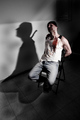
| 06/09/2006 03:19:21 AM | INTERROGATION !!!by jellyooooComment: Hi from the Critique Club!
Based on the story of your image I guessed that you got quite a few 1s 2s 3s and 4's...and after just looking I proved myself right:)) Images like this always make a certain number of voters nervous, but there is no way that this deserves so many 4's and under.
This is a great composition, following the rule of thirds very well. The fact that we can only see the knife as a shadow is excellent and you obviously put so much thought and effort into setting up your scene. You have also cleverly left space in front of the poor guy as if to suggest the presence of the interrogator, creating a little tension for the viewer.
The lighting is great, creating that wonderful deep, shadow. The shirt is a little blown out, but the definition in the arm compensates - drawing the eye away. I like the lack of lighting on the face, it adds mystery.
I love the diagonal of where the floor meets the wall, it adds to the sense of drama. It also serves to divide the image into the light side and the dark side.
The colour is muted but that's perfect for such a sinister scene. Making the blood even redder would have just got you more 1's:))
Well done on a well executed (no pun intended) image. | | Photographer found comment helpful. |
| 06/09/2006 02:49:48 AM | \\\"My Offering\\\"by stardust8488Comment: Hi from the Critique Club!
Hi Tina;)
I've spent five minutes staring at this image and I still have no idea what it is:)) That's not to say an image always has to be immediately recognisable, but voters tend not to want to work too hard when they are ploughing their way through 300+ images. If I'm struggling to identify it I'm sure others did too and that lowered your score straight away.....Is it your cat's toy? I only think that because of your comments, which the voters couldn't see at the time.
I admire your creativity and use of an ordinary flash light, and in a strange way the image is growing on me, but either the flash light was too powerful, or too close or you over processed the image afterwards, because there are two areas of pink blown highlights. One on the wall and one on top of the feathers. So all detail there has been lost and replaced by pink blobs - unless that is what you intended? But then perversely, there is nice detailing in the feathers on top of the toy!
And the eye in the bottom right-hand corner is freaky:)) Is that your cat? Your image certainly has the curiosity factor, which can sometimes hold viewer's attention.
I think this is your first entry? So well done on jumping in at the deep end;) I suggest that you look at all the entries in this particular challenge and read the comments, because you will learn so much that way.
I for one cannot wait to see your next entry, good luck;)
| | Photographer found comment helpful. |
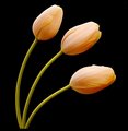
| 06/09/2006 02:21:02 AM | Tulipsby kari1Comment: Hi from the Critique Club!
The first thing I notice about your image is the fantastic use of colour. The expanse of black as a background does not over-dominate, but enhances the soft pastel shades of orange and green.
The three flowers are beautifully placed. There are lovely curves that converge to one point at the bottom of the image, with lovely negative space in between. This gives a feeling of calm, serenity and beauty. There is an overall balance in the composition that is really pleasing on the eye.
Theree is lovely contrast between the lighting on the top and bottom of the tulips. I do though find it a little harsh on the bottom flower, but not so much that it spoils the image for me.
The image is very soft, and I would loved to have seen a just a little more detail in the petals. There is though more of a hint of texture on the the stems, which is nice.
I also think such a lovely image deserves more than the title 'Tulips'..I would have called it 'Threelips' or 'Trinity':)) | | Photographer found comment helpful. |
|
Showing 311 - 320 of ~1171 |
Home -
Challenges -
Community -
League -
Photos -
Cameras -
Lenses -
Learn -
Help -
Terms of Use -
Privacy -
Top ^
DPChallenge, and website content and design, Copyright © 2001-2025 Challenging Technologies, LLC.
All digital photo copyrights belong to the photographers and may not be used without permission.
Current Server Time: 08/05/2025 06:21:11 AM EDT.
|