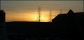
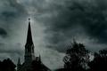
DPChallenge: A Digital Photography Contest You are not logged in. (log in or register
 
Browse Settings
Currently viewing:
Registered Useramber

Show comments:

Per page:

Order:

Comments:


Comments Made by amber
Pages:   ... [106] [107] [108] [109] [110] [111] [112] ... [118]
Showing 1081 - 1090 of ~1171
Image Comment
Salt Of The Earth
05/29/2005 03:03:00 AM
Salt Of The Earth
by naomik

Comment:
Wow! LOVE it!!!!10
Photographer found comment helpful.
Inorganic Metamorphosis
05/29/2005 03:00:32 AM
Inorganic Metamorphosis
by HornOUBet

Comment:
Nice Amethyst?
Photographer found comment helpful.
Attic window
05/28/2005 10:12:40 PM
Attic window
by parrothead

Comment:
I like this image, even with the oversaturation (?) It's unusual. Would have liked to have seen more detail in the ceiling
Photographer found comment helpful.
Abandoned
05/28/2005 10:10:33 PM
Abandoned
by timmi

Comment:
I like the concept of this image. It's a shame you couldn't capture light streaming through those windows. Would have made a good image great.
Photographer found comment helpful.
roxbury nj
05/27/2005 09:20:19 AM
roxbury nj
by gtp1164

Comment:
''
roxbury nj
05/27/2005 06:58:37 AM
roxbury nj
by gtp1164

Comment:
Hello from the Critique Club!

This image captures the end of the day and a pleasant sunset. It evokes feelings of calmness and contemplation.

The picture though seems to be more of a sunset picture than a silhouette: The silhouette is too indistinct or nondescript to be the focus or key element of the image - It is the sunset that is the prime focus here.

The eye is drawn to the centre of the image where the most intense light is, behind the tree. However, the tree is out of focus and the wires dissecting the picture are a distraction and pull the eye to the right where there is little to gain or hold the viewer̢۪s attention.

The bottom half of the image is very dark and over-dominant and serves no real purpose. It cuts the picture in half and is not easy on the eye. Using the rule of thirds would rectify this. As would taking a lower stance and aiming the camera up to get more sky and consequently more balance in the picture.

Due to your exposure the whole image is flat and lacks depth. Using a smaller aperture would help.

Standing in the past
05/27/2005 04:49:35 AM
Standing in the past
05/27/2005 04:44:37 AM
Standing in the past
by kcuman

Comment:
Hello form the Critique Club!

This image is very much like an Escher painting; the images in the lens are upright, upside-down, reversed, reflected and who knows what else. A few minutes of studying induces a headache - but in a good way.

I love the sentiment behind this picture: the history, the nostalgia, the new camera and young photographer looking through to the past via an old camera and its owner - who have captured and ‘preserved’ the stars of years gone by. As a fan of old black and white films I appreciate the intent behind this image. I also like the illusion that you seem to be photographing the viewer.

The lens itself creates a striking framing device and seems to reveal its story, with the framed images of the forgotten stars on the wall. It̢۪s a doorway into the past. As a photographer I find those images and their history fascinating. So the image does hold your attention.

As someone has already mentioned - wearing a yellow top was not the wisest choice in a silhouette challenge and had you worn something darker you may have come closer to fulfilling the challenge, because there is no silhouette here that I can find.

I don̢۪t mind the out of focus exterior of the camera, but that gold chain is very distracting. Your crop seems very severe too. However, as the main focus is the image in the lens, it is forgivable.

This is a fascinating, strange almost hypnotic image in the wrong challenge.
The Town Steeple
05/26/2005 11:23:09 PM
The Town Steeple
05/26/2005 09:45:54 PM
The Town Steeple
by TommyMoe21

Comment:
Hi from the Critique Club!

This is an image that creates a dark, moody, mysterious atmosphere. It conjures up memories of watching late night horror films as a child, where the victims always ended up in the graveyard at night, and you hid behind the sofa.

The dark threatening sky warns us that something unpleasant may be about to happen. In this picture the steeple and cross are in the light, highlighted against a dark sky, which gives the impression of a soon to come battle between good/light and evil/dark. The battle begins as soon as night falls. This symbology is echoed by the bottom left diagonal being lighter than the top right.

That said, the viewer̢۪s eye is drawn to the top of the steeple, but the trees on the right are distracting: The focus of the picture is the steeple, but it is in competition with those trees and therefore the image loses its impact. Cropping the image, or reframing it at the time, to focus solely on the steeple would have created a more powerful image.

The sky is dark , moody and dramatic and is the essential ingredient in creating the striking atmosphere of the picture. However, the dodging around the steeple is a little over done and a little harsh on the eye. But even so, even done like this, it has an unreal quality to it that perhaps works. The leaning steeple perhaps adds to this unreal feeling.

The building itself has too much detail for a true silhouette. Had you exposed correctly for the silhouette, the image would have been more powerful.

This image does evoke a sense of foreboding and appeals to our primal fears.
Photographer found comment helpful.
Pages:   ... [106] [107] [108] [109] [110] [111] [112] ... [118]
Showing 1081 - 1090 of ~1171


Home - Challenges - Community - League - Photos - Cameras - Lenses - Learn - Help - Terms of Use - Privacy - Top ^
DPChallenge, and website content and design, Copyright © 2001-2025 Challenging Technologies, LLC.
All digital photo copyrights belong to the photographers and may not be used without permission.
Current Server Time: 08/04/2025 11:11:45 AM EDT.