| Image |
Comment |
| 08/07/2005 02:58:02 AM |
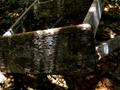
A Hint of Blueby JutildaComment: ** Greetings from the Critique Club **
Simple, but effective. The wood texture really comes out on this image as a result of good exposure control. Composition is good also. The leaf adds a nice tough - wish it were a bit more in focus though. DOF is nice.
- Linda |
| 08/07/2005 02:44:33 AM |
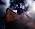
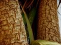
Midnight Cedar by Joey LawrenceComment: ** Greetings from the Critique Club **
Another masterpiece! I love the creativity here, and the cleverness to pull it off. There really is not much to say but EXCELLENT - the contast, texture, DOF, focus, all so perfect!
- Linda |
 Photographer found comment helpful. Photographer found comment helpful. |
| 08/07/2005 02:37:53 AM |
Old 'N' Broken Downby SeaSailComment: ** Greetings from the Critique Club **
Cropped a bit tightly, and a little too dark in my opinion. I like the way the light was casted upon the ladder, but the sun spots are a bit much.
- Linda |
| Photographer found comment helpful. |
| 08/07/2005 02:34:39 AM |
Spiritualby tolovemoonComment: ** Greetings from the Critique Club **
A very creative image, and nice too see in this challenge. The colors are vibrant, and the lighting pretty good - other than the glare off the right side of the moon. Perhaps just by positioning your light differently, bouncing it, or post-processing this could have been corrected. I really like the composition.
- Linda |
| 08/07/2005 02:17:24 AM |
Watchingby PatrolComment: ** Greetings from the Critique Club **
The image seems much too dark imho. Use of a fill flash, or proper metering would have prevented the staute from being backlight and given it a more appealing look. The textures of the wood are hidden in the shadows. The DOF, focus, or both were just not working for you here as all appears too blurry. As for the trees in the background - too distracting. By moving more to the left perhaps you could have gotten the statue alone against the blue sky.
- Linda |
| 08/07/2005 02:12:18 AM |
Aflameby nico_blueComment: ** Greetings from the Critique Club **
Somehow fire / flames never stop intriguing us. Good shot here, although I feel the crop is a bit tight. Good exposure level as the textures of the burning wood center of the pit are well demonstrated.
- Linda |
| Photographer found comment helpful. |
| 08/07/2005 01:55:07 AM |
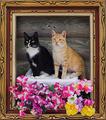
Living Portrait In Wooden Frameby loriprophotoComment: ** Greetings from the Critique Club **
I absolutely ,loved this when I first saw it, and still do. The 3D effect it presents is great. The vibrant colors just pop out at me. I can't help but smile when viewing this.
Great shot - shows some welcome creativity.
- Linda |
| Photographer found comment helpful. |
| 08/07/2005 01:51:51 AM |
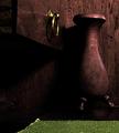
Still Life in Wood #1 Desk & Vaseby lytaComment: ** Greetings from the Critique Club **
Although the image is a bit darker than what I usually like - the lighting and shadows reflect beautiful textures of the wood. The breass ring breaks up the darkness, adding the perfect contrast. The green rug is a big minus here - it clashes rather than enhances. I would suggest some hue manipulation to better blend it into the same color scheme of the brass ring and wood.
- Linda |
| Photographer found comment helpful. |
| 08/07/2005 01:47:09 AM |
Veteran Stumpsby all4uComment: ** Greetings from the Critique Club **
Unique entry - does not really grab attention though as the subject is not clearly defined. I think this would fair better if not so close up. Might also suggest an increased DOF.
- Linda |
| Photographer found comment helpful. |
| 08/07/2005 12:43:46 AM |
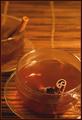
Cinnamon Teaby nomad469Comment: ** Greetings from the Critique Club **
A very creative image for this challenge. I like your thinking.
A couple suggestions - use of a white china cup possibly would have added some nice contrast. Possibly increase the DOF - the background is a bit too blurred out in my opinion. The cropping and frame work well here.
- Linda |
| Photographer found comment helpful. |
Home -
Challenges -
Community -
League -
Photos -
Cameras -
Lenses -
Learn -
Help -
Terms of Use -
Privacy -
Top ^
DPChallenge, and website content and design, Copyright © 2001-2025 Challenging Technologies, LLC.
All digital photo copyrights belong to the photographers and may not be used without permission.
Current Server Time: 08/18/2025 05:26:14 AM EDT.