| Author | Thread |
|
|
08/07/2005 01:51:51 AM |
** Greetings from the Critique Club **
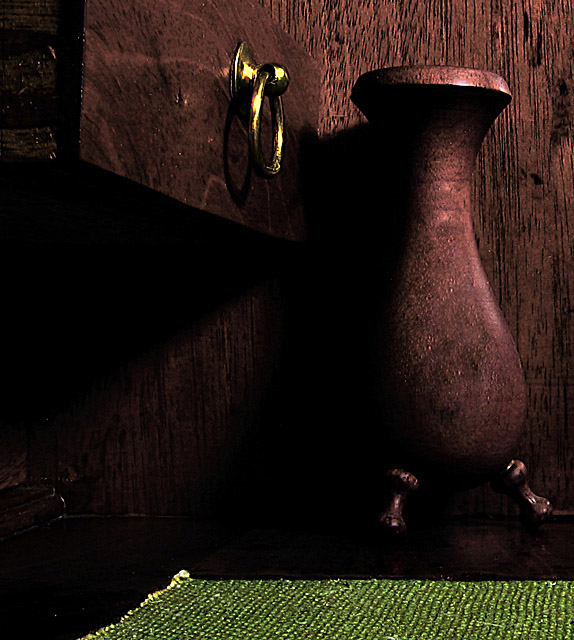
Although the image is a bit darker than what I usually like - the lighting and shadows reflect beautiful textures of the wood. The breass ring breaks up the darkness, adding the perfect contrast. The green rug is a big minus here - it clashes rather than enhances. I would suggest some hue manipulation to better blend it into the same color scheme of the brass ring and wood.
- Linda |
|
 Photographer found comment helpful. Photographer found comment helpful. |
Comments Made During the Challenge  |
|
|
07/31/2005 02:56:33 PM |
|
I find the rug distracting here...I think it is just too bright when compared to the wood. I like the shapes and composition, however. It seems that the wood is just a bit dark. |
|
| Photographer found comment helpful. |
|
|
07/29/2005 11:38:37 PM |
|
I like everything but the green mat. I find it to be so much brighter than the other elements that my eye is forcefully pulled to it and away from the other elements in the image. |
|
| Photographer found comment helpful. |
|
|
07/28/2005 09:16:34 PM |
I formed my opinion of the photo before scrolling down to see the green mat. So my comments will start out being based on that ... I love the tonality of the wood and the fact that it all matches so well. The soft but strong light is perfectly suited to the treatment; it looks especially good on the vase.
The mat adds interesting texture and color. It balances the brass ring. Yet, somehow it behaves in this picture a bit like an insistant child breaking in on a conversation between two septagenarians in their rocking chairs watching the sun set. If the mat must stay for some important compositional purpose ( I'm terrible at composition, so am unwilling to assert a judgement here) then I wonder if selective desaturation or hue manipulation might not soften the loud shade of green to a softer yellower shade that echoes the brass ring. In any case it's a very nice photo. |
|
| Photographer found comment helpful. |
|
|
07/28/2005 03:49:38 PM |
|
Nice study of light and shadow. |
|
| Photographer found comment helpful. |
|
|
07/27/2005 07:02:38 PM |
|
4 - The shot is a little soft for my taste. I like all the various textures of the wood, but I would definitely crop the green thing from the bottom as it is very distracting. |
|
| Photographer found comment helpful. |
|
|
07/25/2005 02:53:22 PM |
|
Not sure about the green carpet, I think it may have worked better without it |
|
| Photographer found comment helpful. |
|
|
07/25/2005 10:00:30 AM |
|
I think the green carpet is a bit distracting. Maybe you were going for contrast, but I think it would have served you better to use light for that. |
|
| Photographer found comment helpful. |
|
|
07/25/2005 08:08:26 AM |
|
Just a tad too dark for my tastes |
|
Home -
Challenges -
Community -
League -
Photos -
Cameras -
Lenses -
Learn -
Help -
Terms of Use -
Privacy -
Top ^
DPChallenge, and website content and design, Copyright © 2001-2026 Challenging Technologies, LLC.
All digital photo copyrights belong to the photographers and may not be used without permission.
Current Server Time: 07/01/2026 04:25:02 PM EDT.