| Image |
Comment |
| 09/26/2005 02:14:39 PM |
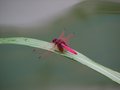
DragonFlyWeb_0008.jpgby eschelarComment: Interesting dragonfly. I don't think I've ever seen one this color. Really shallow DOF. Actually, I wouldn't mind a bit more depth if the background isn't too distracting. Definitely, crop in closer..try getting rid of the right 3rd of the frame, and about 20% off the bottom to start with, and go from there. |
 Photographer found comment helpful. Photographer found comment helpful. |
| 09/25/2005 11:43:19 PM |
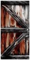
Oliver's Houseby MsMiaComment: I like this one too. The coloring is really cool. The door itself fading from the reds/browns on the left, to more gray on the right, and the structural framing being mostly grays. I also like how you have framed this. |
| Photographer found comment helpful. |
| 09/15/2005 11:40:27 PM |
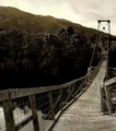
Swinging Foot Bridge Entranceby SJCarterComment: ok, I am going to go against the majority. I don't really care for the sepia. It looks good on the bridge, but the rest just doesn't speak to me. It's a little dark on the far bank. But, I love the lines, love the bridge, and water as well. The mountains make a really nice backdrop. Maybe a bit heavy on the sharpening. Great shot, Jimmy! |
| Photographer found comment helpful. |
| 09/15/2005 11:35:50 PM |
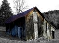
Fawning Barnby SJCarterComment: really cool old building. I think a little bit of the greens/yellows left might add something, but I like it as is. |
| Photographer found comment helpful. |
| 09/15/2005 08:11:52 PM |
|
| Photographer found comment helpful. |
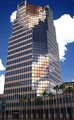
| 09/15/2005 01:37:00 PM |
Downtown 1by phinbobComment: Originally posted by phinbob:
Originally posted by tsheets:
I really like this shot. The textures on the building are really nice. The sky looks over-processed maybe? Maybe it's a polarizer. Anyway, I would try knocking the blue down a bit to make it feel more natural. |
Actually, if you've been to Arizona you would see that we're blessed with a very blue sky. That sky is typical Arizona |
Nope, never been. Sorry about that. My bad. :-) |
| 09/14/2005 07:34:18 PM |
Downtown 1by phinbobComment: I really like this shot. The textures on the building are really nice. The sky looks over-processed maybe? Maybe it's a polarizer. Anyway, I would try knocking the blue down a bit to make it feel more natural. |
| 09/14/2005 07:32:38 PM |
Downtown 3by phinbobComment: I really like the reflections and textures in the reflections. The crop at the top feels a little cramped, and the direct clouds don't have a lot of detail..a little over-exposed. Overall, I like it, though. |
| 09/13/2005 07:56:32 PM |
|
| Photographer found comment helpful. |
| 09/05/2005 01:32:28 PM |
Dark & Light Self Portraitby tsheetsComment: Thanks to all for the comments. This is only the second time I have attempted a self portrait, and yeah, not too comfortable with that process. :-)
Since several of you asked, setup was a black sheet taped to a white wall. Had a cheap clip light shining on the wall from the right to light that, and another one from the left to the side and slightly in front of where I was kneeling. Camera on a tripod centered on the black/white line. The rest was just touch-up in post (making the white, more white, adjusting the saturation, etc...).
|
Home -
Challenges -
Community -
League -
Photos -
Cameras -
Lenses -
Learn -
Help -
Terms of Use -
Privacy -
Top ^
DPChallenge, and website content and design, Copyright © 2001-2025 Challenging Technologies, LLC.
All digital photo copyrights belong to the photographers and may not be used without permission.
Current Server Time: 08/26/2025 04:13:51 PM EDT.