| Image |
Comment |
| 08/08/2005 02:33:56 PM |
Mass Appealby aznymComment: I really like the colors in this photo. Clean and well focused. |
 Photographer found comment helpful. Photographer found comment helpful. |
| 08/08/2005 02:32:59 PM |
Anything for a Cookieby kenskidComment: That is really cute. Nice illusion shot, however, the other boxes of things around it are distracting. Also, you should take advantage of the 640 pixel max and make your image larger for the voters. |
| Photographer found comment helpful. |
| 08/08/2005 02:30:30 PM |
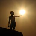
Apollo Rising by Keith ManiacComment: This picture is nicely done. The sun is not too bright and the rays come out nicely. I really like the muted colors. Well done!! 10 |
| Photographer found comment helpful. |
| 08/08/2005 02:29:02 PM |
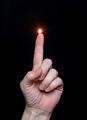
Spontaneous Combustionby barbaraanneComment: Picture well done. Just me, but I probably would have made the flame a bit bigger and desaturated the red halo around it. |
| Photographer found comment helpful. |
| 08/08/2005 02:23:47 PM |
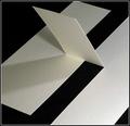
Linen Page with Three Cutsby rjksteschComment: Nice set up of the illusion. Good placement in the photograph and proper lighting. My only complaint...would have been nice not to have the pencil marks on the edge at the top and perhaps a cleaner joint. Both fixable in PS. 8 |
| Photographer found comment helpful. |
| 08/08/2005 02:20:38 PM |
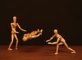
The Amazing Woodies!by CEJComment: Nice illusion picture. Would be even more believable if the woody on the right had his "hands" under the flooting woody. Nice lighting. Suggestion....you should cover the table top with black too. Just my opinion. 7 |
| Photographer found comment helpful. |
| 08/08/2005 02:16:37 PM |
|
| Photographer found comment helpful. |
| 08/08/2005 02:14:20 PM |
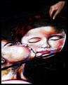
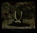
mediallusionby barndogComment: Interesting take on the challenge...has meaning. I'm not sure I understand why you have the bottle in the picture. Technical wise, i think this picture could use a little boost in contrast. I don't know how well it would have been received by other voters, but I think it would have been cool to desaturate all the colors except for the red of the "blood". Would have made it more dramatic, I think. |
| 08/08/2005 02:06:36 PM |
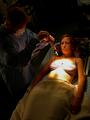
The Workings of a Mad Manby Man_Called_HorseComment: I get the illusion, however, it is really hard to see details with the action so far away and the spot light so bright. The bra is also kind of distracting. Perhaps using a man for the patient model would have been better. |
| Photographer found comment helpful. |
| 08/08/2005 02:02:54 PM |
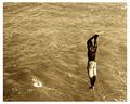
P o i s e dby ergoComment: Interesting illusion. The lighting is great. I like the picture, but I'm not really liking the what the sepia tone did to the color of the water...although it does well for the model. I can't help but wonder if it would look better in a blue duotone. |
| Photographer found comment helpful. |
Home -
Challenges -
Community -
League -
Photos -
Cameras -
Lenses -
Learn -
Help -
Terms of Use -
Privacy -
Top ^
DPChallenge, and website content and design, Copyright © 2001-2025 Challenging Technologies, LLC.
All digital photo copyrights belong to the photographers and may not be used without permission.
Current Server Time: 08/23/2025 06:39:41 PM EDT.