| Image |
Comment |
| 05/22/2005 01:02:58 PM |
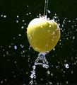
Green Apple Juiceby anirenoComment: The blown highlights are very distracting, particularly as they are in a central position in the image. The implementation is good, but the basic idea is somewhat overused.
Base: 5
Technical: -1
Interest: +1
Emotion: +0
Bias: +0
Total: 5 |
| 05/22/2005 01:01:09 PM |
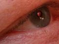
Apple of My Eyeby russbbrinkComment: The apple of your eye is sitting over the left buttock of a woman in a short skirt? Somewhat interesting basic idea, but I have a personal dislike of the exact setup. The skin also seems abnormally red.
Base: +5
Technical: +0
Interest: +1
Emotion: +0
Bias: -1
Total: 5
|
| 05/22/2005 12:51:19 PM |
Schizophreniaby CEJComment: Pity you couldn't quite get the apple slices on the left to line up as well as the ones on the right. Nice concept. The section of power outlet (phone outlet) at the right is distracting, though. |
 Photographer found comment helpful. Photographer found comment helpful. |
| 05/22/2005 12:00:28 PM |
Outside Looking Inby MatthewComment: If I were scoring for the contest:
Base: +5
Technical: +0
Interest: +0
Emotion: +0
Bias: -1
Total: 4.
The closer look at that thing in front (what the heck is that, anyway?) draws my attention enough to avoid a negative interest score, but that's it. I can intellectually understand where you were trying to go with this shot, but it doesn't grab me at all. I had the odd thought thinking about it while I was writing this of putting tiny backpacks on all of them and retitling it "school cliques suck", but I'm not sure that would have helped you with a voting public (I just have a weird imagination).
Again, the angle just bugs me at a personal level somwehre. See my notes on your Evolution shot. |
| Photographer found comment helpful. |
| 05/22/2005 11:56:03 AM |
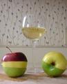
Evolutionby MatthewComment: If I were scoring for the contest:
Base: +5
Technical: +0
Interest: +1
Emotion: +0
Bias: -1
I like the concept of "evolving" from pointy to smooth (the title really makes this shot), but the way you have the picture rotated for some reason just gets under my skin. I can't really give any good reason for it, other than perhaps cognitive dissonance at an implied science involved in evolution (though I suspect those fruits have absolutely nothing to do with each other, whatever they are), and the physics of having them sticking to a wall. |
| Photographer found comment helpful. |
| 05/22/2005 11:52:19 AM |
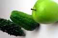
Varietyby MatthewComment: If I were scoring for the contest:
Base: +5
Technical: +0
Interest: +0
Emotion: +0
Bias: +0
Total: 5
The different shades grab the eye at least for a second, making it not completely tedious (a lot of shots in this contest got -1 in the Interest category from me for having absolutely nothing interesting at all about them), but nothing makes me want to look any further, either.
I think this was a hard contest to shoot for. |
| Photographer found comment helpful. |
| 05/18/2005 10:59:42 AM |
contimplationby Man_Called_HorseComment: The light from above looks artificial, particularly given the almost medieval theme. Also, the word is spelled "contemplation". |
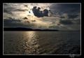
| 05/17/2005 10:33:58 PM |
Homageby atsxusComment: If I were scoring for a challenge:
Base: 5
Technical: +0
Interest: +1
Emotion: +0
Bias: +0
Total: 6
There is a white halo over the land that probably comes from oversharpening, contrast boosting, or highlight adjustment that distracts heavily. The pure whites in the upper left are also a little harsh on the eyes. These are minor things that mostly kept me from really wanting to look too long at the left side of the image, but not bad enough to dock points for that alone (it did contribute to the less than optimal interest score, however).
The rays of light coming out of the clouds held my attention for quite some time, though, looking at how the light played out over the clouds moving to the right. There's something out in the center (boats?), but I can't make out what it is, so it only serves as a distraction. I also wouldn't really know what to make of the title without your comments.
Black and white sea shots in general don't really grab me that well, either. Other than a mild interest in the lighting, there's nothing really memorable or evocative about the shot. |
| Photographer found comment helpful. |
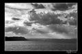
| 05/17/2005 10:25:47 PM |
Creationby atsxusComment: If I were scoring for a challenge:
Base: 5
Technical: -1
Interest: +1
Emotion: +1
Bias: +0
Total: 6
The sharp transition between the blown highlight of the sun against the heavily darkened clouds just draws the eye and really hurts the overall pleasure of looking at the image. I like the framing, the colors, and the mood, though the sun is too high in the sky for my mind to accept it as a dark shot, and the cognitive dissonance breaks the immersion again.
Holding my hand over the top third of the image, I end up with a shot that has none of those problems, which would have blipped the score up to 8. You might just try recropping it. |
| Photographer found comment helpful. |
| 05/11/2005 12:54:12 AM |
Between Sober and Hangoverby ArtysteComment: Originally posted by Zed Pobre:
Woody! The only problem with using him in challenge shots is that you're immediately identifiable. :) |
Or not... looks like there's more than one person taking Woody shots. :)
|
| Photographer found comment helpful. |
Home -
Challenges -
Community -
League -
Photos -
Cameras -
Lenses -
Learn -
Help -
Terms of Use -
Privacy -
Top ^
DPChallenge, and website content and design, Copyright © 2001-2025 Challenging Technologies, LLC.
All digital photo copyrights belong to the photographers and may not be used without permission.
Current Server Time: 08/23/2025 03:28:41 AM EDT.