| Image |
Comment |
| 04/27/2005 06:48:07 PM |
The Tulipby debbybrisComment: Bright white background is harsh on the eyes, and the slight graduation to it doesn't really help break the tedium. Flower seems slightly out of focus. Color contrast is nice. |
 Photographer found comment helpful. Photographer found comment helpful. |
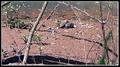
| 04/27/2005 05:07:22 AM |
The Cultivatorby whagerbaumerComment: There are too many things to draw the eye, the subject doesn't seem to be in focus (assuming it's supposed to be the man, not the flowers), and the scene would benefit greatly from a large increase in contrast. |
| Photographer found comment helpful. |
| 04/27/2005 05:05:52 AM |
I Will Hold Uby wanniedaComment: Highly evocative... and the complete opposite of minimalism: multiple subjects and text (which looks added in post-processing, not allowed). |
| 04/27/2005 05:02:23 AM |
|
| 04/27/2005 05:01:11 AM |
Capturing the Capturerby ScubaComment: The scene is beautiful, but the subject is out of focus. If the focus had been reversed, with the photographer sharp and the mountains very out of focus, it would have been much more interesting. |
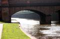
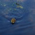
| 04/27/2005 04:59:43 AM |
Moor Hen on Bank of Canelby benhurComment: It took me a good 30 seconds to find the hen, and even then I'm not really sure that's what it is. It could just as well be a chunk of rubble or a hole in the ground. Nothing draws the eye to it, and the rest of the image is both nondescript and slightly blurry, with harsh highlights on the water. |
| Photographer found comment helpful. |
| 04/27/2005 04:58:29 AM |
Camouflageby mb27Comment: The color selection on this is really awful, and the result conceals the subject and hurts the eyes. |
| 04/27/2005 04:48:21 AM |
$100by pumpkinComment: Image looks blurry and washed out. Contrast boosting might help, as would mild sharpening. The background has at least some texture, which is good, but is still on the tedious side. |
| 04/27/2005 04:46:25 AM |
|
| Photographer found comment helpful. |
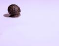
| 04/27/2005 04:46:08 AM |
A Simple Lifeby mrmorrisComment: The third snail-on-montone-background entry I've seen so far. This one avoids being on completely harsh white, which is good, but the color is still bright enough to be hard on the eyes. The shadow adds some effect, which is good, but the overall image still isn't all that interesting. |
| Photographer found comment helpful. |
Home -
Challenges -
Community -
League -
Photos -
Cameras -
Lenses -
Learn -
Help -
Terms of Use -
Privacy -
Top ^
DPChallenge, and website content and design, Copyright © 2001-2025 Challenging Technologies, LLC.
All digital photo copyrights belong to the photographers and may not be used without permission.
Current Server Time: 08/19/2025 08:02:31 PM EDT.