| Image |
Comment |
| 05/04/2005 01:25:33 AM |
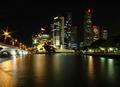
Waterfrontby crabappl3Comment: Another person using a starflare lens filter? With one or two lights that are the focus or main support for an image that's okay, but with so many lights... well, it just looks artificial. Colors on the water are nice. Buildings seem fuzzy, particularly the lit text at the top that the brain wants to think should be readable, and aren't. |
| 05/04/2005 01:23:37 AM |
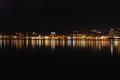
Sittin on a dock in the bayby cwyouComment: Hm. I like the basic concept of the water stretching out the lights, and there is some variation in color which is interesting, but the final result is for some reason a little harsh on my eyes. |
 Photographer found comment helpful. Photographer found comment helpful. |
| 05/04/2005 01:22:30 AM |
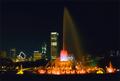
Buck's Placeby flip89Comment: Very nice lighting. Minor nit: I wish I could see some stars. That might be impossible with so much albedo from the city. |
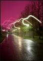
| 05/04/2005 01:21:42 AM |
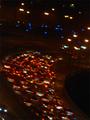
Highway Traffic Lightsby mrezaComment: Well, the basic idea isn't necessarily bad, and I much prefer stopped traffic to the somewhat overdone long-exposure shots I've been seeing (particularly because you seem to have grabbed a wide array of colors in the various lights on the cars), but the focus seems very poor, the colors are off, noise is visible, and the rotation, which *almost* works with the cars alone, throws the scene off because the lamp posts are also angled.
|
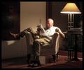
| 05/04/2005 01:18:20 AM |
Night colorsby kaske666Comment: I really like the colors and lighting. Eventhe harsh reflected glare on the table seems to fit in well. Unfortunately, the rules specify that the shot be taken *outside* late at night, and this looks like it's indoors, though possibly in the grey area of an outdoors covered pavilion of some nature. |
| Photographer found comment helpful. |
| 05/04/2005 01:16:05 AM |
Reykjavik in purple skiesby bergwaltersComment: The colors are interesting, but I have no idea what you were attempting to accomplish with those somewhat random looking light streaks, which I find very unappealing. It doesn't help that the image seems tilted to the left, making it seem off-balance. |
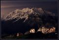
| 05/04/2005 01:14:10 AM |
Mt. Timpanogosby fifieldComment: Very pretty. I like the range of subjects, from the stars to the mountain to the near rocks. My only objection is that the fill flash has caused some glare on the rocks, and the rightmost one seems to draw the eye a little more than I like, possibly because of the color change halfway through. |
| Photographer found comment helpful. |
| 05/04/2005 01:12:35 AM |
my fatherby da-answerComment: Focus seems soft, the image has a lot of visible noise, and the more importantly the rules specified that the shot be taken *outside* late at night. |
| Photographer found comment helpful. |
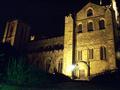
| 05/04/2005 01:11:01 AM |
Silent Nightby RiponladyComment: The choice of color balance doesn't seem to work well, and that bright white flare is very distracting. Nice building, though, and I like the lighting on the leftmost tower. A shot of that alone would probably have been superior. |
| Photographer found comment helpful. |
| 05/04/2005 01:09:56 AM |
Holocaustby H R VerryComment: A stirring picture, and you get bonus points for choice of subject and the evocative theme. Unfortunately, I have to dock them again for the bright orange, which just strikes me as absolutely wrong for a night shot. Although I'm sure you did take this at night, the result looks like it was shot at noon and then overprocessed. |
| Photographer found comment helpful. |
Home -
Challenges -
Community -
League -
Photos -
Cameras -
Lenses -
Learn -
Help -
Terms of Use -
Privacy -
Top ^
DPChallenge, and website content and design, Copyright © 2001-2025 Challenging Technologies, LLC.
All digital photo copyrights belong to the photographers and may not be used without permission.
Current Server Time: 08/19/2025 01:54:46 PM EDT.