| Image |
Comment |
| 02/12/2007 09:36:48 AM |
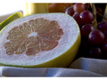
Red Pamelloby TlemetryComment: I'm not a fan of how the blown hightlight in the top left blends 100% (on my monitor) into the border of the this shot - becasue of this the whole foreground of the shot seems to be under-expoused.
Compositionly sound, but I would like to have seen more punch in the colours - especially in the grapefruit. One last nit-pick, IMHO the border does nothing for this shot, the top and bottom approach should have been swap for a full wrap around at about half the width.
Sorry to be so mean (4) |
 Photographer found comment helpful. Photographer found comment helpful. |
| 02/12/2007 09:32:50 AM |
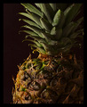
Study in Lighting and Textures (Pineapple no. 11)by TooCoolComment: Indeed, the lighting and the texture are great in this one, as well as the composition. I also like there is tons of detail in the darker parts of the shot. However I'm not too sure on the chunky black border, because of the black background, I would have chosen a contrasting colour.
Overall great shot. (6) |
| Photographer found comment helpful. |
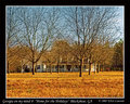
| 02/12/2007 09:29:33 AM |
Thambiliby aznymComment: I like the natural candid feel of the this, and a change to see a street style applied.
Watch the highlights of the sun hitting the trees, they are slightly blown. Also, as this is advanced, I would have liked to have seen some tidying up of the ground area, as some of the rubbish is a little distracting. I would have also have been nice to see the traders face, but I'm not sure if that was even possible.
(5) |
| Photographer found comment helpful. |
| 02/12/2007 09:23:11 AM |
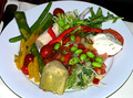
Mmmm... Salad Barby JuliBocComment: IMHO there is just far too much noise and too many blown highlights in this one.
Agin IMHO it doesn't appear that there has been any consideration for the composition of this, with the edges of the plate out of frame and the distracing background to the left and top of the frame.
Sorry to be mean (3) |
| Photographer found comment helpful. |
| 02/09/2007 07:00:05 PM |
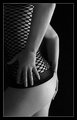
jurkjecrop1.jpgby PuckzzzComment: I heard a rumor that if you look hard enough you'll see a tattoo;-)
I like the pose, and good choice for a B&W (of course!). Lovely curves and a nice bottom.
However my eye seems to be drawn to the wedding band. My mind says it doesn't fit, so my eyes get stuck on it.
|
| Photographer found comment helpful. |
| 02/09/2007 06:56:43 PM |
Home for the holidaysby Elvis_LComment: Elivs - this is great, more so when you see the original, the digital darkroom is a wonderful place!
I do find the branches a tad on the distracting side, but once your eyes get used to them, it's so such a big barrier to the rest of the image.
I like it. |
| Photographer found comment helpful. |
| 02/06/2007 05:14:54 AM |
Holy Shot V1by SomeamateurComment: What do I like about this?
Well:
* The sky's colour is really punchy, and set the tower off nicely
* Good contrast and detail in the stone work
* Upward shot of the tower adds drama and perspective to the shot
Not so hot on:
* The shot needs to be rotated in you post-prod software. All software has a crop tool that you can us to rotate, most have a straighten tool. If you straiten the upper-most ledge, the whole shot will be balanced and I won't feel drunk.
* There are two MASSIVE splodges of sensor dust or lens muck in the shot. Again all software has some sort of clone tool. Use it, it will cover a multitude of sins. Just remember to use a large (as you can!) soft brush to do it.
I love contrasty images, and this is a classic composition for a church tower.
Tips for next time:
* Get lower and shoot wider - not sure what focal length you used, but more door would give this a more imposing feel. Get you knees dirty and get down!
* Get your self a polarizer and you'll get deep colours is both the sky and stone (looks like you did this already, but this is the number one for me!)
* Straighten up as best you can in frame. That will mean you crop less in post and can get a bigger print from it.
Overall nice shot, just needs one or two tweaks in software. |
| Photographer found comment helpful. |
| 02/02/2007 07:50:34 PM |
Dancing Through Dark Times 'The Passage'by MAKComment: now for something different...... You suck man!
Just kidding, your so hot right now I can feel it in MK. You trail blazing S.O.B.
Where is this? Stowe Gardens or somewhere similar? I always take crap/dull pictures at places like that, but this is cool. Also, HDR? Loving the contrasty look. |
| Photographer found comment helpful. |
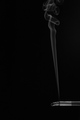
| 02/02/2007 07:45:46 PM |
La fuméeby hannekeComment: not for much longer in the UK or France!
Loving your work Hann.
I'm crap at smoke photographs, but this is strong with minimal effort. |
| Photographer found comment helpful. |
| 02/01/2007 05:35:49 PM |
Baredby Jaded_HousewifeComment: This is one of the most emotive (and dare I say sexy) self-portraits I've seen here. The nudity is really only incidental, as you 'happen' to be naked. This would & should have scored highly in the challenge.
You make 'body beautiful' what you make it. |
| Photographer found comment helpful. |
Home -
Challenges -
Community -
League -
Photos -
Cameras -
Lenses -
Learn -
Help -
Terms of Use -
Privacy -
Top ^
DPChallenge, and website content and design, Copyright © 2001-2025 Challenging Technologies, LLC.
All digital photo copyrights belong to the photographers and may not be used without permission.
Current Server Time: 08/01/2025 05:15:42 PM EDT.