|
|
|
Showing 961 - 970 of ~1226 |
| Image |
Comment |
| 05/25/2006 01:30:09 AM | Hard habit to breakby admajicComment: Great composition and nice lighting. I also like the depth of field use, but I'd really like to see the back of the ash tray focused and the cig pack left out of focus. I know...too picky. Nice capture and great concept. |  Photographer found comment helpful. Photographer found comment helpful. |
| 05/25/2006 01:28:48 AM | HDD failureby BrookiedComment: Yup, it failed, but ultimately suceeded in buring down the neighborhood. Nice composition and cool post-processing to make for some interesting flames. | | Photographer found comment helpful. |
| 05/25/2006 01:28:00 AM | The Resultsby amandaloreComment: Very nice. While it depends a great deal on the title, as soon as I read it I got that stomach-turning feeling. Great lighting and excellent composition make that feeling and mood possible. Nice work! | | Photographer found comment helpful. |
| 05/25/2006 01:26:56 AM | I am poorby vstromComment: It looks like you have a really nice image here, but it is posted too small. As far as I can see, you composition and toning are great, but I can't make out detail. You only posted at about 40% of what's allowed. Always use the full resolution that is allowed. You will score much, much better. |
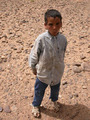
| 05/25/2006 01:14:44 AM | Man in the Morningby swallaceComment: Hey there from the Critique Club
First of all, thanks for the detailed shot information. This makes critiquing so much more pleasant and easier. I really appreciate it.
Camera Work/Technical: The horizon is a bit tilted. In landscape, especially those that include water, that is one of my biggest pet peeves. Perfect WB, and all the tones are exact to what my eye would expect to see. I think a graduated natural density filter would have helped you keep a little more detail in the sky for this image.
Lighting: Very nice. I like the peaceful, early morning feeling that your lighting choice provides. I also like the detail that was produced by the gently moving water.
Composition/Content: Great composition and excellent job putting the rule of thirds to work. This provides many elements and leading lines to pull the viewer's eye into and around the photograph. The foreground is a little distracting, and I think getting a little closer, as to exclude it, would have helped out a bit.
My Opinion: Without a face and an expression, you can't produce an environmental portrait. I am not saying that I am right, I am just offering my opinion. I think you have produced a nice image here, but it just didn't hit the voters as an environmental portrait. He is surrounded by his play time environment, but I really need to see his face. | | Photographer found comment helpful. |
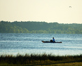
| 05/25/2006 01:04:46 AM | Surflessby frestepiComment: Hey there from the Critique Club
Camera Work/Technical: Very nice focus on a live subject and a slow shutter speed. I also like your depth of field use that works nicely with the lighting to isolate the subject from the background.
Lighting: Terrific! I am assuming that there was some fill flash used here, and it worked perfectly. It is just the right amount to really make him jump off the page without blowing out any highlights. This is often very difficult, especially with light clothing. You knocked it out with no problem.
Composition/Content: Very nice, as well. The subject draws the most attention, but the shoreline works well to direct the viewer's eye back to the dejected subject.
My Opinion: I like this one. I like the dejected feeling that is obviously portrayed by his expression alone. Great mood, but to really understand the photograph, the viewer has to read the comments. Just remember that the comments are not viewable until voting for the challenge is over. Welcome to DPC and the over-use of the update link. 5.2 is a great start, and I look forward to many more of your images to critique. | | Photographer found comment helpful. |
| 05/25/2006 12:51:18 AM | Easy prayby facesastheycomeComment: Hey there from the Critique Club
First off, always try to include some info about the shot in the Photographer's Comments section. It really helps out when we know what the photographer was thinking and what equipment/lighting/etc. were used, especially when you request a critique.
Camera Work/Technical: Your horizon is tilted. While not everyone is like me (and probably for very good reason), that is the first thing that jumps out at me, thus is one of my pet peeves. Always make sure the horizon is, well, horizontal, unless you are going for a tilted effect. Here, it looks accidental rather than intentional.
Lighting: Very nice lighting. Everything is evenly exposed and nicely toned in this image. You managed to keep all the detail in you darks without blowing out your lights. Nice work.
Composition/Content: Everything is dead centered, leaving the eye very little room to move around. The trail of birds helps to move the viewer's eye around a bit, but not enough to overcome the centering. Try using the rule of thirds for your subjects and you will produce some much more interesting images.
My Opinion: I agree with most of the previous commenters that this isn't an environmental portrait. It surely would have placed better in a different challenge, but, to me, and environmental portrait includes a person surrounded by their work or play environment with their face showing. Not a bad image, but just not suited for this challenge. | | Photographer found comment helpful. |
| 05/25/2006 12:42:30 AM | Grad Studentby electinaComment: Hey there from the Critique Club
Camera Work/Technical: A bit off focus, but the exposure is dead on. Nice WB to create a nicely tined image.
Lighting: The lighting looks good. No overbearing hues or weird tones anywhere in the photo.
Composition/Content: You captured a very interesting expression from an obviously interesting character, but there was really nothing outside the title to link him to his environment. Keep in mind that many voters overlook the title initially to determine if the shot meets the challenge.
My Opinion: With a little more focus and something in the frame to link him to his environment, this would have drawn a much higher score. Your post-precessing worked very well in this one, too. Looking at your profile, I appreciate the fact that you enter a lot of challenges. It took me 10 months to enter my first 9 challenges. You've done it in under two. Great dedication to learning how to make images that are more appealing to others. Keep shooting and keep entering. I look forward to critiquing more of them. |
| 05/25/2006 12:28:21 AM | She Thinks my Tractor's Sexyby tuffyComment: Hey there from the Critique Club
Camera Work/Technical: Nice work with the camera, as well as post-processing to give this one a nice depth of field. You did a very nice job of isolating him from the background, while still including the necessary elements of his environment.
Lighting: The lighting is a little harsh, but you have already addressed that in your comments. An early morning (if those still exist, haven't seen one in a loooooong time) or late afternoon shooting of this one would have improved it a great deal.
Composition/Content: I would have liked to have seen a bit more of him and his environment. The composition is a little cramped, but pulling back a bit and including more of his body, the tractor, and the dusty field that I am imagining would have also drawn more high votes.
My Opinion: Nice work, and I think that this one was better than several that placed higher. You met the challenge very well, while others had missed it by a mile. With a little more info in the frame, I think this one would have pulled a much higher score. | | Photographer found comment helpful. |
| 05/25/2006 12:18:35 AM | Afternoon Snackby meyersComment: Hey there from the Critique Club
Camera Work/Technical: Nice focus and great depth of field use. Great WB for a very nicely toned image.
Lighting: The lighting is very nice, as well. Your exposure is very even and controlled, thus producing a very appealing image.
Composition/Content: It is a little too centered for me, but I like the way the vine draws the viewer down into the frame and over to the butterfly.
My Opinion: It missed the challenge by a mile, but you were not alone. In my opinion, an environmental portrait is of a person in their work or play environment. It is an area around them that provides at least a partial definition of who that person is. Nature alone isn't an environmental portrait for me. You have a very nice image, but just not for this challenge. | | Photographer found comment helpful. |
|
Showing 961 - 970 of ~1226 |
Home -
Challenges -
Community -
League -
Photos -
Cameras -
Lenses -
Learn -
Help -
Terms of Use -
Privacy -
Top ^
DPChallenge, and website content and design, Copyright © 2001-2025 Challenging Technologies, LLC.
All digital photo copyrights belong to the photographers and may not be used without permission.
Current Server Time: 08/05/2025 01:52:28 AM EDT.
|