|
|
|
Showing 721 - 730 of ~1242 |
| Image |
Comment |
| 07/05/2006 09:09:56 PM | NEW: Lightning Trucksby KitaComment: Hey there from the Critique Club
Camera Work/Technical: I do agree with Rebecca that the highlights are a bit blown. However, I do like the movement that you created with the background. I think that this was a very creative idea.
Lighting: Just a touch too harsh. If this had been toned down just a little, I think that the voters would have been more fond of it.
Composition/Content: I also think that your composition needed some work. While I am no stickler for the 'rules of photography,' I think that the centering did not work very well for this one.
My Opinion: You absolutely met the challenge, and did so in a very creative manner. I just don't think that it was what the majority of the voters had in mind for the challenge. Even still, I like it, and with some minor lighting and composition changes, I think that it would have pulled a better score.
Eric
|  Photographer found comment helpful. Photographer found comment helpful. |
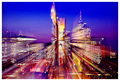
| 07/05/2006 04:51:05 AM | Shooting the Breezeby ArtanComment: Hey there from the Critique Club
Camera Work/Technical: These are always very difficult for me to critique, especially from a technical standpoint. The blur is a bit distracting to me, and it is difficult to find an area of crisp focus.
Lighting: Very nice lighting. This is the main strength of this image. You captured great coloring in every part of this image.
Composition/Content: I think that the tall parts of the skyline are a bit too centered for this type of capture.
My Opinion: While this is a very nice zoom blur, it really isn't what I think of when I hear motion blur. Still, I think that it met the challenge, and the voters liked it enough to place it in the top 25.
Eric
| | Photographer found comment helpful. |
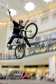
| 07/05/2006 04:45:28 AM | Look Folks - No Handsby michael_pComment: Hey there from the Critique Club
Camera Work/Technical: This is where a great idea lost some of its potential points. Your motion blur is terrific, but your focus is off on the rider. Your depth of field complements the blur very nicely, but it may have been one of the main reasons that you lost the crisp focus that this one needed.
Lighting: Your lighting is very nice. The bright background really helps isolate the rider in his dark clothing. You also did a terrific job with the exposure. No important detail was lost to highlights or shadows.
Composition/Content: Great choice of subject for this particular challenge.
My Opinion: As is, this one scored a little higher than I would have expected. You did a great job meeting the challenge, and with the rider in crisp focus, I'd expect to see this one well into the 6 range.
Eric
| | Photographer found comment helpful. |
| 07/05/2006 04:39:27 AM | get to the flowerby alpharichComment: Hey there from the Critique Club
Camera Work/Technical: Interesting, but the flower lost some of its crisp focus with the camera movement. I do like your choice of WB, as the colors are nicely captured.
Lighting: Great lighting for the effect you were after. The subject stands nicely off the background that you created.
Composition/Content: I think that this one is a bit too centered. While I am no stickler on the rules of photography, it often helps the image by pulling it out of the center.
My Opinion: I think that this one scored pretty close to its potential. Voters here like vivid colors and high contrast. I do like the idea, and I think that you pulled it off pretty well.
Eric
| | Photographer found comment helpful. |
| 07/05/2006 04:28:01 AM | Moonlit Pierby kgearyComment: Hey there from the Critique Club
First of all, congrats on your best finish to date, as well as a 6+ score. It takes many of us much longer than three challenges to make that mark.
Camera Work/Technical: First off, I am happy to see the straight horizon line. It is perfect! Accidental horizon tilts are a pet peeve of mine, so I always appreciate a straight one. I also like your depth of field choice for this one. All the rocks are crisply focused, as is the (wonderfully horizontal) horizon and the buoy. I also like your WB choice, giving this a great, moody feel.
Lighting: The light that the moon provided is also very nice. This was a great time of day to provide the great mood that you produced here. I might have used a graduated natural density filter to enhance that sky a little, but I couldn't be sure without being there. Very nice lighting.
Composition/Content: This is one of the main strengths of the image. The rock wall serves very well to pull the viewer deep into the image and feel the mood. Even though it was probably 230 degrees that day, this one produces a cold and lonely feeling.
My Opinion: I think that this one met the challenge in a very creative way. I also believe that it should have scored a bit better, as it is much better, in my opinion, than some of those that finished ahead of it. Voters here like vivid colors, so maybe a red or orange sky would have vaulted it up a bit. Personally, I prefer it just the way you captured it.
Eric
| | Photographer found comment helpful. |
| 07/05/2006 04:13:38 AM | Physics...by ApeeComment: Hey there from the Critique Club
Camera Work/Technical: I agree with the General. I would have changed the focus around on this one and used a deeper depth of field. While I can see what's moving, the fret bars are very distracting and compete very heavily with the motion of the subject.
Lighting: Your lighting is very nice and very even. There were no details lost with in the highlights or shadows.
Composition/Content: I also like your angle for this shot. It serves very well to pull the viewer's eye up and into the frame, but the frets take over and pull it away from the subject of the challenge.
My Opinion: I think that this one scored pretty close to its potential as it is. Giving this one a deeper depth of field and a longer exposure would have surely pulled this one out of the sub-5 category.
Eric
| | Photographer found comment helpful. |
| 07/05/2006 04:07:53 AM | Stealth Sedanby levyj413Comment: Hey there from the Critique Club
Camera Work/Technical: I think that your focus emphasizes your background a bit too much. If you could have caught the blur on a more shallow depth of field, I believe that your score would have benefited.
Lighting: Your lighting came out terrific. It is the main strength of this image.
Composition/Content: While the pole does give away the fact that the image was shot at a tilt, I do not believe that it detracts from the capture at all. It adds some interest to the photo, and actually helps move the viewer around the frame.
My Opinion: I really like it, but I think that it relied too heavily on the title. Keep in mind that these challenges have 200, 300, even 400 entries, and the voters spend very little time trying to figure out what is in the frame. I think that this image is far better than a 4.8, but it just took too long to figure out what was there. Nice work, and I look forward to more.
Eric
| | Photographer found comment helpful. |
| 07/05/2006 04:02:37 AM | Stealth Sedanby levyj413Comment: Hey there from the Critique Club
Camera Work/Technical: I think that your focus emphasizes your background a bit too much. If you could have caught the blur on a more shallow depth of field, I believe that your score would have benefited.
Lighting: Your lighting came out terrific. It is the main strength of this image.
Composition/Content: While the pole does give away the fact that the image was shot at a tilt, I do not believe that it detracts from the capture at all. It adds some interest to the photo, and actually helps move the viewer around the frame.
My Opinion: I really like it, but I think that it relied too heavily on the title. Keep in mind that these challenges have 200, 300, even 400 entries, and the voters spend very little time trying to figure out what is in the frame. I think that this image is far better than a 4.8, but it just took too long to figure out what was there. Nice work, and I look forward to more.
Eric
| | Photographer found comment helpful. |
| 06/27/2006 06:29:37 AM | Peacock in our houseby UAE_GuyComment: Hey there from the Critique Club
Welcome to the challenges. I think that this should be a great learning entry for you. Rule number one around here is to use the full size parameters that DPC allows for each challenge. As you can see, the voters and comm enters will beat you down pretty hard for small images.
Camera Work/Technical: While I believe that your subject is crisply focused, it is hard to tell with the washed look that this one has. I am not sure if it was just a harsh exposure, or if it was done with post-processing.
Lighting: While the lighting looks nicely even, the entire image has an overexposed and washed out look to it.
Composition/Content: Cool composition. I like the way the shape of the bird's neck pulls the eye up and into the image, then the beak and feathers take over to give this one a very nice balance.
My Opinion: With an image this size, you did pretty well with the score you got. I have seen similar sizes do much worse. Make sure your submission are as large as allowed and your score will grow greatly.
Eric
|
| 06/27/2006 06:20:38 AM | The pastby DufusComment: Hey there from the Critique Club
Camera Work/Technical: The image is nicely crisp and well-focused, but I think that I'd like to see this one with a much more shallow depth of field. While the background is not terribly overpowering, it is still a bit distracting.
Lighting: I think that the lighting is too harsh. I do like the backlit feeling of the animal skin, and the nicely contrasting shadows cast by her working hands, but the entire frame seems a bit washed out.
Composition/Content: I believe that your choice of subject matter is the strongest element of this image. This is a lady doing something that is well out of the ordinary in today's technology-dependent society. So, terrific subject, but the composition is a bit off. I see some literal framing, but the framed feeling of the image could have used more attention.
My Opinion: Nice work meeting the challenge in a very creative way, and with very creative subject matter. I think this one would have pulled a better score with some lighting adjustments. As it is, I think that it scored pretty close to its potential.
Eric
| | Photographer found comment helpful. |
|
Showing 721 - 730 of ~1242 |
Home -
Challenges -
Community -
League -
Photos -
Cameras -
Lenses -
Learn -
Help -
Terms of Use -
Privacy -
Top ^
DPChallenge, and website content and design, Copyright © 2001-2025 Challenging Technologies, LLC.
All digital photo copyrights belong to the photographers and may not be used without permission.
Current Server Time: 08/12/2025 09:47:49 PM EDT.
|