|
|
|
Showing 501 - 510 of ~1242 |
| Image |
Comment |
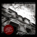
| 05/21/2007 02:24:12 AM | DEAF POET'S LAMENTATION by hotpastaComment: Very well-seen and terrifically executed. The voters have spoken, and I cannot see anything to add in the way of a thoughtful critique. Congrats on another ribbon to add to your ever-increasing collection. Nice work! My favorite part (aside from the great image) is the number 1 hit...clever! |  Photographer found comment helpful. Photographer found comment helpful. |
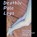
| 05/21/2007 02:19:46 AM | Deathly Pale Legsby snafflesComment: Hey there from the Critique Club
Camera Work/Technical: Crisp focus on the on the woodwork, but the legs seem to lose some sharpness with your depth of field. Nice work with the colors and post-processing to create a nice, pale set of legs.
Lighting: Very nice and even. No blown highlights and no details were lost in the shadows.
Composition/Content: I agree with Kelly on the border, but I do like the overall composition. I like it even more after reading that you were upside down when it was shot. I think that those borders could have been half that size, maybe even less, and the layout would have looked better.
My Opinion: I do like it, but I think that I'd like it more with less border and better focus on the legs.
Thank you for the opportunity to provide a critique on your entry,
Eric
| | Photographer found comment helpful. |
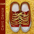
| 05/21/2007 02:13:24 AM | Data Processing Logicby splidgeComment: Hey there from the Critique Club
Camera Work/Technical: Crisply focused for shooting lights and well-captured. Just glancing at it, I didn't really see much to the image. That may have cost you and tenth or two from the voters. Now, spending some time with it, I see what you have captured here.
Lighting: Your lighting is solely provided by the subject of your image. Nice idea and great concept.
Composition/Content: The tilt definitely adds interest to this capture. You also chose a great font that fits right in with the overall feel of the image.
My Opinion: I think that many voters passed it by, as I did when I first saw it. Even still, you managed a strong score and a well-deserved finish.
Thank you for the opportunity to provide a critique on your entry,
Eric
| | Photographer found comment helpful. |
| 05/21/2007 01:49:07 AM | Daredevil Psychotic Ladybugsby freakin_hilariousComment: Hey there from the Critique Club
Camera Work/Technical: Your choice of focal points makes this one a bit distracting. While I can see that parts of the ladybug are focused, I'd really like to see this one with the bug fully focused. I do like the contrast that you achieved.
Lighting: I like the contrast that you created with the lighting here. My only complaint with the lighting is that the focal point is on the brightest part of the image, and that isn't the subject of the image.
Composition/Content: I'll echo the straw comment from below. I'd really like to see the entire bug, as well as the entire bug nicely focused. The straw on this side of the subject seems more accidental than an intentional composition.
My Opinion: Nice idea, and a pretty strong capture. With a bit of a change in the focal point, as well as the composition of the bug, your score would have surely grown.
Thank you for the opportunity to provide a critique on your entry,
Eric
| | Photographer found comment helpful. |
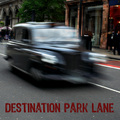
| 05/21/2007 01:42:55 AM | Destination Park Laneby NuzzerComment: Hey there from the Critique Club
Camera Work/Technical: I like the idea you had here, but I think that the lack of focus is a bit overbearing for what you produced. While I understand the use of motion, I think zooming out a bit, thus including more of a focused area, would have made this one easier to look at.
Lighting: Your lighting is the strength of this image, in my opinion. Even with the motion blur, its pretty easy to see that you captured a very nicely lit scene.
Composition/Content: Again, I think that the subject occupies a bit too much of the frame. Your choice of text and font fits this one very well.
My Opinion: Overall, I like it. I would, however, like to see more of the scene around the speeding vehicle. I think it would really pull me more into the scene and frame, making it more real to me as a viewer.
Thank you for the opportunity to provide a critique on your entry,
Eric
| | Photographer found comment helpful. |
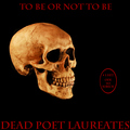
| 05/21/2007 01:31:41 AM | Dead Poet Laureatesby dannyleeComment: Hey there from the Critique Club
First of all, congrats on your second highest scoring entry to date. Strong work!
Camera Work/Technical: Very nice job with your minimalism approach. Your focus on the human skull is very crisp and an obvious strength of this image.
Lighting: Your lighting on the skull is also very nice. You did a terrific job with you shadows and highlights here, and I cannot see anyway that I could offer to improve you lighting.
Composition/Content: I think that the text and layout could have benefited from a little more creativity. While it fits nicely into the minimalistic approach, I think a bit better layout would have grown your score.
My Opinion: Overall I like it and I think it earned a strong score, just as it deserved. Nice work, and congrats again on getting a new image up there on your profile page.
Thank you for the opportunity to provide a critique on your entry,
Eric
| | Photographer found comment helpful. |
| 05/21/2007 01:25:19 AM | Devoted Pasta Lovers by De SousaComment: Alright, this is unfair! Not only did I pull this one for critique, but I also snagged librido's entry. I apologize that I have nothing to offer in the form of a thoughtful critique. You obviously have your hand on the pulse of the voters, and your work is well above my ability to provide feedback. I had a strong feeling that this would blue the second that it popped up on my monitor. Truly amazing. | | Photographer found comment helpful. |
| 05/21/2007 01:21:17 AM | Deep Pink Love - Love Bitesby xianartComment: Hey there from the Critique Club
I'll echo some of what your previous commenters have already said. This one is so nice because it is so over the top. I agree that the over-saturation and the boldness of this capture would make it a perfect album cover. I like your depth of filed, as well as the grain you created with the over saturation. Nice work, and I agree that you were robbed on this one. This would absolutely make a terrific album cover!
Thank you for the opportunity to provide a critique on your entry,
Eric
| | Photographer found comment helpful. |
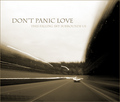
| 05/21/2007 01:15:20 AM | Don't Panic Loveby JoshuaRaineyPhotographyComment: Hey there from the Critique Club
First of all, congrats on a new personal best, as well as cracking your way into the 6's with only your third entry. A well-deserved score and top 15 finish!
Camera Work/Technical: While the photograph is technically poor, it was the perfect creation for this challenge. Nicely seen and very, very well-executed.
Lighting: Also excellent for this capture. You created a very somber mood with the lighting and toning that you offer us.
Composition/Content: I'd like to see those two short light trails on the left of the image longer, but that's about all I'd change.
My Opinion: This is one of my favorites in the challenge. I think that increasing your exposure by 3 or 4 more seconds, thus making those two short light trails on the left longer, this one would have cracked the top 10.
Thank you for the opportunity to provide a critique on your entry,
Eric
| | Photographer found comment helpful. |
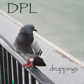
| 05/21/2007 01:10:14 AM | Dirty Pigeon Landingby EssAreDubyaComment: Hey there from the Critique Club
Camera Work/Technical: It's difficult to find your main focal point. It looks like your focus locked onto the rail instead of the preferred area of the pigeon's eye.
Lighting: Your lighting is pretty good, but maybe just a bit flat. I think a little curves adjustment would have helped out a good deal.
Composition/Content: I like your leading lines and your rule of thirds use. The eye is immediately drawn to the nice placement of the subject, while the rail, sidewalk and street lines all work well together to draw the eye around the frame.
My Opinion: Funny, but not quite what the voters were looking for. With a better placement of your focus and a little bit of a lighting adjustment, I think this would have placed a bit better.
Thank you for the opportunity to provide a critique on your entry,
Eric
|
|
Showing 501 - 510 of ~1242 |
Home -
Challenges -
Community -
League -
Photos -
Cameras -
Lenses -
Learn -
Help -
Terms of Use -
Privacy -
Top ^
DPChallenge, and website content and design, Copyright © 2001-2025 Challenging Technologies, LLC.
All digital photo copyrights belong to the photographers and may not be used without permission.
Current Server Time: 08/11/2025 01:28:57 PM EDT.
|