|
|
|
Showing 421 - 430 of ~1242 |
| Image |
Comment |
| 12/09/2008 02:39:17 AM | Smirkby geinafetsComment: Hey there from the Critique Club
Camera Work/Technical: With the image at this size, it looks like your primary area of focus missed the subject's eyes. As a general rule, and believe me when I say I am not stickler for the 'rules' of photography, portraits should have the most crisp area of focus on the eyes of your subject. I really like the depth of field you created with that wide open aperture. It absolutely adds to the interest of the capture, as well as keeps the viewer's eye from wandering too far off the point of the subject.
Lighting: While I can see that this one is indeed backlit, it just takes too much time to look at the image and figure it out. Your average voter here probably spend about 5 seconds before tossing out a vote for each challenge entry, so it needs to be readily obvious that the challenge has been met. If it isn't, voters usually assume that it is a DNMC and vote it low.
Composition/Content: Fantastic composition. The tight framing added to the smirk that you captured on the face of the subject gives this one nice appeal. It makes my mind wonder what else is going on outside of the frame.
My Opinion: Unfortunately, as votes go around here, 4.33 about hits this one just right. The composition is definitely the strength of the image, but there are too many flaws for just composition alone to overcome.
Thank you for the opportunity to provide a critique on your entry,
Eric
|  Photographer found comment helpful. Photographer found comment helpful. |
| 12/09/2008 02:28:46 AM | It's Electricby dwainasaurusComment: Hey there from the Critique Club
Camera Work/Technical:Nice focus, and your tones are very true-to-life.
Lighting: The backlighting is adds a nice glow, but the front of your subject looks too muted for me.
Composition/Content: I like the tight composition that you achieved, but the subject matter lacks the 'wow' that you see in the higher scoring entries.
My Opinion: While the idea was very creative, I think that the overall execution was below the capabilities shown in your previous entries. 5.31 is about where I'd expect this sort of image to score. Just thumbing through the challenge entries, this one speaks to me as more a a family snapshot than a creative challenge entry. Not bad, just also not terrific.
Thank you for the opportunity to provide a critique on your entry,
Eric
| | Photographer found comment helpful. |
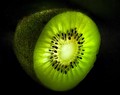
| 12/09/2008 02:22:14 AM | Kiwi Glowby PaulComment: Hey there from the Critique Club
So, its been a really big week for you. Just a few days ago, this was your new personal best, both in score and challenge placement. Then, you had to go and outdo yourself and pull in a ribbon. Nice work.
Camera Work/Technical: Your focus is spot on and exactly where it needs to be. This is one of the major strengths of the image. I also like the tones that you captured. The brightness of the green does nicely against the darkness of the background.
Lighting: Superb. Hollowing out the kiwi did wonders for the lightning.
Composition/Content: I like the composition, but the content is a bit too common for my personal preference. Search kiwi on the site photos and you'll find lots of these. However, your composition shows a more creativity than most, and you captured this one better than most of the others that I looked at while thinking about your image.
My Opinion: I think that the 6.35 is about right for this capture. A top 15 placement is fitting looking at the rest of the challenge entries, and this is one of the better fruit shots in the challenge. Nice work in pulling of a fine image with fairly common subject matter. If I had voted on this challenge, this would have been in the 6 or 7 range. You met the challenge well.
Thank you for the opportunity to provide a critique on your entry,
Eric
| | Photographer found comment helpful. |
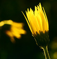
| 12/09/2008 02:11:53 AM | A Taste of Yellowby MsAmbrosiaComment: Hey there from the Critique Club
Camera Work/Technical: Your depth of field is spectacular, but I do find it difficult to place your primary area of focus. The second flower in the frame serves well to grab the eye and move it around a bit, though it is not overbearing and does not compete with your subject with your use of Bokeh.
Lighting: The lighting is nice, but I'd like to see a little more on the green stem. I think that this one would have popped a bit better if you had reflected a little of the backlighting back onto the front of your subject. This could have been done with the use of a reflector, or using something as simple as a white sheet of paper...even someone standing near it with a white shirt would do the trick.
Composition/Content: The almost-square cropping makes this one look off balanced and tense in my opinion. While I do like your overall composition, the subject matter is just far too common here on DPC.
My Opinion: This image scored near its potential. I think that the scored suffered a little from the awkward framing, but mostly from the commonality of the subject and lack of creativity. I would have given it a 4 or maybe a 5.
Thank you for the opportunity to provide a critique on your entry,
Eric
| | Photographer found comment helpful. |
| 12/09/2008 01:50:17 AM | Citrusby Shutter-For-HireComment: Hey there from the Critique Club
Camera Work/Technical: I really like the crispness that you captured on your chosen background, but I'd also like to see that same sharp focus on the lime itself. The Tupperware provided a very nice texture for you background
Lighting: I also like the lighting on this image and your setup did a fine job exposing the greens of the lime, as well as the blue in your Tupperware.
Composition/Content: I do agree with your initial assessment, not much in originality or creativity here. We have all done that from time to time though. Looking through your portfolio and challenge entries, this one is well below your potential in creativity and content.
My Opinion: 5.64 is about right for this entry and about where I'd expect to score it had I voted in the challenge. I think that the challenge was met whether there was some additional lighting added or not.
Thank you for the opportunity to provide a critique on your entry,
Eric
| | Photographer found comment helpful. |
| 12/09/2008 01:41:27 AM | Crystal Globeby Physics_GuruComment: Hey there from the Critique Club
First of all, congratulations on a new personal best score. This one is nearly a half point better than you last personal best. Well-done.
Camera Work/Technical:I like the cool tones that you created here, and the depth of field is terrific. My only technical issue is that the primary focus area seems to be on the reflection that is on the right side of the globe. It might not have been possible just based on the materials, but I'd really like to have seen this one more crisp around the continents.
Lighting: The lighting is superb, and your chosen materials lend themselves to this. Again, the cool tones make this one appealing.
Composition/Content: Something is off with the composition of the image. The globe itself looks well centered, and I think that this was the right choice for the capture. However, the bowl appears to be shifted a bit to the left of the frame as if you were angled to one side of the setup. It gives the image an unbalanced feeling while it looks like you were shooting for balance.
My Opinion: 5.888 is a very good score for this image. I think that you did a fine job meeting the challenge, but your creativity was lacking a touch. Glass has become a very common subject on this site. I do like what you did with the lighting and the cool tones, and this gives the image a nice darkness that I do like a good deal. Again, congrats on the new personal best.
Thank you for the opportunity to provide a critique on your entry,
Eric
| | Photographer found comment helpful. |
| 12/05/2008 01:15:00 AM | Meby ericwooComment: Relatively OK. It was a kid with tons of genetic issues, many of which that will never be solved. We took him back to Egleston in Atlanta and the acute issue was solved. |
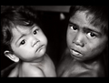
| 12/01/2008 11:49:50 PM | Bonded in Poverty : Sagkahan Slum, Philippinesby hotpastaComment: 6
ETA: I guess that 6 jumped up there when I was voting with my keyboard. Sorry for just leaving a number. Anyway, this is a very nice image and the expressions almost seem painful. Well seen and well captured. Great post-processing with a really nice tonal range. Message edited by author 2008-12-09 06:12:44. | | Photographer found comment helpful. |
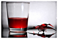
| 11/19/2008 06:44:24 PM | Life Bloodby aliquiComment: --Feedback Request--
Camera Work/Technical:Your focus is sot-on and your tones are wonderful. I really like the feel that you portray to the viewer here. The crisp image paired with the crisp reflection and imperfect background give this one a feeling of third world medicine and a struggle for life and health.
Lighting:The lighting is also one of the strengths of the image. Your background is bright, but it does not compete for the eyes attention with the subject of the image. The two highlights on the glass itself are a bit distracting, but not enough to pull from the vote I would have given it.
Composition/Content:The tight crop really adds to the tension and the 'darkness' of the image. I'm not sure if that what you were aiming for or not, but it certainly adds to the mood of the image and increases the overall interest for me. Your composition also flows very well for me. The crisp, red glass grabs my eye right away, then the leaf serves well to pull my eye through the frame and investigate what else is around. The imperfections in the background and the vignetting that you created with the foam core do a wonderful job to keep my eye within the frame, yet exploring the entire image.
My Opinion:I like the image, so my opinion is that it should have scored higher. However, its just not DPC-friendly. The voters here like pretty images that are clean, crisp and mostly unoriginal. 7 of the top 10 images are just copies of what someone else has already shot, as you will probably find to be the case with most of the challenges. I did not vote in this challenge, as I refrain from the open challenges due to the ridiculously low image sizing that DPC requires. I am sure that with a more properly sized image that this one would have done better. I like it, and I'd really like to see a better size of it. Nice work!
Eric
| | Photographer found comment helpful. |
| 11/01/2008 11:39:43 AM | Melissa all wet.by MPRPROComment: Beautiful shot, very crisp and well-composed. I like the lighting you achieved here. I hope this one makes it past that silly genitalia rule. Great work either way! | | Photographer found comment helpful. |
|
Showing 421 - 430 of ~1242 |
Home -
Challenges -
Community -
League -
Photos -
Cameras -
Lenses -
Learn -
Help -
Terms of Use -
Privacy -
Top ^
DPChallenge, and website content and design, Copyright © 2001-2025 Challenging Technologies, LLC.
All digital photo copyrights belong to the photographers and may not be used without permission.
Current Server Time: 08/12/2025 01:40:24 AM EDT.
|