|
|
|
Showing 401 - 410 of ~1231 |
| Image |
Comment |
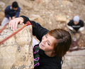
| 12/09/2008 05:24:58 AM | Birds eye viewby lukeisleyComment: Hey there from the Critique Club
Camera Work/Technical: Great depth of field, and your tones are very true-to-life. I like the blur of the leading rope line, though I would like to see a little more of it in focus. I do like that the main focal plane runs across her face, the knot in the rope, and her hand that she is using to hang onto the rock with.
Lighting: The lighting is nice and even, and you captured this one without losing any of the details in blown highlights or deep shadows.
Composition/Content: As others have already mentioned, you managed to present a very interesting point of view. I think that this is the main strength of your image, but that just wasn't enough to pull a score much higher than where this one landed. Her smile is wonderful, and I can feel the good times that all seem to be having. I would like to see this one with a wider crop, though that was probably not possible shooting with that 70-200.
My Opinion: I like the image and I think that it scored pretty close to its potential. Well-seen and nicely captured.
Thank you for the opportunity to provide a critique on your entry,
Eric
|
| 12/09/2008 05:17:13 AM | Counting Ballots - The Franken v Coleman Senatorial Recountby d56rangerComment: Hey there from the Critique Club
I think that everything that can be said about your entry has been said by other commenters. Even with the title, I'd need to be part of your area to understand exactly who was hanging on by a thread. I think that the voters scored this one in the same range that I would have had I voted on the challenge.
Thank you for the opportunity to provide a critique on your entry,
Eric
|
| 12/09/2008 05:12:47 AM | Holding Handsby SpongetoastComment: Hey there from the Critique Club
Camera Work/Technical: yospiff hit this one on the head. Your compression makes this one very hard to judge or consider the technicals of the image.
Lighting: It is backlit, but the lighting is way too harsh. The sun really washed out your image and created a very distracting lens flare.
Composition/Content: I like what's there, I just don't think that it fits well into this challenge. I know, the challenge is about lighting. Still, I'd like to see this one in a street challenge with better execution.
My Opinion: I think that the score fits, and I think that there is lots to be learned from this one. You did meet the challenge, but execution would have been much stronger. It seems like more of a snapshot that a well thought out image. I think that this capture scored about where it should have.
Thank you for the opportunity to provide a critique on your entry,
Eric
|  Photographer found comment helpful. Photographer found comment helpful. |
| 12/09/2008 05:06:09 AM | back lightingby khamaelComment: Hey there from the Critique Club
Camera Work/Technical: Unfortunately, this capture is really lacking from a technical standpoint. I do like the idea, and I LOVE naked women, but I think that the focus is a bit too hard to find. That coupled with the overly warm red tones of the image leaves this one a bit short of strong execution.
Lighting: Interesting, but just not a strength. Its really hard to say what would have helped you achieved the lighting that you were after in this one. Perhaps some fill flash, not much, then a little bit quicker of a shutter speed.
Composition/Content: I like the content, and I like the idea. I think that the composition would have fit this one well if the execution of the shot had been stronger.
My Opinion: Nice play on words, but you missed the challenge by a mile. It specifically called for an image that used lighting from behind your subject, meaning that your subject was between you and your primary lighting. Even still, I like the idea. I think that this one was scored pretty accurately.
Thank you for the opportunity to provide a critique on your entry,
Eric
|
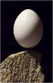
| 12/09/2008 04:57:14 AM | Rocking on Rockby GlanniComment: Hey there from the Critique Club
First of all, congratulations on your new personal best.
Camera Work/Technical: The focus seems off, but that's always hard to figure out when shooting a bright white egg.
Lighting: Your lighting is definitely the strength of the image. I really like the shadow that you captured on the egg, as well as your nicely dark background.
Composition/Content: The composition has some interest, but it really lacks the interest that it needs to hold my eye into the frame.
My Opinion: 5.75 is a generous score. I do like your lighting, and that part of the image is very nicely done. In my opinion, it was a bit of a stretch in meeting the challenge, but the voters did agree. Again, congrats on your new personal best. Now I want to see you do it again and again.
Thank you for the opportunity to provide a critique on your entry,
Eric
|
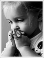
| 12/09/2008 04:50:36 AM | Always Hanging On By A Thread Of Faithby peterComment: Hey there from the Critique Club
First off, congratulations on your new personal best, and by nearly a full point. Fantastic, and well deserved.
Camera Work/Technical: Near-flawless. Your primary area of focus is directly on that left eye, and exactly where it should be. Your relatively shallow depth of field also creates a very tender feeling with the image, as well as puts the crucifix well into focus. You captured a nice tonal range although I'd like to see this one with a bit more contrast. That is more personal preference than a criticism, though.
Lighting: Your choice to light her from the side produced some terrific shadows that also serve to add to the feeling of your image. My only change would be to back you lighting off of her face just a bit more to avoid blowing that right cheek out. It blends right into her nose and is just a bit distracting to the eye.
Composition/Content: Your composition and content are both amazing for this particular capture. Images with religious tones are hard to place on here, and they seem to span the gamut of scoring. Personally, I try to avoid religion and religious discussions, and I am not a big fan of what I view as diverting from complete self-reliance. HOWEVER, this one even tugs on my heart. The contrasting of what my mind understands as reality comes close to pulling a tear out of this generally poor attitude. You took the innocence of childhood and managed to combine it with the thought that all hope has been lost. What could this child have going on in that little head to have lost all hope? Terrific image, and well scored, in my opinion. Her expression is priceless and you nailed exactly the mood your were looking for. Again, amazing.
My Opinion: Without detracting from the winners of this challenge, I like this one A LOT better than five of the images that scored ahead of you. Saying that, I think that the voters really missed this one. You were probably penalized (especially those 1s, 2s, and 3s) for including religion in your work. As I said, I am no fan of religion, but this would have surely been one of the very few 9s or 10s that I hand out. Wonderful image, and well scored. You should have ribboned in my mind. The only thing that I dislike altogether is the title. Luckily, I rarely look at the titles when voting. Given a specific challenge, I think that you should be able present a title to me without words below the image. Very, very well-done!
Thank you for the opportunity to provide a critique on your entry,
Eric
| | Photographer found comment helpful. |
| 12/09/2008 04:30:36 AM | Red Leafby BrinComment: Hey there from the Critique Club
Camera Work/Technical: Excellent focus that produced some very nice and very, very crisp lines. The color that you managed to reproduce is beautiful and remarkably vivid. I also like that the eye really only sees three colors in this one; the red, the white, and a burgundy. The technicals are the strength of this image, in my opinion.
Lighting: Wonderfully backlit! I like the fact that the light underneath the leaf almost perfectly silhouetted the veins of the leaf.
Composition/Content: Also very nice. I like the angle that you have composed this as the point of the leaf grabs the eye and pulls it right up to the stem, allowing it to roam through the color and leaf veins as it passes.
My Opinion: 5.88 seems a bit low for this one. It is a very common subject, but it was reproduced very nicely. The voters here rarely subtract for images that have been seen before, and this one was done to meet the challenge very well. Had I voted in this challenge, this would have been one of my 6s, more than likely. The voters' average overall is generally a bit more generous than the votes that I give, so I am surprised that this one didn't finish better.
Thank you for the opportunity to provide a critique on your entry,
Eric
| | Photographer found comment helpful. |
| 12/09/2008 02:55:38 AM | A Study in Backlightingby SnapperLComment: Hey there from the Critique Club
Camera Work/Technical: It's impossible for me to tell where the image focus lies, and the colors are all washed out.
Lighting: While you did indeed achieve backlighting here, it is far too harsh. The face is covered in a lens flare, and the brightness just serves to push my eyes out of the frame.
Composition/Content: I do like the mood that you captured, but the flaws are for too many for mood alone to overcome.
My Opinion: I do hate that the voters handed you a new personal worst and it makes me unhappy to add that this one was probably scored about where it should have. This entry is well below your potential and capabilities that you have proven with your previous entries.
Thank you for the opportunity to provide a critique on your entry,
Eric
| | Photographer found comment helpful. |
| 12/09/2008 02:46:38 AM | Worshipby obgynlukeComment: Hey there from the Critique Club
Camera Work/Technical: I like the crispness that you captured.
Lighting: No way is this one overexposed or too bright as some of your voters and commenters have suggested. I think that you captured exactly what you set out to capture.
Composition/Content: Nice composition, as well. The reds and greens are nicely saturated, and the petals do a wonderful job pulling my eye into the frame. The brightness pulls my eye directly to the central subjects, then the petals let me wander through the frame again.
My Opinion: I really, really like this image...I think. The current image sizes that DPC allows for the open challenges are far too small for today's technology, PERIOD. Add to that the fact that you sized this one even smaller than those poor requirements and you have a perfect formula for a poorly scoring image. I bet this one was spectacular on your screen, and I bet that it would look terrific in print as well. It is just hard to see on the size of the monitor that I use.
Thank you for the opportunity to provide a critique on your entry,
Eric
| | Photographer found comment helpful. |
| 12/09/2008 02:39:17 AM | Smirkby geinafetsComment: Hey there from the Critique Club
Camera Work/Technical: With the image at this size, it looks like your primary area of focus missed the subject's eyes. As a general rule, and believe me when I say I am not stickler for the 'rules' of photography, portraits should have the most crisp area of focus on the eyes of your subject. I really like the depth of field you created with that wide open aperture. It absolutely adds to the interest of the capture, as well as keeps the viewer's eye from wandering too far off the point of the subject.
Lighting: While I can see that this one is indeed backlit, it just takes too much time to look at the image and figure it out. Your average voter here probably spend about 5 seconds before tossing out a vote for each challenge entry, so it needs to be readily obvious that the challenge has been met. If it isn't, voters usually assume that it is a DNMC and vote it low.
Composition/Content: Fantastic composition. The tight framing added to the smirk that you captured on the face of the subject gives this one nice appeal. It makes my mind wonder what else is going on outside of the frame.
My Opinion: Unfortunately, as votes go around here, 4.33 about hits this one just right. The composition is definitely the strength of the image, but there are too many flaws for just composition alone to overcome.
Thank you for the opportunity to provide a critique on your entry,
Eric
| | Photographer found comment helpful. |
|
Showing 401 - 410 of ~1231 |
Home -
Challenges -
Community -
League -
Photos -
Cameras -
Lenses -
Learn -
Help -
Terms of Use -
Privacy -
Top ^
DPChallenge, and website content and design, Copyright © 2001-2025 Challenging Technologies, LLC.
All digital photo copyrights belong to the photographers and may not be used without permission.
Current Server Time: 08/10/2025 11:29:30 AM EDT.
|