|
|
| Image |
Comment |
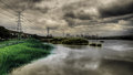
| 12/04/2009 06:44:49 AM | A Cloudy Day in Taipei Cityby DeenComment: Hey there from the Critique Club
My thoughts on the image: I absolutely love the drama you captured in the sky, as well as the balance created with the reflection in the water. While not a common presentation in landscape images, the power lines you included serve well as a line that leads me deep into the image. I agree with Jeff in that I like the left to right transition of color to monochrome. Additionally, I like the dichotomy you created with the nice green grass, a peaceful pond that is led into a busy city by a row of menacing power lines. This entry speaks a lot if one takes time to listen.
My ideas for improvement: I would have probably not have included the city in a landscape challenge, but that is strictly personal opinion. Had I voted, that may have prevented me from scoring this one well.
Where I would have/did score this entry: As I eluded to up above, I did not vote in this particular challenge. I am actually torn as to how I would have voted. If I were taking the time to study and comment on much of the challenge, this one would have pulled an 8 or 9 from me because of all it contains. Had I been storming through, handing out votes like many of us so often do, I would have most likely written it off as more of a cityscape and low balled it with a 4. Either way, I am glad I got the opportunity to critique the image and really have a chance to listen to all that is said within.
Thank you for the opportunity to provide a critique on your entry,
Eric
|  Photographer found comment helpful. Photographer found comment helpful. |
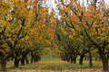
| 12/04/2009 06:36:01 AM | Autumnby Rino63Comment: Hey there from the Critique Club
My thoughts on the image: Great colors and an interesting array of textures. I like the point of view in that it provides terrific leading lines that serve well to draw me deep into the image. This does a great job pulling my eye to nearly every individual tree and leaf that I can see.
My ideas for improvement: I think pulling back on the crop would have yielded a nice improvement to the image. As it is, I do see the landscape. With more to look at, my eye would have also felt the landscape.
Where I would have/did score this entry: I did not vote on this particular challenge, but it would have most likely drawn a 5 from me. With a more open crop, I think the score would have most certainly grown.
Thank you for the opportunity to provide a critique on your entry,
Eric
| | Photographer found comment helpful. |
| 12/04/2009 06:31:58 AM | Red Barnby davidwComment: Hey there from the Critique Club
My thoughts on the image: Nice entry. The colors you captured here are an amazing strength of the image. You found a very nice balance of a rural landscape scattered with interesting area architecture. The sun and lying shadows are equally as intriguing to my wandering eye.
My ideas for improvement: I'd like to see a little more vibrance in the sky itself. There are nice pastels there, but a bit more contrast would have added a nice punch.
Where I would have/did score this entry: I did not vote in this particular challenge, but this one would have most likely pulled a 6 or 7 from me. In that fact, I do agree with the voters here. Nicely done!
Thank you for the opportunity to provide a critique on your entry,
Eric
| | Photographer found comment helpful. |
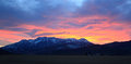
| 12/04/2009 06:25:05 AM | Fire in the skyby beekeeperComment: Hey there from the Critique Club
My thoughts on the image: I am jealous of your location. There is nothing here in Atlanta that nears the beauty of what nature has created there. The colors are amazing and the flow of the mountains beautiful.
My ideas for improvement: While I am no HDR fan, I do think that this could have benefited from a little less exposure on the sky, along with a little more exposure on the land and mountains. Not to the point of the unnatural look of the typical HDR, but just a bit of tweaking in opposite directions.
Where I would have/did score this entry: I didn't vote on this challenge, but I would have tended to agree with the voters on this one. This would have fallen into the 5 range with me.
Thank you for the opportunity to provide a critique on your entry,
Eric
|
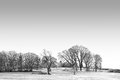
| 12/04/2009 06:20:25 AM | Chill Hillby aliquiComment: Hey there from the Critique Club
My thoughts on the image: This entry immediately brought a smile to my face as soon as it loaded. The simplicity and minimalism of the capture make it a pleasure to view. Your perpendicular lines you captured between the intersecting land and tress give my eyes a great guide to wander the frame.
My ideas for improvement: I think that the sky is just a bit overexposed and that the details look just a bit over-processed. Outside of that, there are very few things that I would have chosen to change here.
Where I would have/did score this entry: I think that the voters missed this one. I did not vote on this particular challenge, but this one would have fallen in the 6 or 7 range for me. I really, really like the minimalistic approach you took to the challenge. Well seen and well presented.
Thank you for the opportunity to provide a critique on your entry,
Eric
| | Photographer found comment helpful. |
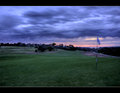
| 12/04/2009 06:10:05 AM | Dawn on the 4thby TerComment: Hey there from the Critique Club
My thoughts on the image: I am not a fan of the post-processing here. It looks like the images you used for the sky were not aligned fully, leaving a repetitive, blurry feeling to the overall image.Even with that, I do like the strength in the colors and the approaching storm you captured.
My ideas for improvement: I'd like to see the golf course area a bit more exposed and brighter. While I am not 100% sure that the overlay is off up top, I think it was. If so, it needs to be properly aligned. If am am mistaken, please accept my apology.
Where I would have/did score this entry: I did not vote on this particular challenge, but this entry would have pulled a 3 or a 4 from me. The relative darkness of the landscape itself leaves room for vast improvements.
Thank you for the opportunity to provide a critique on your entry,
Eric
| | Photographer found comment helpful. |
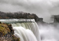
| 12/04/2009 06:03:37 AM | Niagaraby juliejoldComment: Hey there from the Critique Club
First of all, congrats on a new personal best. Its always great to see a new entry sitting there atop the previous scores! Also, nice job, and a very rare occurrence in the fact that you submitted an entry that made it all the way through without a 1, 2, OR 3 vote. Your bell curve looks funny!
My thoughts on the image: Well seen and very well presented. I love the moodiness you captured with the various tones of gray. Without the area of grass on the left, it would be hard to tell that this was not a nice black and white conversion. I am not normally a fan of soft waterfalls, as they are extremely overdone here, this one is very, very well done as evidenced by your strong finish.
My ideas for improvement: I honestly have nothing to offer here for any vast improvements. Perhaps some selective dodging and burning to add some depth and drama to the sky.
Where I would have/did score this entry: I did not vote in this particular challenge, but I would have fallen up there with your 6s or 7s depending on the strength of the overall challenge itself. Nicely done.
Thank you for the opportunity to provide a critique on your entry,
Eric
|
| 12/04/2009 05:55:15 AM | primitiveby posthumousComment: I always love the opportunity to spend time with your images. This one is no different. I agree with Steve. There is something very alive in there. It looks more heavenly and angelic to me, especially shining through brighter than the back lighting itself. I see a steamy lake, a nice mountain range, and a beautiful sunrise...all from an abstract of a paper towel. It is always a nice surprise to see how much a creation like this actually speaks to your comment givers. While the overall vote is no surprise give the average voter's expectation of a crystal clear water droplet, light refraction through wine glasses, or the weathered face of a third-world citizen, I still take delight in the fact that there are still many votes of 6 or better. I didn't vote in the challenge, but this one would have been a top pick for me. As always, Mr. Giovanni, it is a pleasure each time I run across a request for a critique from you. Thanks for the opportunity. | | Photographer found comment helpful. |
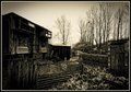
| 12/04/2009 05:46:44 AM | Rural landscape with pigeon shed.by rooumComment: Hey there from the Critique Club
My thoughts on the image: I like it, but I don't think that it fits well into the landscape challenge. The toning is nice and I really love the interest that is contained within the capture. The processing is near-perfect for the subject matter. The various textures you managed to capture truly are amazing if you give your eye time enough to explore the image.
My ideas for improvement: As far as the image as it is, there are not many areas that I would alter the shot. I like the detail you capture, and the various textures paired with the array of leading lines keep my eye moving from one interesting item to the next. I would like to see the sky with more interest and better exposed. As it is, it does compete with my eye attention with the rest of the image.
Where I would have/did score this entry: I did not vote on the entries of this challenge, but my vote would have probably fallen the range of 4. I do see the rural setting well, but I have grown to expect more land in a landscape image.
Thank you for the opportunity to provide a critique on your entry,
Eric
| | Photographer found comment helpful. |
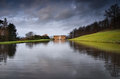
| 12/04/2009 05:37:27 AM | Chatsworth House on a moody dayby alpharichComment: Hey there from the Critique Club
My thoughts on the image: I like the leading lines you created with this composition. It serves as a terrific guide for my wandering eye. It grabs me, leads me in, thus leaves me with enough interest to explore the remainder of the image.
My ideas for improvement: I'd really, really like to see more interest in the sky. I think that even some contrast adjustment may have added enough drama to make it more appealing. I also think that I'd like to see your point of view moved either a little higher or a little lower to change the line of mountains that are behind the building. My eye wants to see those either above or below the building. It is a bit distracting running through the main focal point of the image.
Where I would have/did score this entry: I did not vote in this particular challenge, but this would have drawn a 5 from me. I do think that it fits the challenge well, and there are some nice strengths in your capture. With a more dramatic or colorful sky and a different point of view, I believe that this one could have easily grown the vote.
Thank you for the opportunity to provide a critique on your entry,
Eric
|
Home -
Challenges -
Community -
League -
Photos -
Cameras -
Lenses -
Learn -
Help -
Terms of Use -
Privacy -
Top ^
DPChallenge, and website content and design, Copyright © 2001-2025 Challenging Technologies, LLC.
All digital photo copyrights belong to the photographers and may not be used without permission.
Current Server Time: 07/30/2025 05:55:50 PM EDT.
|