|
|
|
Showing 1051 - 1060 of ~1226 |
| Image |
Comment |
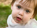
| 05/09/2006 02:27:18 AM | Fresh cut grass...YUM!by elru21Comment: Hey there from the Critique Club
This is a terrific image and grabs your attention at first glance. IT really held me for a bit with the nice composition you created. The focus is crisp and the crop you have chosen works very well in this photograph. Your catch lights are very nice, as if peering into the heart of childhood. I think that wheeledd said it best below with "Cute shot of a kid with a dirty face but nothing to lift it to the next level." This really is a great shot, but with just a little time editing, it could be one that really pulls the viewer in and hold on. Whenever I critique a photo, I usually copy it and send it to photoshop to determine what I would have done with it. With this one, I spent just a few minutes and had something that I think would have drawn a ribbon. You stated that you thought it was over-sharpened. Perhaps on the skin, but the eyes really pop with the sharpening that you have here. I darkened the midtones to 0.88 with a levels layer, made a very minor curves adjustment with an S, added a Gaussian blur layer at * pixels and 55% opacity, then made a layer mask to uncover those beautiful, sharp eyes and those red lips. I ended up with a beautifully soft photo that had amazingly crisp eyes. Everything I used is allowed in the advanced editing challenges. Don't get me wrong, you have a very nice photograph to begin with. Nor I am saying that this is the only way to edit. But with just a few minutes of editing, you'd have a top ten, I believe. I hope these suggestions and this critique help. |  Photographer found comment helpful. Photographer found comment helpful. |
| 05/08/2006 03:53:57 PM | A New Breedby trumpetwalrusComment: Hey there from the Critique Club
This is one of the most creative captures of the challenge. You did a very nice job presenting the appearance that the apples are indeed joined. I know that you've heard some of it already, but I going to echo your past comments a bit. The black dish is horribly distracting. With it simply sitting there, it probably took away a full point for most of the voters, maybe even more. Perhaps it was a shot at your last Complementary Colors challenge, including the black dish on the white background. It also looks like your camera chose the dish for the main point of focus for the image, thus leaving the apple just a touch out of focus. With the aperture set at 2.8, your depth of field is left very shallow. Judging from that and the 1/50 sec shutter speed, I assume that you were trying to compensate for low light. May try it again outside, or in a brighter room. I like the wide, rectangular composition that you created, and the colors complement each other nicely. I would have liked it a bit better if the green skin had gone up to the stem, but that wouldn't cost you any points in my voting. I think you had an excellent idea that didn't reach its full potential. The creativity is well above average, but the execution falls a bit below. As is, I'd rank it in the 3-4 range. Removing the dish and improving the focus would easily put in in the 6-7 range, in my opinion. | | Photographer found comment helpful. |
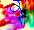
| 05/08/2006 03:09:03 PM | Painting with darkby arhunt35Comment: Hey there from the Critique Club
Wow, this is a tough one. The various colors in the photograph work very well together, but no one subject really jumps out to capture the viewer's full attention. When shooting for these challenges, you really have to consider how much time the shot will be viewed. On this site, you need a crisp image that dramatically grabs the eye right away. I believe that this one would make a terrific, wall-hanging enlargement, especially if paired with its positive image side-by-side, but its not a shot that typically does well in these challenges. It is very busy and, outside the harsh, blue line, I really can't tell where the area of focus initially was. The camera movement provide some very interesting and uniquely similar shapes. The shapes serve somewhat to move the viewer's eye around the frame, but the chopped off shape curves seem more accidental than an intentional capture. It no doubt meets the challenge, but the positive would have probably been received just as well. As was stated earlier, this is great for an abstract art piece, but lacking interest for a photograph. | | Photographer found comment helpful. |
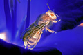
| 05/08/2006 02:42:49 PM | Bright Beeby coliwablComment: Greetings from the Critique Club
You have captured a terrific negative image here, as well as a great macro. You depth of field is perfect for this capture and I can tell that the focus is very crisp. I think that this could have been a top 20 finisher if you had composed or cropped it a bit differently. Centering the bee in the frame really gives the eye nowhere else to go. The negative yellows give a great blue hue, but the viewer really overlooks that by going straight to the brighter bee. While nature makes its own decisions, waiting for the bee to face the lens would have improved this even more. I know that this might not have even been a possibility, as these guys never follow a script for me either. Changing the composition would have also altered those distracting bright spots on either side of the frame. Shifting your shooting position from to the right a little would have gotten rid of the one on the left, gotten the bee out of the center, and possibly provided a very nice balance between your darks and lights. Great lighting and detail capture, right down to his hairy back and the antennae. Overall, I think you have a terrific idea that just wasn't executed to its potential. A nice capture that I would rate in the 5-6 range. The photo met the challenge very well. | | Photographer found comment helpful. |
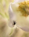
| 05/08/2006 01:05:53 PM | Emergingby cpanaiotiComment: I think that this one suffered from the focus not being crystal clear. While we can make out the head of the ant inside the flower, everything looks blurred to me. These types of shots don't typically do well on this site. Also, bringing the ants position to the left would have helped out your composition some by bring the the center of the flower more into the frame. Great eye to see such a scene, just not the best of all execution. Notice with your high scoring photographs that your focus is crisp and they have a great contrast of colors. | | Photographer found comment helpful. |
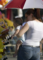
| 05/08/2006 02:38:16 AM | Parade vendors appeal to all agesby MelethiaComment: Nice photo-journalistic capture, but it really lacks any one area of interest. The kid's expression and captivation with the stuffed toy is nice, but he gets lost in the shadow. The cute mom would make an interesting subject, but her face is partially hidden. I agree that this one would also work well in a tabloid-type magazine. Crisp focus and nice exposure with the difficult lighting conditions, but some room for improvement. | | Photographer found comment helpful. |
| 05/08/2006 02:31:06 AM | Careful, I spitby KelliComment: --Trading Post Comment--
Great coloring here and excellent focus, but I think you picked a subject that is a bit too common for a free study. These are the toughest of all challenges to do well in, and I normally avoid them. This one makes me chuckle, and the composition is very nice. I still believe that it should have scored better, and well above a 5, but voters on here are hard to figure out most days. I think you'd have done better if you would have isolated the llama against the sky and left out that tree line that's centered in the frame. | | Photographer found comment helpful. |
| 05/08/2006 02:18:43 AM | Seniorby nards656Comment: --Trading Post Comment--
I got to you before the voting was over! I still like it, and think that it is a nice shot. Maybe a hair over processed, but not terrible at thus resolution. Nice lighting, and I think that the square crop serves this one well. | | Photographer found comment helpful. |
| 05/08/2006 02:14:23 AM | Light and shadowby MelethiaComment: --Trading Post Comment--
Nice capture and nice score. I think that you scored about as high as you could have with this shot and this site. Vivid colors and overdone neat image seem to do better than nice composition and striking contrast. I really like the tonal range that you captured here, as well as the contrast. Beautifly composition and crystal clear focus also work to make this a nice image. The dark and bright areas of the capture also serve to make this a well-balanced image. | | Photographer found comment helpful. |
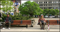
| 05/08/2006 02:10:27 AM | Two worlds - One bus stopby timfythetooComment: --Trading Post Comment--
Nice score, and I don't see anything wrong with the border. I think that the composition could have benefited from shifting a bit to the left. The gentleman on the left is a bit too close to the frame's edge for me. Terrific colors and wonderful clarity. I think that the 640 pixels allowed here really limited the score that this one could have bought. Nice work! | | Photographer found comment helpful. |
|
Showing 1051 - 1060 of ~1226 |
Home -
Challenges -
Community -
League -
Photos -
Cameras -
Lenses -
Learn -
Help -
Terms of Use -
Privacy -
Top ^
DPChallenge, and website content and design, Copyright © 2001-2025 Challenging Technologies, LLC.
All digital photo copyrights belong to the photographers and may not be used without permission.
Current Server Time: 08/05/2025 02:16:33 AM EDT.
|