| Image |
Comment |
| 05/15/2006 02:48:59 AM |
Lolitaby mannjuditComment: Hey there from the Critique Club
First off, always try to include some info about the shot in the Photographer's Comments section. It really helps out, especially when you request a critique. That said, you have the beginning of a very nice portrait here, but I am not sure how it fits into the challenge. Your depth of field use is this shots greatest strength. Very nice choice in background coloring and very nice work in blurring out beyond distraction. You lighting looks a bit flat, and her catch lights could use some enhancemnt. Great model and great colors, but meeting the challenge is one of the biggest score improvements you can do here. |
 Photographer found comment helpful. Photographer found comment helpful. |
| 05/15/2006 02:44:05 AM |
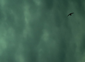
"One swallow does not make a summer."by RisingSunComment: Hey there from the Critique Club
Nice idea, and very interesting sky. I think that this one suffered because of the large amount of negative space. I do like the simple composition you accomplished, but the bird is a bit too small to hold the viewer's interest. As mentioned already, a bit more definition in the sky would help out. Keep in mind that voters look at each photo for only a short amount of time. Crisp clarity and vibrant colors help put a great deal in pulling higher scores. Nice choice and well seen. I think that this one would have done much better in a negative space type of challenge. Well sen. |
| 05/15/2006 02:40:00 AM |
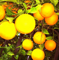
Orange in the morning is goldby lunixComment: Hey there from the Critique Club
First off, always try to include some info about the shot in the Photographer's Comments section. It really helps out, especially when you request a critique. You chose a great cliche here, and one that is out of the ordinary. As mentioned in earlier comments, the flash was much too harsh and really overexposed those oranges. You chose a nice composition and the layered oranges sever well to draw the viewer deeper and deeper into the frame. Toning that flash down a bit would have gotten this one a full point or more. I Would make suggestions on how, but I am not at all familiar with Canon equipment. |
| 05/15/2006 02:34:58 AM |
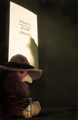
Dick: Private Cockby xianartComment: Hey there from the Critique Club
These are always tough for me to critique. You have a very creative and interesting shot here with several elements that work well to keep the viewer looking around inside the frame. It's very difficult to get a wow-type of photograph using stuffed animals or toys. Check out the recent toys challenge, and you'll see just that. While I do like your creativity here, this one just lacks that pop needed to send it to a top 10 type of photo. I am not sure that it could be done with stuffed animals. Very nice job meeting the challenge. This was a tough one that I sat out, but you met it very well. |
| Photographer found comment helpful. |
| 05/15/2006 01:41:46 AM |
Dorothy's Pixy Cousinby NeuferlandComment: Hey there from the Critique Club
Cool idea, and a nicely lit and exposed capture. There are two things that strike me as needing some attention in this shot. First, as mentioned by hideout, the pink hair ribbons really wash her face out, thus distracting from her expression. This is a biggie to watch out for when doing portrait-type work. Secondly, those chopped off elbows leave me looking to the edge of the frame, instead of at the subjects in the shot. Chopping off limbs, especially at major joints, hurts composition. It also looks like she was cutout, I think because of the dodging around her hair. Excellent choice of expression and wonderful clothing for this shot. It meets the challenge well, and, with some minor adjustments, this one would have scored a great deal better I believe. |
| Photographer found comment helpful. |
| 05/15/2006 01:31:12 AM |
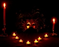
Dark Primeval Carnivalsby kari1Comment: Hey there from the Critique Club
This capture does produce the moody, cultish feel that you were after, but the lighting is lacking just a little. I think changing the position of the small candles to move them out of the frame without loosing the light would have made this one even better. Those just look out of place and take away some interest, in my opinion. You have a very nice balance using the two larger candles on either side, and those also fit the overall feel of the photo. The composition is just a little too centered for my taste, but I do like the photo overall. Great idea, and small changes would make it even better. |
| Photographer found comment helpful. |
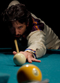
| 05/15/2006 01:22:11 AM |
Don Pedro's Cueby jdannelsComment: Hey there from the Critique Club
Great composition and depth of field use. Looking at your portfolio, you really have a knack for interesting subjects and nice composition. I like the way the balls and cue stick serve to draw the viewer up and into the eyes of the player. Nice choice of wardrobe colors to contrast nicely with the table felt. The right eye seems a bit too enhanced considering the overall shadow on that side of the face. Perhaps a small light on the floor to your right would have helped eliminate this harsh shadow a bit. I wouldn't have added a lot of light because of the mood that the lighting produces. Just enough to show a little detail would have helped a great deal. |
| Photographer found comment helpful. |
| 05/15/2006 01:11:35 AM |
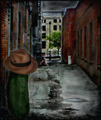
Dill Pickle Conspiracyby timfythetooComment: Hey there from the Critique Club
This is too funny. I JUST finished the trading post comment, then I pulled you again from the CC cue. How the heck does that happen?!?! In addition to what I just added, I think that the burning is a little overdone. It adds a great dirty feel to the alley, but you can really see it in the sky. Going for the 50s-60s poster, maybe desaturating is all a bit or toning it differently would have given an even older feel. Very creative, but just not my preference. |
| Photographer found comment helpful. |
| 05/15/2006 01:06:42 AM |
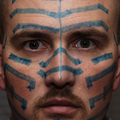
'Til I'm Blue in the Faceby nards656Comment: --Trading Post--
The lighting looks a little flat here. I do like the composition and the square crop, but I'm not sure that it fits snugly in the challenge. I do like the creativity, but I think more blue would have helped. Great focus. I hate doing self-portraits. |
| Photographer found comment helpful. |
| 05/15/2006 01:02:44 AM |
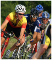
Delightfully Psychotic Cyclistsby MelethiaComment: --Trading Post--
Great sports capture, but I think that its stretching it a bit with the title. I like your composition here, and the DOF is nice. I think that this one would have done very well in a different type of challenge. |
| Photographer found comment helpful. |
Home -
Challenges -
Community -
League -
Photos -
Cameras -
Lenses -
Learn -
Help -
Terms of Use -
Privacy -
Top ^
DPChallenge, and website content and design, Copyright © 2001-2025 Challenging Technologies, LLC.
All digital photo copyrights belong to the photographers and may not be used without permission.
Current Server Time: 08/04/2025 03:34:13 PM EDT.