|
|
| Image |
Comment |
| 08/09/2008 11:37:34 PM | DSC_2414_edited-3.jpgby rcrawfordComment: IMO, with my background at risk, I have to say that the lighting is just ok.
I keep saying that there are no correct ways to light, but, there are plenty of wrong ways.
What I mean by that, is, again, photography, both still, and motion, rely on first impression.
There are many ways to get that impression, and most of the time it usually falls back on the lighting.
Here, your image looks flat to me.
It's like your key light, and your back are at the same levels of transmission. Your, f stops are similar.
If this is the case, most photographers in my industry never keep the f stops the same on a lighting set up.
Your key is where you get your base level, and normally your fill is softer, and your back is a bit hotter to give a nice edge.
Negative fill is introduced either by using dark fabric like duvatene, or using even less light on one side of the subject. this gives the nice shadows, and makes the light more interesting.
|  Photographer found comment helpful. Photographer found comment helpful. |
| 07/10/2008 11:43:19 PM | | | Photographer found comment helpful. |
| 07/10/2008 11:38:20 PM | Downtown Brisbane QLD Australiaby PompouspeteComment: Not framed in landscape, and not a landscape by traditional thought.
A way too busy snapshot of a crowd of people, all wearing hats of similar make.
You're not letting me care, what am I supposed to look at? The only thing that stands out is the 'Rendezvous' sign.
I guess I see the coincidence on the sign, and the crowd, but then, why didn't you title the image to help me know what's on your mind?
Your tonal value is just ok, the whites are there, barely, but your blacks seem to dip into the abyss.
A shoehorn like this is way too obvious, and won't make any big marks in a DPC contest.
Good luck. | | Photographer found comment helpful. |
| 07/10/2008 11:30:25 PM | Untitledby iamkmaniamComment: architectural, not landscape unless you are considering your frame, then yes, you are right.
The tonal value needs help, your whites are not there, and your blacks dip into the abyss. | | Photographer found comment helpful. |
| 07/07/2008 08:16:47 AM | Blue is the New Greenby vw8802Comment: Very underrated.
An excellent image, and one I would like to see more of from you.
Don't let DPC get you down, keep going, don't give in, do your thing.
I can't wait to see your next image. |
| 07/04/2008 12:36:15 PM | |
| 07/03/2008 11:37:10 AM | |
| 06/30/2008 09:15:01 AM | Brain Bulbby freakin_hilariousComment: I can see the water line, which takes away from your accomplishment.
Another image similar to this filled the globe with more water, taking that line away.
An above average score, but, could of been higher if it were not for that line. | | Photographer found comment helpful. |
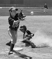
| 06/26/2008 10:53:05 PM | The Final Out by brownsmComment: Sorry, but I am on the opposite end of liking this image.
Yes, typical voting from viewers that see an image they like, but have no clue what to look for in a sports action image.
I gave a 5 in the voting, which is high for this image from me.
The thing is, there are certain guidelines to sports action photography, and very few were met here.
I hate looking at ear shots. I want to see the face.
To me this is a photo from a loving parent of their great child, but, not a great sports action photo.
| | Photographer found comment helpful. |
| 06/23/2008 01:19:37 AM | | | Photographer found comment helpful. |
Home -
Challenges -
Community -
League -
Photos -
Cameras -
Lenses -
Learn -
Help -
Terms of Use -
Privacy -
Top ^
DPChallenge, and website content and design, Copyright © 2001-2025 Challenging Technologies, LLC.
All digital photo copyrights belong to the photographers and may not be used without permission.
Current Server Time: 08/03/2025 05:51:01 AM EDT.
|