|
|
|
Showing 331 - 340 of ~1712 |
| Image |
Comment |
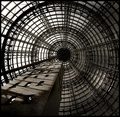
| 04/02/2007 11:45:00 AM | Ancient Computingby cdpalmaComment: an interesting idea
comp great, light barely noticeable to plane flat, nice movement, good lines, texture ok, overall a great attempt |  Photographer found comment helpful. Photographer found comment helpful. |
| 04/02/2007 11:37:25 AM | | | Photographer found comment helpful. |
| 04/02/2007 11:34:22 AM | My Dearest Langdon,by bdennyComment: A very unique image for the challenge.
comp nice, nice light effect, color ok, dof good, movement great, nice texture, a bit cluttered however, too much to absorb, overall a good attempt | | Photographer found comment helpful. |
| 03/12/2007 07:41:11 AM | Folding Chairby Man_Called_HorseComment: Description of "Furniture" challenge; We've all got it, right? The challenge is to do something creative with furniture.
Originally posted by Darth_Vader:
Very nice image but don´t think this is "to do something creative with furniture" will have done better in a different challenge - I´ll give you 5 for the overall nice image |
Originally posted by veggie:
beautifull picture. Love the texture jumping out at me, the focus, dof and colors all great
but... it does not seem to fit for this contest.. or the title could have been 'cow furniture' |
Originally posted by ecameron:
although this is a nice picture, the main focus is not of furniture and the challenge is furniture |
The challenge description DID NOT say anything about the furniture having to be the main focus. IT DID NOT say anything about how to place, focus, or block the image within the frame.
The description said to be "creative". That is all.
Therefore, those that thought the same thing as these members were actually ADDING to the description wrongly.
Originally posted by trey:
I think that this may be a bit of a stretch compositionally, but the exposure is pretty nice. |
Originally posted by HeiSch:
pretty much all the lines lead away from the chair |
Do you even know what you are talking about?
More thought to your comment would be nice so as to prove your point, and not your limitations. Message edited by author 2007-03-12 07:42:41. |
| 03/10/2007 12:20:17 PM | | | Photographer found comment helpful. |
| 03/08/2007 08:35:51 AM | After Hoursby Man_Called_HorseComment: Originally posted by xXxscarletxXx:
Could use some cool editing |
What kind of cool editing are you referring too Amy?
A comment like that that isn't backed up by examples really is a no comment to me.
It tells me that there was not a lot of thought put forth. |
| 03/02/2007 10:35:59 PM | Secureby Man_Called_HorseComment: I disagree that the guard needs more detail. He is up against a white wall. He is wearing black. The separation between the two is obvious. I Think Hank needs to calibrate his monitor. |
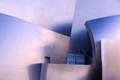
| 03/01/2007 12:12:36 AM | Walt Disney Concert Hallby FastexposureComment: AJ??
I know your style dude, it has to be you. That cheese puff look of yours.
Really nice. I truly mean it, as far as you know that it.
Keep going. | | Photographer found comment helpful. |
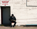
| 02/19/2007 10:29:57 PM | Boxed in by Giantsby KelliComment: What Giants? All I see is a pink and green bg.
This is a cute portrait. Lovely child. However, I am not convinced that this is a street photo. I am not saying DNMC, but, for all the image shows is that this could of been taken in the front porch of some igloo.
Good comp, nice color, nice lighting but the color temp is mixed from your flash and the tungsten light. Mixing color temp isn't nessisarilly (sp) bad, because of the imperfect world we live in. The heavy shadow under her chin is not desireable. Nice portraiture. Texture ok. No eye movement.
Keep going, try again. | | Photographer found comment helpful. |
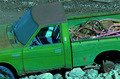
| 02/19/2007 10:23:21 PM | "HI LUX"by mangymooseComment: HI LUX huh.
I am not convinced that this is a street photograph. Even if the street was in Beirut, or Bahgdad, or even near a junk yard.
All I know is that this is an ovbiously unused green truck surrounded by broken rock.
Comp needs help, color interesting, great texture, light is ok to being just flat, no eye movement, whites need help, blacks too deep, over all I hope you can do much better.
Keep going, try again. | | Photographer found comment helpful. |
|
Showing 331 - 340 of ~1712 |
Home -
Challenges -
Community -
League -
Photos -
Cameras -
Lenses -
Learn -
Help -
Terms of Use -
Privacy -
Top ^
DPChallenge, and website content and design, Copyright © 2001-2025 Challenging Technologies, LLC.
All digital photo copyrights belong to the photographers and may not be used without permission.
Current Server Time: 08/06/2025 12:47:03 AM EDT.
|