| Image |
Comment |
| 01/14/2003 07:03:54 AM |
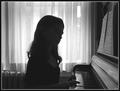
Beethoven - Piano Sonata No. 8 in C minorby mariomelComment: Greetings from the Critique Club
I have to say I really enjoy looking at the picture. I think if I made one suggestion it would be to have her face showing more detail by keeping the silhouette. I guess the easiest way to accomplish that is by have her had turned more towards the center of the piano.
There's some needless space behind the girl. Try cropping that out for a tighter look.
I think going with b&w was a good idea and I also think the lighting is almost perfect. Just the area around her head seems a bit overexposed especially the side where her face is. Great photo. Sorry it didn't do better. E-mail me if you have any questions. |
 Photographer found comment helpful. Photographer found comment helpful. |
| 01/13/2003 04:08:35 PM |
|
| Photographer found comment helpful. |
| 01/13/2003 03:56:27 PM |
|
| 01/13/2003 06:38:12 AM |
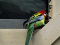
Now how do I turn this thing onby YomiComment: Greetings from the Critique Club.
I look at this photo and see a lot of potential. People didn't seem to get this. I think the reason why is that you can't really tell where this is happening. Is it in the bird's cage? Is it on a roof? I honestly can't tell. Either move the shot or location to make it clearer. Also showing a small bird next to a huge tv screen would have worked too.
With the exception of the bird the colors are very bland. I'm not sure what else you could do except move this into a studio with better lighting.
It may be my lack of photography experience so please forgive me for not giving a more detailed critique. I personally would have a shot with more of the television. If you have any questions please feel free to e-mail me. |
| Photographer found comment helpful. |
| 01/13/2003 03:58:54 AM |
|
| Photographer found comment helpful. |
| 01/09/2003 04:54:41 PM |
Puppy Litterby inspzilComment: I think this photo is hilarious. If only you had a tighter crop and a little sharper focus. That pup looks like a trouble maker. |
| Photographer found comment helpful. |
| 01/09/2003 04:47:18 PM |
|
| Photographer found comment helpful. |
| 01/08/2003 11:56:04 AM |
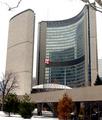
Toronto's Famous City Hallby MorganComment: Greetings from the Critique Club.
I didn't get to this photo during regular voting but I would have given it a four.
This to me is an average looking snapshot. The snow and sky are over exposed. A blue sky if possible would be better.
This photo doesn't say travel to me. If the title said something like "Famous Tourist Attraction of Toronto" it might work a little closer to the theme but that's stretching it.
Other than the Canadian Flag the colors are very bland in my opinion. I would try to avoid shooting the sky if its gray almost white like this.
I'm just an amateur photographer so I couldn't tell you how to avoid the leaning building phenomenom other than take a picture somewhere else.
Good Luck in future challenges. |
| 01/08/2003 11:45:09 AM |
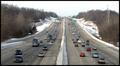
Soopahighwayby muckpondComment: Greetings from the Critique Club.
I didn't make it to this photo during voting so I didn't have an orginal vote to share with you. I'd give this a 6.
The reason, and I know its not your fault is that the colors pretty bland. Gray sky, gray road, brown trees. If possible a blue sky would have perked this one up. Maybe a night shot from this exact spot and framing would have been better. If you almost died getting this I assume you must have crossed over the railing? If not you would certainly get higher marks from me if this were a night shot on a tripod.
I like the framing of the shot. I would either leave it as it is or crop alittle from both sides to make it a tighter shot.
As long as you don't killed trying give this one another shot in Spring, Summer or Fall. |
| 01/07/2003 07:11:14 PM |
|
| Photographer found comment helpful. |
Home -
Challenges -
Community -
League -
Photos -
Cameras -
Lenses -
Learn -
Help -
Terms of Use -
Privacy -
Top ^
DPChallenge, and website content and design, Copyright © 2001-2025 Challenging Technologies, LLC.
All digital photo copyrights belong to the photographers and may not be used without permission.
Current Server Time: 07/31/2025 05:40:46 PM EDT.