| Image |
Comment |
| 01/24/2003 08:36:24 PM |
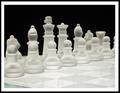
I've Seen All Good Peopleby KickDrum5150Comment: Well this is a wonderfull photo and I think the only thing that may have kept it from the top is the obscurity of the song. Who knows?
This really looks like a computer generated picture. I say that because it doesn't have depth to me. It looks very flat. The pieces seem to be stuck together and stuck to the background. I hope that makes some sense. Maybe just a hint of a back light might give more contrast between some of the pieces and seperate them from the background.
The focus seems soft but they may be due to the frosted pieces.
I think the composition is nice with good balace between light and dark.
I am no lighting or photo expert but I think there may have been a away to give this a more 3d look in my opinion.
I still think this is a fantastic picture but I always try to find ways that I might improve it. I think both us learn more that way as now I want to go and get a $9.99 glass chess set and give it a shot. Good work. |
| 01/23/2003 11:59:23 AM |
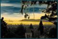
Golden Gateby GeneralEComment: Greetings from the Critique Club.
First off, what a splendid photo. I like the colors. It almost makes this place look like a different world. I think what you did here was very cool. I can understand why this photo didn't place well. I think mostly because it is different. I like the branches hanging down in the shot but whether you did it intentionally or not the outlines around them are very distracting and makes it look a little over edited.
I have never taken a photo with this technique so I can't tell you ways in improving this photo in those terms.
The composition is nice. I don't like the building in the bottom center. I don't mind the buildings and bridge furthur away but I don't like that building there. I think I would have wanted more of a seperation between the city and nature.
I found this photo difficult to critique so forgive me if its not the bext one ever. Good work and good luck in future challenges. |
 Photographer found comment helpful. Photographer found comment helpful. |
| 01/22/2003 04:09:56 PM |
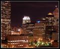
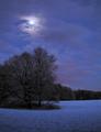
"Manned Scape"by KickDrum5150Comment: Greetings from the Critique Club.
First off. Nice title and nice photo for the challenge. People who live in cities were at a disadvantage for this challenge and I think you met the challege the best you could.
First off I like the star effect you got with some of the lights. Looking that you had a 25 sec exposure time with an f/10 suggests that a smaller aperture created the star like affect un less of course you used a star effect filter. It worked well either way. You should also consider yourself lucky to have a camera that can do low ISOs. Much to popular belief it is wiser to use a lower ISO for low light shots than a larger one. There is hardly any noise in this picture. The composition is very nice and I like how you have the tall buildings step down to the smaller one in the middle. I think the only thing I would improve with this photo is the focus. Focusing at night is very difficult if this photo were a little sharper it would be better in my eyes. Good work and good luck with future challenges. |
| 01/22/2003 03:52:16 PM |
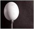
Egg Tby redfigComment: Greetings from the Critique Club.
I must say yet another fine photo from you.
I think this was a difficult challenge because part of it was to make the viewer laugh. I didn't laugh at this photo only because I don't get it. So in those regards I don't believe it met the challenge. I think this photo being taken on a tee box at a golf course with someone about to hit it would be better.
This is very clear and sharp photo. The contrast is brillant and I honestly couldn't think of a way to improve you technique. I think you choose B&W very well and I look forward to seeing more of your photos in future challenges. Other than not being all too humorous this was one of the finest shots of the week. |
| Photographer found comment helpful. |
| 01/20/2003 09:12:56 AM |
Moonlightby emorgan49Comment: Greetings from the Critique Club.
This is a great photo. It's a shame it didn't do better. There were some really beautiful pictures this week but some didn't beat this one out in my opinion.
Anyway, I think the main problem with the photo is the noise. You could use either Neatimage or Photoshop with Despeckle to smooth things out. I may be wrong but doesn't snow usually reflect a blueish hue from moonlight? I ask this because you comments mention something about not making it so blue. I think this is a very natural looking photo and I can't imagine changing it. That said there are a few ways you could try to do it. If you can adjust the white balance on the camera you could trick the camera to think that the subject it is shooting has a different light source. I don't want to go too deep into that but if you are shooting with moonlight and tell the camera that the light coming in is from a flourescent light it might change the colors a bit. That's just an example. The other way of changing the amount of blue would be to use Photoshop to adjust the curves. I'm not sure if you have Photoshop but if you do give it a shot. I took the liberty to make some adjustments to the photo. I made it less blue and removed the noise. If you'd like I can e-mail it to you. I hope this helps. |
| Photographer found comment helpful. |
| 01/20/2003 08:28:49 AM |
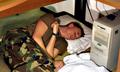
Hard Worker?by jimmyn4Comment: I got this idea from a Seinfeld episode where George slept under his desk when he worked for the Yankees. So I stole this idea. But at least I'm not the only one who took someone elses idea and twisted it to be funny. |
| 01/20/2003 08:22:00 AM |
Had Milk....by connieComment: But then I can't vote on anymore photos! This is a great photo. I would like to see this in color but the b&w is fine. |
| 01/20/2003 08:14:35 AM |
Fortifiedby crabappl3Comment: Nice picture and border. It must have been difficult to get all of these things in focus. I may have tried to get the end of the needle more in focus. The shadow from the needle on the cream box is a bit distracting along with the one on the box of oj. I think the best way to avoid that is to play with the angles of your light to minimize the shadows. i don't think you could completly avoid them but they might be less pronounced. Good work and good luck. |
| Photographer found comment helpful. |
| 01/16/2003 02:22:39 AM |
Nature at it's best ...by CreativeFlyPhotoComment: This reminds me of the old Tarzan movies I used to watch when I was a kid. I think this a great photo. I'm curious to see what this looks like in color. Good work and good luck. |
| Photographer found comment helpful. |
| 01/16/2003 02:19:11 AM |
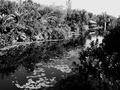
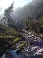
Riu Ripollby bcncrazyComment: I don't mind the lens flare too much but the upper left hand corner is over exposed. Taking the photo earlier would have helped eliminate the flare and possibly overexposed sky. The composition is very nice so I think this same photo at a different time during the day would have made this one even better. |
Home -
Challenges -
Community -
League -
Photos -
Cameras -
Lenses -
Learn -
Help -
Terms of Use -
Privacy -
Top ^
DPChallenge, and website content and design, Copyright © 2001-2025 Challenging Technologies, LLC.
All digital photo copyrights belong to the photographers and may not be used without permission.
Current Server Time: 08/02/2025 12:31:05 AM EDT.