| Image |
Comment |
| 06/14/2003 07:27:38 AM |
|
| 06/14/2003 07:26:42 AM |
|
| 06/14/2003 07:24:46 AM |
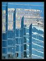
International Glass Reviewby JakComment: And I thought my magazine was a popular choice at the newstands :) I could definitely see this on the cover. great reflections. |
| 06/14/2003 07:14:29 AM |
W i R e Dby miss parkerComment: Interesting composition. The more I look at it, the more I could see it on a magazine cover. |
 Photographer found comment helpful. Photographer found comment helpful. |
| 06/14/2003 07:13:11 AM |
|
| Photographer found comment helpful. |
| 06/14/2003 07:12:35 AM |
|
| Photographer found comment helpful. |
| 06/14/2003 07:11:12 AM |
Vogueby danh669Comment: The face should be the focal point here, but it is in a bit too much shade to draw the eye immediately to it. Maybe another light source or a reflector could have helped here. It also would have removed the shadow on the hand. Pretty model. 6 |
| 06/14/2003 07:09:09 AM |
The Gardenerby JonatanComment: Interesting macro shot. I would have liked to see the focal point (I guess you'd call it a seed pod) in uniform lighting, rather than half in shade. 6 |
| Photographer found comment helpful. |
| 06/14/2003 07:07:02 AM |
Outdoor Photographerby progersctComment: The silhouette effect is damaged by the glow on the tripod. There's a bit of banding on the sky too. I think a closer crop on the photographer from a different angle, bringing in the sun and water would have looked better. |
| 06/14/2003 07:05:10 AM |
Flare (Canada's Fashion Magazine)by friscaComment: Nice composition. There's a LOT of free space for type though. Perhaps the background could have been a bit more graduated, rather than blown out all the way down. |
| Photographer found comment helpful. |
Home -
Challenges -
Community -
League -
Photos -
Cameras -
Lenses -
Learn -
Help -
Terms of Use -
Privacy -
Top ^
DPChallenge, and website content and design, Copyright © 2001-2025 Challenging Technologies, LLC.
All digital photo copyrights belong to the photographers and may not be used without permission.
Current Server Time: 08/01/2025 08:53:17 AM EDT.