| Image |
Comment |
| 09/06/2007 09:22:19 PM |
|
 Photographer found comment helpful. Photographer found comment helpful. |
| 09/06/2007 09:21:41 PM |
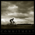
COMMITMENTby AlexSaberiComment: i don't know why I'm commenting about this because this is an awesome pic and I'm not voting on your slogan abilities!!! ha! but if you took out the word often, this would be a poster. and again- incredible image!! :0) 9 |
| 08/29/2007 02:48:16 AM |
|
| Photographer found comment helpful. |
| 07/05/2007 09:48:12 PM |
Homage to Marilynby jaggedComment: this is a gorgeous image but it seems very flat. Just a bump in contrast. Also I'd rather see the model without makeup- maybe it's the pose that seems so old fashioned or maybe now that I look again, with that makeup of the pin up girls? Red lips and fake eyelashes? anyhow, it's a great start!!! :0) |
| Photographer found comment helpful. |
| 06/14/2007 10:15:51 PM |
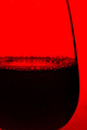
Touch of Bubblyby SomeamateurComment: *critique club*
Wow, this is a really interesting image to critique! I love the lines of the image and the high contrast of it. The reflection in the liquid is awesome too. There is a slight loss of detail in the back bubbles, not too much to complain of though.
I think this is one of those images people are just going to disagree on. There's nothing technically wrong with it, just a matter of personal taste! I'm really digging the super saturated background. Two small things I might edit are the bottom left corner is distracting, I would crop it. Also there's a white speck top left- I'd clone that out :0)
|
| Photographer found comment helpful. |
| 06/12/2007 02:24:34 AM |
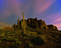
Religion in the Rockiesby ClayaComment: *Critique Club*
Wow- what a cool find! I really like the framing and the centered composition too. There's something not right about this and I'm having a hard time putting my finger on it.
The contrast is varied. In the trees you have it nailed but the mountains are losing detail. I know it's normal but with the sky having almost no gradient it seems strange...
The image is very cool toned and I'd like to see it warmer a bit. You might check it out and see if you like that too. I see that you used a mask for the interior and I think it was a bit too much- grain is starting to show in the blacks.
But really there's an overall majestic quality you've captured- it's awesome! |
| 06/12/2007 02:13:20 AM |
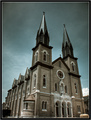
All Praise Infrared!by danheacockComment: *Critique Club* :0)
While the exposure on this is excellent and the tones lovely I find it distracting that the bottom of the church has been cut off. I don't know if it's your filter that make the towers look almost metallic but it's cool. Also the image doesn't seem sharp to me. I can never really tell if it just might need some sharpening in post processing or in camera but either way sharper would be nicer here...
This would look awesome as a metallic print!!!
|
| Photographer found comment helpful. |
| 05/30/2007 03:41:05 AM |
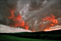
Eruption by skewsmeComment: hahhah I just spewed my drink all over at the idea of you torching your house!!!! very nice image too, aside from the spewing! :0) |
| Photographer found comment helpful. |
| 05/08/2007 01:16:07 AM |
|
| Photographer found comment helpful. |
| 04/18/2007 03:08:11 PM |
|
| Photographer found comment helpful. |
Home -
Challenges -
Community -
League -
Photos -
Cameras -
Lenses -
Learn -
Help -
Terms of Use -
Privacy -
Top ^
DPChallenge, and website content and design, Copyright © 2001-2025 Challenging Technologies, LLC.
All digital photo copyrights belong to the photographers and may not be used without permission.
Current Server Time: 09/03/2025 01:32:41 PM EDT.