| Image |
Comment |
| 10/01/2006 08:38:29 PM |
Mud and Gritby MudHutComment: Very nice but maybe lighten the face just a little so the expression can be seen on the entire face. Still great!! |
 Photographer found comment helpful. Photographer found comment helpful. |
| 10/01/2006 08:31:06 PM |
|
| Photographer found comment helpful. |
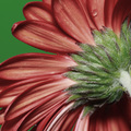
| 10/01/2006 08:29:38 PM |
SubtleBeautyby Elvis_LComment: Very nice but I dont like the green background. For such an interesting texture on the subject the background is just too stark of a difference. Of course too much texture on the background would detract from the subject... so it would be hard to find the right mix. |
| Photographer found comment helpful. |
| 10/01/2006 08:22:40 PM |
Momentby thegrandwazooComment: I cannot figure out the expressions on their faces... they dont seem to go together. That is the only things that I notice about this shot. Everything else is great; colors, lighting, blending, ect. Its a good peice of work but I think if her expression was different, maybe a happier one like his, it would be dang near perfect. |
| Photographer found comment helpful. |
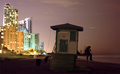
| 10/01/2006 08:20:54 PM |
Star Gazersby behindthescenesComment: Great idea, great composition, but the difference in brightness hurts it in my opinion. The contrail in the sky does as well. I would have removed that from the picture and brightened up the right hand side just a little to make up if the difference. Also the buildings look a little over exposed as the lights in the windows are starting to blossom a bit too much. Dont take this the wrong way though... I really like what you did. |
| Photographer found comment helpful. |
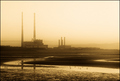
| 10/01/2006 08:18:47 PM |
Untitledby abcmorganComment: I find the birds a little distracting due to the 'smooth' colors of this shot. Everything seems to flow very well except for those little dots! I think some would say there is a bit too much exposure in the sky but I think it works well due to the diminished colors used. It is a nice shot... I just hope it was dim due to clouds and not smog! |
| Photographer found comment helpful. |
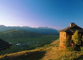
| 10/01/2006 08:17:04 PM |
Spring Creek Ranchby baco99Comment: This is a nice shot. The only thing I could say against it is the brightly lit side of the building is too much compared to the dim valley... either the house should be dimmed a little or the valley brightened a little to make the gap between them smaller in my opinion. But even still this is nice. I'd love to spend a week relaxing there!! |
| Photographer found comment helpful. |
| 10/01/2006 08:14:59 PM |
Rebecca Riggby jblaylockraynerComment: Wow, this is a very nice portrait. Too bad the dog didn't look a little more relaxed as the female subject does but I know how hard it is to control animals. But the expression on the subject is great, the colors and composition add to it... I just cannot find anything but a few minor nit-picks with this. Great!! |
| Photographer found comment helpful. |
| 10/01/2006 08:12:33 PM |
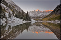
Autumn's Winterby heathenComment: Not sure if the orange tops were in the original or if you added the effect to simulate a sunset glistening off the peaks. Either way I think it stands out way too much since the rest of the picture conveys a calm serenity... |
| 10/01/2006 08:10:56 PM |
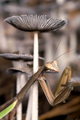
Praying Mantisby danderson107Comment: The DOF was probably your intent but I think having a little bit more of the mantis in focus would be a little better; specifically in the 'arm' area. Other than that I think this is a great shot; you have good colors, good layout (though that first shroom may be a little dominant (towering) over your subject, and I can tell you put forth a lot of effort on it. Nice work. |
| Photographer found comment helpful. |
Home -
Challenges -
Community -
League -
Photos -
Cameras -
Lenses -
Learn -
Help -
Terms of Use -
Privacy -
Top ^
DPChallenge, and website content and design, Copyright © 2001-2025 Challenging Technologies, LLC.
All digital photo copyrights belong to the photographers and may not be used without permission.
Current Server Time: 08/04/2025 06:53:19 PM EDT.