|
|
|
Showing 831 - 840 of ~3109 |
| Image |
Comment |
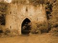
| 06/05/2003 02:17:07 PM | Castleby trishComment: Greetings from the Critique Club
By Inspzil (who entered a photo for duotone called "the castle")
Composition - The composition of this photo really needs something to make us see this differently. It is not a compelling enough subject where a head on, straight up view of it is going to awe me into giving you a 10. I think this needs something to show some perspective in this photo, even if it leads us to believe things that aren't true. For instance, taking the shot from extremely close looking up, so we think the castle is quite tall, when in fact, it's more like "castle Jr."
Technical - I'm having a problem judging the horizon on this pic. It looks fairly level when I look at it, but every time I go back, I doubt that it is level and I still can't decide what way its off. The landscape doesn't help that perception at all either. I feel however that the building is actually photographed on a pretty level plane. I also think that this is a little bit too brown. I'd have liked to seen the brown a little less saturated.
Overall - Not a bad picture, and I think it was scored fairly. It's a worthy subject, but you need to give it something besides this very straightforward angle. Well I hope this might have some impact on the future pictures you take.
Take care and best of luck - Bob |
| 06/02/2003 02:25:59 PM | Silouette des ustensilesby orussellComment: O - I admit I'm one of the ones who marked down for originality in this challenge. I think if you could've done something a little different with the lighting on this one, It would've helped. And its not at all because I think the lighting is bad on this one, just maybe not had it the same across the whole picture. I picture this in my head with the bright light in the middle and substantially darker on both sides, like putting some kind of "v" directly behind the vase so that the light on both sides of it was diverted, so it wasn't quite so intense. Maybe if you could've made it where it looked like the light was coming OUT of the vase it would've done more for me. Just thoughts though. Its really a solid picture as is. Bob |  Photographer found comment helpful. Photographer found comment helpful. |
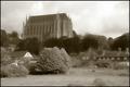
| 06/01/2003 07:57:31 AM | Lancing collageby marboComment: Very nice architecture. THe sky is a little ominous, it would be cooler if it was darker. Nice job keeping everything in this picture focued. It wouldn't look right if something was out of focus here. A shallow DOF would've left the foreground blurry as heck and that's never good. I don't really like the houses in front too much. I think it would've been more effective to just get the big building. If the big building were up a little higher and looked more menacing, then I think it would be good to have the couple houses there so show relative size. - Bob | | Photographer found comment helpful. |
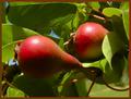
| 06/01/2003 12:37:47 AM | Natural Red and Green (baby pears)by sherryk471Comment: Greetings from the Critique Club
By Inspzil
Composition - 2 small pears in a tree. I can't say I've paid too much attention to baby pears before. Around here we seem to have more green ones than red. The framing of this shot is pretty good. I think if the pears were not as close on the vertical plane it would've strengthened the shot by taking out a little of the green and making the part we viewers focus on a little broader. Usually I find myself saying the opposite, but each pic is different. The photo has a nice balance to it. The colors if they were a little more equally distributed would contribute to that. The green is a little overpowering.
Technical - This needs to be focused better, and that's the bottom line. The rest of the pic would've scored reasonably well but it's just not as focused (or focused in the right spots) as I think it should've been. The exposure is pretty good and as a result, that helps the color of this photo.
Overall - A pair of predictable complimetary colors. This just wasn't executed to maximize the potential of the subject. I think the composition is adequate, but not outstanding. Maybe it would've been a little better to alter the angle a little to achieve a more unique perspective on these 2. I think that would help a lot the more I think about it. Hope this could be of some use to you. Good luck and keep shooting - Bob |
| 06/01/2003 12:28:50 AM | In Low Earth Orbitby magnusComment: Greetings from the Critique Club
By Inspzil
Composition - A pink tulip! wow I can't say I've ever seen one of these. My last submission for primary colors was 2 tulips, of mixed colors. I had red and white ones in my backyard, but not pink! I think this one had just a little too much breathing room. I'd have cut some off the left side. I think it might have been a better option if the picture was just a shade crisper. I'm not so sure pink and green count as complimentary colors, but for the sake of argument, we'll say they are. Conceptually it is very good and this is a good flower for it...Nice straight stem.
Technical - Just a pinch off on the focus. That little bit matters a lot in macros though. That's obvious though, I'm sure I'm not telling you anything there. Maybe a tripod was in order for this shot. The exposure is right on and the DOF is great with it being so shallow. The colors all look nice and bright and there's no obvious oversharpening or saturation. It's all in the focus that I find any problems.
Overall - After thinking about the crop, you did the right thing. IF this were pin sharp, then I think it would've been in your best interest to crop it a little tighter. Since it isn't, I think you're best off as it is. Its a good shot, and works conceptually, but it just wasn't pulled off as clear and clean as it could've been. Best of luck - Bob | | Photographer found comment helpful. |
| 05/30/2003 10:08:28 PM | Floating Flameby TerryGeeComment: Greetings from the Critique Club
By Inspzil
Composition - This is a very nice photo. It is a worthy candidate for this challenge. I think the only thing I see right off the bat that I would change about it is that I wouldn't have cropped/taken the photo so tight to the flame. I'd have left a little more there. I think if you pulled back a little from the candle you'd have saturated the water just a little more naturally, without PS. I think the shadow in the water is really great. Nice work there.
Technical - A superior photo, no doubt. The colors are jumping out at we viewer types as they should be in this type of photo. The focus is just great too. A real clear well taken photo. If you did some PS to it, it doesn't show at all, which is a great sign. good work in portraying this shot this well.
Overall - Its a quality photograph all the way around. The only suggestion I can give is the one I gave earlier, to give the candle a little breathing room. Other than that, I couldn't have done it any better. Great work. - Inspzil |
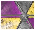
| 05/30/2003 10:03:15 PM | Color Wheelby greenem2Comment: Greetings from the Critique Club
By Inspzil
Composition - This was not a terrific capture. This was a good job by the photographer to make the picture as good as it is. I think you really maximized what you could get out of this subject. The colors are worn, tattered, and I believe that gives them some character and makes it not so posed and pretty. This is more real and that's well portrayed in your photo. You made this shot with the framing of the shot IMO. Kudos for that! It meets the challenge very nicely too.
Technical - This really isn't a tough shot to take by any means. I am curious to know if you took it like this or cropped it to achieve this framing. Exposure is excellent as is the focus. Real nice work.
Overall - I think its a good shot. The subject doesn't really allow anything too exceptional, but this is as well photographed as I think it could be deserted and still. Excellent framing makes this shot as good as it is. Nice work. Good luck in future challenges. - Inspzil | | Photographer found comment helpful. |
| 05/30/2003 09:47:31 PM | Horsepowerby willtataComment: This is probably in my top 3 favorites of DPC. This is an outstanding shot in every facet of it. My sentiments mirror that of emorgan49. I don't think there is a flaw to this picture, it's THAT good. I loved it when I voted on it and I still do. Exceptional shot. I hope someday I will take a shot this good. Great work! |
| 05/30/2003 02:54:54 PM | Home Wallby tyrkinnComment: This is a pretty weird photo if you don't mind me saying so. I like the painting, but the photo involves more than that. I like the bright spot on the wall and the use of negative space to really accentuate the painting. We are forced to look at it. My feeling is that it will not do very well, but I think its better than average. I really think you made the most of this bit of wall and the painting. Good job | | Photographer found comment helpful. |
| 05/30/2003 02:52:24 PM | | | Photographer found comment helpful. |
|
Showing 831 - 840 of ~3109 |
Home -
Challenges -
Community -
League -
Photos -
Cameras -
Lenses -
Learn -
Help -
Terms of Use -
Privacy -
Top ^
DPChallenge, and website content and design, Copyright © 2001-2025 Challenging Technologies, LLC.
All digital photo copyrights belong to the photographers and may not be used without permission.
Current Server Time: 08/17/2025 11:13:00 PM EDT.
|