| Image |
Comment |
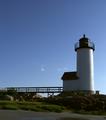
| 06/22/2003 08:54:05 AM |
Annisquam Harbor Lighthouseby KarenBComment: This photo needs to be quite a bit sharper. Its a little underexposed but you wouldn't want to go too far with it or you'd lose this nice blue sky. A couple of wispy clouds would've been a good addition though. Good idea, just a soft picture where it should've been sharper. |
 Photographer found comment helpful. Photographer found comment helpful. |
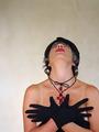
| 06/22/2003 08:52:23 AM |
Nine PMby amonteforteComment: Stunning how sharp this photo is. Wish the model was looking somewhere near the camera. excellent light, exposure, framing. 9 |
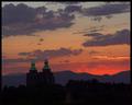
| 06/22/2003 08:50:34 AM |
Sacred Spaceby dsidwellComment: Great composition. Love the building. Great color, love the sky on this one. Well framed too. Looks oversharpened though is my only problem with this one. |
| Photographer found comment helpful. |
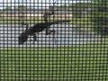
| 06/22/2003 08:49:21 AM |
I'm Still Hereby togtogComment: Something needs to be in focus in this picture. I would venture to say that it should be the lizard. |
| Photographer found comment helpful. |
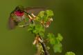
| 06/22/2003 08:47:14 AM |
The Flight of the Humming Birdby paganiniComment: This was a valiant effort. I don't think it worked out as well as you hoped though. The focus is pretty soft. The subject looks oversharpened and the whole pic looks oversaturated. I'm seeing pixelation in the greens on the bottom Left corner. I really wish this would've worked out a little better for you. |
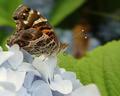
| 06/22/2003 08:43:44 AM |
Butterfly Raspberryby shareinncComment: I wouldn't have put this guys head dead center in the middle of the frame for this challenge, but I'm not going to count that against you. Nice detail in the butterfly. If this wasn't the off-center challenge, I'd have cut some of the leaf off. DOF is just a little too shallow for this pic. Needs just a little more to bring the back wing into semifocus. Overall nice pic |
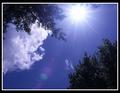
| 06/22/2003 08:40:21 AM |
Bright SUnny Dayby CreativeFlyPhotoComment: Great sky color. Hate the sunflares. Nothing personal, just never liked them. I don't like the way the trees have the little highlight sparkles on them. Makes them look plastic. I do however think the framing is very good with the trees on the corners and the clouds on one side. I like the asymmetry to this pic. Good work |
| Photographer found comment helpful. |
| 06/22/2003 08:38:19 AM |
Cloud fanby ewebComment: Interesting illusion. I think the framing could've been better to not have so much dead area at the top of the frame. Not a lot either... I think trimming this to 1.5:1 aspect would've done the job. The focus could've been just a little better. The greyscale is interesting. Great idea. |
| Photographer found comment helpful. |
| 06/22/2003 08:35:23 AM |
DOCutivityby TarbiniComment: Greetings from the Critique Club
By Inspzil
Looks like a Savin
Composition - Nice and colorful. I think there are a few dead spots though where there are no buttons. I was thinking maybe taking this from the number side would've worked out a little better. What do I know though? You do have a better array of colors from this end, and they are brighter.
Technical - With only a very small area of this actually in focus, and part of that area not having anything there, it might've given the illusion that more of it was in focus if some of the number buttons were in focus. Good use of shallow DOF, but maybe just a little too shallow. I think at f5.6 or so you could've put the whole green button in focus, considering you had the light to do this, and/or a tripod because handholding at 1/30 sec or 1/15 sec is definitely tough to pull off.
Overall - For what it is, I think you pulled off a pretty good pic. A little greater DOF to show more of the "start" button in focus I think is the only thing that would've made much of a difference to this pic. Nice work. Good luck in future challenges - Bob |
| Photographer found comment helpful. |
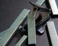
| 06/22/2003 08:25:26 AM |
Predator and Preyby shareinncComment: Greetings from the Critique Club
By Inspzil
Composition - I think your staple puller does look like something predatory - a saber tooth staple puller. I like the general idea. But I think I would've shredded some of the staples to make it look like scraps left at a kill site. Maybe broken the one it's biting too. The concept is pretty good. Needs just that little bit of refining. Maybe break a couple of them smaller so they look like staple offspring. A less reflective background might have helped too.
Technical - You need more light so you can stop up to F-8 or so. That would provide you with focus on more of the frame. The focus here is just a touch soft too. It could use just a little more focus. The exposure is good as it is. The goal is to get this exposure, but with the F-stop set much higher.
Overall - I think with minor adjustments, you could've maximized the potential of this picture. I don't think it's a bad shot. The biggest factor for why this rated where it did is focus. If it was pin sharp, it would've done better. My personal opinion on it is look at it in ACDSee (if you have it. If you don't, get it!) I generally look thru all my images at "fit to screen" size. When I see a pic that I might use, I blow it up to 70%. If it is sharp at 70%, then I will consider using it. If not, then go on to the next one. When I resize, I always hit sharpen one time in PS. With the background you used, that might not work as it will make it look sparkley. There's you nickels worth of free advice. Forgive me if I left any hanging prepositons - Good luck in future challenges - Bob |
Home -
Challenges -
Community -
League -
Photos -
Cameras -
Lenses -
Learn -
Help -
Terms of Use -
Privacy -
Top ^
DPChallenge, and website content and design, Copyright © 2001-2025 Challenging Technologies, LLC.
All digital photo copyrights belong to the photographers and may not be used without permission.
Current Server Time: 08/16/2025 02:53:07 PM EDT.