| Image |
Comment |
| 07/19/2004 08:01:05 AM |
Revelationby HRoxasComment: Just play these number for powerball or megamillions and you could have a fortune.... |
 Photographer found comment helpful. Photographer found comment helpful. |
| 07/19/2004 07:31:30 AM |
Nothin To Sayby surajbharComment: Even if this doesn't meet the challenge, its still a good photo. Very emotive shot. |
| 05/11/2004 07:48:24 AM |
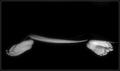
Tulipby Dav3dukComment: Greetings from the Critique Club
By Inspzil who is knocking the rust from the critiquing pencil
Composition - Generally I like the composition of this shot. I would have like to seen the black area just a bit higher and a bit more to the left. The water drops are a nice touch. The colors are nice and vibrant. There are a couple of things about this shot that are just too "normal" I guess. Sometimes the angle of macro shots makes the shot as much as the subject. This is by no means saying that you're taking this at a bad angle, but its not anything fresh. I'm not a huge fan of flower macros, however I have taken some and seen a substantial lot of them. There are 2 kinds of flower macros in my book - There are the very unique revolutionary "I can't believe that's a flower" kind and then all the rest. Unfortunately yours is pretty good, but since it isn't anything groundbreaking, it gets shoved into the other category. Nothing personal, that's just the way it is :( Without your explanation in the comments, this made no sense to me for this category. I can understand why it didn't do as well as I'm sure you hoped.
Technical - The image is a little overexposed for my tastes. A little less exposure and/or dropping the ISO to 100 would've saturated the colors a little more and made it even a little more vibrant. In my opinion, you had enough light to be able to comfortably do that. The other alternative would be to close the aperture a little to lessen the exposure and also bring a little more focus to the outer regions of the photo. I think I would've done a little post-editing to increase the contrast a little more. You get more pop that way IMO. I'm not impressed by something that is unedited when there are ways that the picture could be improved simply. You could've done a little cropping to move the black spot more central and a little to the left by cutting some off the top and the right side.
Overall - I think your score is low for this image. I'm sure I've had lesser images that have scored better than this. Part of that is the flower macro bias that goes on (which I don't doubt that I also exercise from time to time). But key points to me were framing - exposure - contrast. There is nothing wrong with the general composition of this shot, but in the same breath, there is nothing outstanding about it either. Best of Luck to you - Bob |
| 03/28/2004 12:24:36 PM |
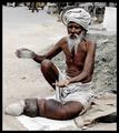
80 years youngby camelotnorthComment: Greetings from the Critique Club
By Inspzil
Composition - Not a bad idea for a portrait. I think it needs a little polishing. This is just a little too informal for my tastes. I prefer backgrounds and light that I have more control over. Sometimes these portraits are some of the best, unfortunately not this one. The biggest thing to me is that with all the details and lines of interest in the face of your subject, you've lost a lot of that with the lighting. A little underexposure here would add a lot of interest. There is a lot to be done with shadows and also greyscaling that can really make a portrait of an older person pop with a very intimate, often emotive tone. Clothing is also something I'm looking at. I'm not thinking she dressed special for this portrait.
Technical - The lighting is very flat on this one, to the point that I would have thought you used the flash if you didn't say anything about it in the comments. Of all the things that I can see in this picture that I like and don't like, that was the very first thing that came to my attention. You might have considered a lower camera angle as well. I think I'd have greyscaled this and maybe even added a little grain for effect. But what do I know?
Overall - Too many unpolished edges to this one. The clothes, the background, the lighting, these things all weigh pretty heavy with this one. I find that it would be hard to do a flattering portrait of this person, but an interesting or intriguing portrait is there to be had. Good luck in future challenges. - Bob |
| Photographer found comment helpful. |
| 02/26/2004 05:24:05 AM |
Keep Staringby MichelleSComment: THe skin looks a little yellow. Also I'd crop some of the black off the right side to make the whole thing a little better which would also draw a little more attention to the gash. |
| 02/26/2004 05:21:23 AM |
I've had enough!!by BukiosComment: I don't know about the conflict part but this is a damn good picture. I could definitely see it on the wall or on a calendar somewhere. I don't think it suits this challenge really well, but enough to where I'm not going to give it a bad score. 7 |
| Photographer found comment helpful. |
| 02/26/2004 05:05:25 AM |
Distraught over conflictby ijerryComment: This has the potential to be the one of the best pictures of this challenge. The biggest knock on it is that the focus is off. Its something that is rarely allowable, and in this case, it doesn't work for me. The theme of the photo is great and so is the mood created by the lighting. Just a little clearer and I think you would've put yourself toward the top with this photo. Well conceived just not executed quite to perfection. 7 |
| 02/26/2004 05:02:17 AM |
Never go to bed mad by kosmikkreeperComment: Good theme, great idea and very well done. Most creative photo of the challenge at this point and well portrayed to boot. Nice job 9 |
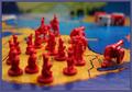
| 02/26/2004 05:00:14 AM |
risky businessby ScantyNebulaComment: I don't see the advantage of going with this shallow DOF. Especially not using this angle for the photo. I think it would be more successful in a portrait format with the cannon pointng up. Also with a little more room in front of the cannon. Then, put the focus on the cannon thus deemphasizing the focus on the troops. |
| Photographer found comment helpful. |
| 02/26/2004 04:57:28 AM |
|
| Photographer found comment helpful. |
Home -
Challenges -
Community -
League -
Photos -
Cameras -
Lenses -
Learn -
Help -
Terms of Use -
Privacy -
Top ^
DPChallenge, and website content and design, Copyright © 2001-2025 Challenging Technologies, LLC.
All digital photo copyrights belong to the photographers and may not be used without permission.
Current Server Time: 07/31/2025 03:35:01 PM EDT.