| Image |
Comment |
| 08/23/2003 11:30:05 PM |
Mt Rainierby timj351Comment: The bottom part is really cool. I think you have too much space on top and also the sky seems to be banding or pixelating, or both. Oversaturated? Maybe... Good luck. Good shot. |
| 08/23/2003 05:24:27 AM |
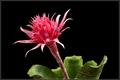
Bromeliadby DennisFComment: Stunning colors. Nice crisp clear photo. Very well done indeed 9 |
 Photographer found comment helpful. Photographer found comment helpful. |
| 08/23/2003 05:23:05 AM |
Foxglove teardropby dasserComment: I don't think the background is very good for this photo. I think that it's pretty good, but could really move up a couple notches if the background were less busy. |
| 08/23/2003 05:21:42 AM |
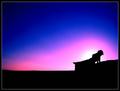
Inner Strengthby BobsterLobsterComment: You might've gotten just a little closer to the subject on this one to show a little more detail. This is excellent. The blue part of the sky is great. The pink part is great. The part where they come together is banding somewhat. very well done - 9 |
| Photographer found comment helpful. |
| 08/23/2003 05:18:55 AM |
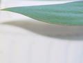
Magic Carpet Rideby channeledComment: I think this would've been a more effective picture with he leaf at the bottom of the frame in lieu of the top. |
| 08/23/2003 05:18:16 AM |
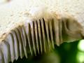
Space Betweenby patriciabrown2001Comment: This looks like a mushroom to me. I'm not real sure I'd qualify this one into the negative space realm. Not a bad photo though. |
| Photographer found comment helpful. |
| 08/23/2003 05:17:03 AM |
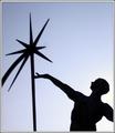
icarusby SeanachaiComment: This just seems a little too soft for my tastes. I like the idea. I wish the blue sky were a little bluer too. |
| Photographer found comment helpful. |
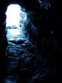
| 08/23/2003 05:14:53 AM |
Light At The End Of The Tunnelby JaxsonComment: Good use of overexposure to make a lot of contrast on this one. I'm not wild about the picture overall, but I can really appreciate what you set out to do with this shot. |
| Photographer found comment helpful. |
| 08/23/2003 05:10:54 AM |
Chaosby johnnykillchristComment: This is not-so-negative-space. There is way too much going on here. It would be a pretty cool abstract though with the right crop. |
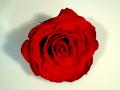
| 08/23/2003 05:09:32 AM |
Rose in milkby IvarComment: Too centered for this challenge. I don't think negative space was used correctly here IMO. There isn't much of it and what there is isn't effective. |
| Photographer found comment helpful. |
Home -
Challenges -
Community -
League -
Photos -
Cameras -
Lenses -
Learn -
Help -
Terms of Use -
Privacy -
Top ^
DPChallenge, and website content and design, Copyright © 2001-2025 Challenging Technologies, LLC.
All digital photo copyrights belong to the photographers and may not be used without permission.
Current Server Time: 08/14/2025 08:13:25 AM EDT.