| Image |
Comment |
| 09/06/2003 04:15:08 PM |
Neoclassicalby magnetic9999Comment: Think I've seen a picture very very similar to this one. But this one is also very good. Nice work. 8 |
 Photographer found comment helpful. Photographer found comment helpful. |
| 09/06/2003 04:14:12 PM |
Smile!by joannadivaComment: This is really grainy. The colors are not represented nearly as well as they should be. Don't think this is a very good interpretation of repetition either. |
| Photographer found comment helpful. |
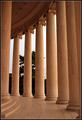
| 09/06/2003 04:12:42 PM |
Pillars of eternityby YomiComment: The shadows are a killer on this one. If the emphasis wasn't so much on the repetition end, it would've been a little better. I think this just would've been a better picture if the pillars were all one solid color. |
| Photographer found comment helpful. |
| 09/06/2003 04:10:03 PM |
Natural Fractalsby tomlewis1980Comment: Too much background stuff. Plain black would suit it much better. Nice color to the fern. Too bad about the flies being there too. Not a huge distraction, but not helping anything either. |
| Photographer found comment helpful. |
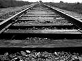
| 09/06/2003 04:08:48 PM |
Railroad Tracksby silverleafComment: Wow. I have a shot that is damn near identical to this one. I had to look really close at this one. It is slightly different though. SLIGHTLY. So you must have good taste :) Not a bad shot. |
| Photographer found comment helpful. |
| 09/06/2003 04:07:04 PM |
The rhythm of my homeby johnmkComment: Good colors. Too bad the weather wasn't a bit more cooperative. I think the photo could be a little sharper too. |
| Photographer found comment helpful. |
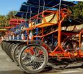
| 09/06/2003 11:13:34 AM |
Surrey, Surreyby JeileenComment: This photo lacks clarity. Either everything is slightly out of focus, or after resizing you need to sharpen it one time to restore the clarity. |
| Photographer found comment helpful. |
| 09/06/2003 08:53:24 AM |
self portrait 2by photogooComment: Cool overexposure use on this shot. I think the only thing I would change about it is make the fingernails as perfectly pigmented as the lips. If they were just a bit longer and really red, that would really make this picture that much cooler. It already is a cool picture though. I bet it would make a cool poster. |
| 09/05/2003 05:22:08 AM |
The Cow Parade in Atlantaby giseleComment: Greetings from the Critique Club
By Inspzil
Composition - Subject wise, I don't see how this is meeting the challenge. I'm thinking of these things more like characters than monuments. But I think that's really secondary here. I don't really understand this interpretation though as a picture on the whole. I find the background to be very busy. I think this would've been a good picture to take the ants perspective and shoot straight up on this one. The sky looks like a good fitting background for this. I think that the angle is a little odd too that this picture was taken with. I'm not really understanding that either. It doesn't really seem to accomplish anything except make the photo a little different than the norm, but I can't say its for the better necessarily. It is however, at a considerable enough angle that we can tell its on purpose and not just a little mistake on your part.
Technical - This isn't a badly taken pic. The colors are pretty good and its very clear. With that much camera, it really shouldn't have too many technical problems. I'm not sure how the original looks compared to the final image, but this seems okay.
Overall - I just flat out don't get this picture. I'm not seeing how its relating to the challenge topic and the angle is throwing me for a bit of a loop too. I'm not particularly fond of this picture for these reasons. Good luck, take care - Bob |
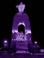
| 08/31/2003 08:23:54 AM |
WWII Monument in Ottawaby kosmikkreeperComment: This photo needs to be so much bigger. There is a ton of details that just can't be seen. The blue cast is a nice touch. This is a good picture, but at this size, which I'm sure is the legal maximum, it seems that the really interesting detailed parts are just too small. Maybe it'd be possible to just concentrate on the bottom guys in the monument. It looks like a pretty cool tribute to the fighting men of wwII |
| Photographer found comment helpful. |
Home -
Challenges -
Community -
League -
Photos -
Cameras -
Lenses -
Learn -
Help -
Terms of Use -
Privacy -
Top ^
DPChallenge, and website content and design, Copyright © 2001-2025 Challenging Technologies, LLC.
All digital photo copyrights belong to the photographers and may not be used without permission.
Current Server Time: 08/14/2025 08:13:22 AM EDT.