| Image |
Comment |
| 11/04/2002 05:32:00 AM |
Familiarby hedonistComment: Good macro shot. I like the color effect on the eye. Gives it something different. I'm not sure I would've framed the shot like this though. - Inspzil |
| 11/04/2002 05:35:00 AM |
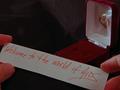
Not What She Was Expectingby karmatComment: Could this have been more effective with the hands of a woman, being a little more consistent with the title? Good image though - Inspzil |
 Photographer found comment helpful. Photographer found comment helpful. |
| 11/09/2002 05:43:00 AM |
The Monster, the Myth, the Legendby sg10Comment: The photo is pretty good. I'm not so sure about subject or relevance to topic, but I haven't been paying much attention to that all week, WHY START NOW? Good pic. Colors might be a bit oversat. - Inspzil |
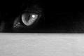
| 11/04/2002 04:56:00 AM |
Don't cross my pathby zadoreComment: This is a well taken photo. I'm not sure I like the composition. If the focus was just on the eye why use the foreground "cover" to hide the rest of the cat. It looks dark enough where if the background were dark, we wouldn't be able to see him anyway. The negative space in the shot would be accenting the eye much more than the distracting table or whatever it is. IMO - Inspzil |
| Photographer found comment helpful. |
| 11/07/2002 09:15:00 AM |
Crossedby crabappl3Comment: I like the mood set with the red tones of this picture. The overall composition though I don't feel is that strong. If it were me, I would've included the whole hand and 3/4 of the face vs 1/2. Maybe given it a little more exposure time too. - Good Luck! - Inspzil |
| Photographer found comment helpful. |
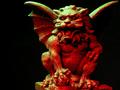
| 11/10/2002 08:19:00 AM |
Guardian Gargoyleby digitalArtComment: Cool statue. I think he could've used a little more light. This is pretty darn close though. I might have also not taken the pic quite so close. - Inspzil |
| 11/08/2002 07:52:00 AM |
The Deadby mjcecilComment: I don't know what kind of superstition this is, but it's cool. So you'll have to take a 7, like it or not - Inspzil |
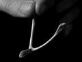
| 11/08/2002 07:33:00 AM |
Make a wishby ParentxComment: I really like the idea. The picture is pretty well taken. I like the choice of B&W for this shot. Nice job - Inspzil |
| 11/05/2002 11:10:00 PM |
Over Your Shoulderby gradbertComment: Those look like some large grains of salt. Maybe it's just the perspective, or the region from whence you come. - Inspzil |
| 11/08/2002 06:46:00 AM |
Take me to your leader!by jenaromComment: The loss of focus in the foreground is really detrimental to this shot. The idea is pretty good and the way the lighting is, it gives this piece a little believablity. The picture should've had the blurry areas cropped out . This would've brought a little more attention to the subject and been far less distracting - Inspzil |
| Photographer found comment helpful. |
Home -
Challenges -
Community -
League -
Photos -
Cameras -
Lenses -
Learn -
Help -
Terms of Use -
Privacy -
Top ^
DPChallenge, and website content and design, Copyright © 2001-2025 Challenging Technologies, LLC.
All digital photo copyrights belong to the photographers and may not be used without permission.
Current Server Time: 08/11/2025 10:33:42 AM EDT.