| Image |
Comment |
| 01/25/2004 08:45:05 AM |
In the dawnby alexvoloComment: Nice warm colors. Too bad that sign is in the way it'd be a ...... oh wait, that's what this is all about. All kidding aside, its a nice warm picture. Looks like the sun is coming up and its gonna be a great day. Good luck |
| 01/25/2004 08:37:05 AM |
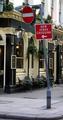
Zebra Crossingby ChiquiComment: I didn't realize they liked to shop to the point they meritted their own sign to cross the streets. I enjoy this shot, although photographically I don't see much that I like. It can be funny still without being Ansel Adams-ish. Good Luck |
| 01/25/2004 08:33:55 AM |
The Green Man (Trafficlight)by terjeComment: Very creative. I really like this. Maybe it isn't the hardest photograph or the prettiest one, but I like it, especially for this rotten challenge. 8 |
 Photographer found comment helpful. Photographer found comment helpful. |
| 01/25/2004 08:29:28 AM |
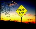
Dead Endby pitsamanComment: This doesn't do much for me in any real creative ways, but technically everything is pretty sound and the colors are gorgeous. 7 |
| Photographer found comment helpful. |
| 01/25/2004 12:42:00 AM |
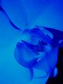
Neon Orchidby cdm36Comment: Greetings from the Critique Club
By Inspzil
Composition - Wonderful macro of this flower. I personally do not see any tie to the challenge whatsoever. I think part of this challenge had to do with dark. This photo could've been shot at noon outside with a black background and no one would know. It's not that its a bad shot, but it just doesn't seem an appropriate subject for the challenge given. As far as the picture goes, I might have considered leaving no background showing at all.
Technical - The focus and color are awesome. The thing that bothers me about this is that it looks so flat. There isn't much depth to it where I think we expect that in a macro this close. My hat's off to you getting this focused this well. It looks like you might have a hot pixel near the middle of the picture. The little white sparkles across the top in the flower are also mildly detracting. It is an unusual perspective with the darker sections of the flower in the foreground and the more brightly lit areas in the background. I wouldn't say its bad altogether, just not what people expect. That can be good too though.
Overall - Nice picture, but not right for this challenge. I think pretty much that explains why it didn't do as well as it could've in a different challenge. Its a good shot. Good luck in future challenges - Bob
|
| 01/25/2004 12:24:55 AM |
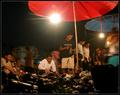
Every Thursday Night, In My Neighborhoodby librodoComment: Greetings from the Critique Club
By Inspzil
Composition - I didn't know what the stuff in front was, so this photo when I saw it during voting it didn't make any sense. I understand it a little more now, but I think that it might've been a little more conducive to show the foreground stuff a little more. The lens flares on this just dominate this image too much. Having some of the people moving seems a little odd too. I'd prefer to see them clear. If you were going to blur some of them, blur them all. One thing that I can't get past is that there is not a real focal point except for the bright lights.
Technical - For the speed of the shutter, its pretty well lit. I'm surprised the people have blurred that much at that speed. Originally I thought the colors were duller and you could greyscale this, but with the reds and blues, I don't think that's a viable option. Moving the camera angle down, getting away from the bright lights and giving a little more exposure to the foreground stuff that appears to be for sale would be my recommendation. Give the shoes the limelight.
Overall - This needs a focal point to me. I can't get past the lights. There are some intersting things going on, but I don't think the majority of the viewers knew what that was. Maybe focusing on the vendors more would've helped. Less lights, more clarity, a focal point and I think your score goes up. Good luck - Bob |
| Photographer found comment helpful. |
| 01/25/2004 12:07:47 AM |
The Spearmanby flip89Comment: Greetings from the Critique Club
By Inspzil
Composition - This is a really nice composition as it is. The only thing I can see here is that its tight in the frame. There seems to be a little bit of the pole showing behind it but its not a huge distraction.
Technical - To me, this seems to be where all the problems fall. The sky has some funky things going on that look like the results from oversaturating. It could also be some noise from the longer exposure. It seems like the exposure might have been just a little too long. Shortening that would've cut down the hot spots and maybe even a little of the background noise. I'm still trying to figure out what the blue line is right above the base of the statue.
Overall - I'm disappointed that this didn't do better than it did, even with some of its shortcomings. I thought it was a better photo than 5.0 but I guess I'm just one voter. Take care, good luck and all that stuff - Bob |
| Photographer found comment helpful. |
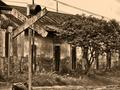
| 01/24/2004 05:59:15 PM |
Sign of Oldby RgarciaComment: Great toning. The color of this sign is really authentic like an old photo. Great shot. I think this one should do pretty well 8 |
| Photographer found comment helpful. |
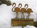
| 01/24/2004 05:56:40 PM |
Not In This Weather They Don't!by basia03Comment: some funky effects on the heads and necks of the flamingos. There may be some oversharpening or compression issues involved. The title sure says a lot too. |
| Photographer found comment helpful. |
| 01/24/2004 05:55:17 PM |
|
| Photographer found comment helpful. |
Home -
Challenges -
Community -
League -
Photos -
Cameras -
Lenses -
Learn -
Help -
Terms of Use -
Privacy -
Top ^
DPChallenge, and website content and design, Copyright © 2001-2025 Challenging Technologies, LLC.
All digital photo copyrights belong to the photographers and may not be used without permission.
Current Server Time: 08/05/2025 08:34:46 AM EDT.