| Image |
Comment |
| 02/25/2003 05:17:54 AM |
Our Futureby smellyfish1002Comment: I think the child's head should be taking up a little more of the frame. There is too much open area here. Great concept though. The lighting is a little harsh for my tastes. This is a great pic though. |
| 02/25/2003 05:14:13 AM |
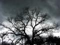
Before the Stormby xertionComment: Awesome image. Really breathtaking. Great capture of the sky and behind this tree makes it a 10 in my book. Awesome!! |
 Photographer found comment helpful. Photographer found comment helpful. |
| 02/25/2003 05:12:02 AM |
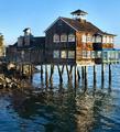
The Dock Houseby GotchaComment: Cool building. unbelievable that they'd build something like this on a dock. Hope it never freezes there:) Nice rich colors of the wood. I think it would be a little better if it were just a pinch sharper and clearer. |
| Photographer found comment helpful. |
| 02/25/2003 05:10:10 AM |
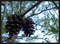
Winter Foliageby karmatComment: I don't like the pinecones that underexposed. They lack color, not that they're jumping with vivid color to begin with, but I think they should look at least like wood. Great DOF on this shot. |
| Photographer found comment helpful. |
| 02/25/2003 05:08:30 AM |
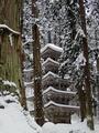
so white, so silentby kenboComment: If this pic wasn't leaning so hard to the left it would definitely be a 10. THis is really gorgeous. Well framed in by the trees and everything. awesome. Settle for 9? |
| Photographer found comment helpful. |
| 02/25/2003 05:06:56 AM |
Sunraysby timj351Comment: Very nice shot. Love the silhouettes of the hill an trees. Water is very calm. Great capture of the clouds and sun. |
| Photographer found comment helpful. |
| 02/25/2003 05:04:02 AM |
Fresh Bedsheetsby tcherringComment: Baby looks a little blotchy.... sure she's not allergic to your Fabric Softener? Cute pic but it doesn't do much for me in the way of Stock Photography |
| Photographer found comment helpful. |
| 02/25/2003 04:52:42 AM |
Diceby PopeTomComment: This pic would've been much better with the right lighting. You have a lot of cool translucent dice but really could've taken advantage with something lighting them up properly, without the whole picture being so bright. Interesting idea for a shot though. Someone is a gamer looks like. |
| Photographer found comment helpful. |
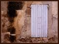
| 02/25/2003 04:50:03 AM |
Stone Wall, Shutters Closedby jjbeguinComment: Awesome wall. I really like the contrasting colors of the shutters with the wall. The wall is very cool as well with the unique colors and strange patterns. Great shot. |
| 02/25/2003 04:47:30 AM |
Colorbrellaby AntithesisComment: The bright light in the middle on the left side of the centerpiece is very, very distracting IMO. I love the colors of this, but I think they could've used a little help from PS with a bit more saturation to make them a bit more vivid. |
Home -
Challenges -
Community -
League -
Photos -
Cameras -
Lenses -
Learn -
Help -
Terms of Use -
Privacy -
Top ^
DPChallenge, and website content and design, Copyright © 2001-2025 Challenging Technologies, LLC.
All digital photo copyrights belong to the photographers and may not be used without permission.
Current Server Time: 08/18/2025 02:22:05 AM EDT.