|
|
|
Showing 1431 - 1440 of ~3109 |
| Image |
Comment |
| 03/28/2003 05:34:32 AM | Self portrait 7by pitsamanComment: Greetings from the Critique Club
By Inspzil
Composition - With all due respect, I don't think this sort of image belongs in the challenges. This is total snapshot material. It does meet the challenge, and it is a cute picture to some degree, but it is not challenge material. The composition is cluttered. It doesn't really have any flow to it. There is a subject, but it isn't really that interesting. The shadow from the flash on her arm is very distracting. More creative lighting would've been preferred or bounce flash so it wasn't so darn bright.
Technical - Pretty well focused and not badly framed. The flash was not the optimum lighting for this situation. The DOF is pretty good actually. I like the face not being in total focus. GOod job there. Doesn't look like any processing was truly needed or done.
Overall - I think the score pretty much reflects my thoughts about this image. This is a better picture for your scrapbook than an attempt to win a ribbon. It needed more setup to get only what you wanted in the photo. Good luck in future challenges - Inspzil |
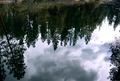
| 03/28/2003 05:20:52 AM | Above from Below from Above... er, yeah, that's right.by leko2kComment: Greetings from the Critique Club
By Inspzil
Composition - I'm not sold that this really meets the challenge, but for purposes of discussion we'll say it definitely does. The composition of this photo is this reflection. It really is a nice reflection, but leaves me wanting more. As nice as it is, I see this as a pretty background without a subject. There is no strong focal point.
**Added later - This does have a really nice feel to it like an oil painting. Ever consider turning it so it looks right side up? Just an afterthought.
Technical - This photo is pretty underexposed. Part of that is the water looks like its filtering out some of the greens in the grass and trees. I think the photo could've used a little slower shutter speed to capture a bit more of the colors. The DOF is not really an issue here. Overall not badly taken, but could use a little help making the colors stand out with exposure or processing.
Overall - I don't see this as a terribly effective shot. The reflection is neat, but not really stunning. There isn't anything about it that sets it apart. I think the score you received is fair. It isn't a bad picture, but it seems to be missing something. Hope this could be of some use to you. Good luck in future challenges. - Inspzil Message edited by author 2003-03-30 13:22:20. |  Photographer found comment helpful. Photographer found comment helpful. |
| 03/27/2003 03:13:43 PM | Colorado Twilightby SavoryAveryComment: Greetings from the Critique Club
By Inspzil
Composition - I'm torn by this image. I generally like it just to look at, but when I think about what is good and bad in the shot and what is there and what isn't, I start questioning why I liked it. Maybe when I get done I'll have my feelings sorted out :) I like the texture of the hills and the perspective of this shot. The river with the few trees speckled around it is great. But I think there is too much negative space on the left side. I'd have cut this pic off from the river going left to leave a portrait oriented photo. The remaining hills are enough to illustrate the contrast between the river and the outlying areas. To me, the most important thing you need to do with this photo is really bring something to the forefront to act as the "subject". I think the river is enough of a subject to give this photo a little more purpose but that would require that the photo be cropped down even smaller. This crop would not be as dramatic as the first one though.
Technical - As far as I'm concerned, this is a pretty well taken photo. Great exposure and a very broad DOF which makes for a very nice landscape. I'm not looking for your camera, as nice as it is, to be able to capture every leaf and twig on each tree. It looks pretty good to me. Maybe a little more saturation on the colors would've helped a little.
Overall - I think that this photo definitely has its place. It reminds me of a textbook photo in something like a geography book. It acts as a great representation of the importance of rivers and also a great relief picture showing some of the earth's texture. As a challenge photo, I think it is lacking a true subject without zeroing in on something. It is a very nice photo though. I think that it does meet the challenge better than most of the photos this week. Hopefully this is a little help for you. Good luck in future challenges - Inspzil |
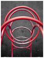
| 03/27/2003 09:02:46 AM | Playground Part from Aboveby JPRComment: Greetings from the Critique Club
By Inspzil
Composition - Interesting perspective. The bar closest to the camera is really hard for me to get past in this pic. There isn't a lot you can do about it, but I really don't like it there at all. The rest of it is fine. It doesn't have any real exceptional visual impact, but it's not completely unworthy of being a subject. And it meets the challenge :)
Technical - At least with that real close bar, the camera didn't focus solely on it. There is a great DOF that keeps all the other bars pretty focused. Its hard to tell what the Aperture was though with no EXIF data furnished. Exposure is okay. Looks like it might've been a cloudy day. The framing is as good as I think it could be. Pretty well taken photo.
Overall - Pretty average, as the score shows. Its a pretty well taken photo of something that isn't terribly exciting. I think the perspective works for this pic, but I think there are other ones to explore that might give this subject a little more visual impact. Hope this helps a little. Good luck on your future challenges - Inspzil | | Photographer found comment helpful. |
| 03/27/2003 08:48:50 AM | Candle Lightsby ozaibakComment: Greetings from the Critique Club
By Inspzil
Composition - I like the way the candles are arranged. They have pretty good color and the negative space works well. I think the candles shouldn't have been burned so much before the picture was shot. It makes them nonuniform in shape and the areas around the wicks are also of differing sizes. The flames are also not all pointing in the same direction. Not a bad composition for a photo. Not anything extraordinary either.
Technical - Focus, focus, focus. Intentional or not, the focus being this soft really killed your score. It is never taken very well, as artistic as it might be. And I think this photo has a really nice exposure and framing. A little tiny bit soft might've been okay, but this is a lot soft. I have a feeling this was a handheld shot where it should've been on a tripod for stability. If it was on a tripod, then I have to think something was bumped or something. In any case, the lack of clarity has really hurt what could've been a pretty good picture.
Overall - Focus. You have it, you do much better. You don't have it, things kind of slide. I'd set this one up again with some newer candles and try it again off a tripod. Might have to wait for the little breezes to stop so all the flames are perfectly upright or have a light even breeze blow them all to one side. Hope this helps a little. Good luck in future challenges - Inspzil
| | Photographer found comment helpful. |
| 03/27/2003 12:05:34 AM | Black & Blue Scratchby danh669Comment: Greetings Newbie from the Critique Club
By Inspzil
For reference I'll add a little "veteran's" point of view advice that you can take or leave.
Composition - Difficult to interpret what the heck I was looking at. I see now, but it took a combination of what I was seeing and the title to eventually come to the conclusion that it was pocket billiards and not just some abstract stuff. (clarity of subject is very important to the large majority of DPC voters, myself included). This is a good idea and meets the challenge. Using the approach you've taken I'd have turned it slightly to make it symmetric. The light showing thru at the bottom of the pocket is a great touch. I think it should've been the selling point of this photo. The overall color tone of the pic is good.
Technical - I think this photo would've scored substantially higher if the aperture were about F11 or so to bring the ball more in focus, if not totally focused. It would've capitalized on the light showing thru the side of the pocket. The ball is pretty blurry. (Even soft focus on DPC is generally frowned upon by most of the newer members) The exposure is great and the framing is pretty close. It doesn't look like a lot of processing was done, which generally means you did a very good job, or that you didn't do much to the photo.
Overall - I can see why this did poorly by the difficult time I had determining what I was even looking at. Voters, myself included, don't have several minutes to try to sit and determine what every subject is like I did here tonight. Abstract photos are actually acceptable if you put "abstract" somewhere in the title. If not, it's assumed that you just don't know what you're doing and your photo obviously sucks :) . There is a lot for folks like me, who start as virtual novices, to learn about photography. Hopefully this gives you a little insight into what we, the voting public, are looking for and how we are looking at it. My recipe is Clarity of Subject, Consistent with Topic, and Creativity. Anyway, there's my 2 cents. Welcome to DPC and good luck with future challenges. - Inspzil | | Photographer found comment helpful. |
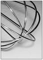
| 03/26/2003 07:56:15 AM | Whiskby lisaeComment: Greetings from the Critique Club
By Inspzil
Composition - Whisks are good photographic subjects. I think something is lost though from this extreme short distance. The properties of whisks that I personally find appealing in terms of photography are the lines of the wires and the regularity of the pattern they form on the whole. This close sort of obscures that regularity so that it sort of looks like a jumble of wires. I wish the background was flat. The little texture there isn't really hurting anything, but I don't prefer it to plain and flat. The highlights left from the flash are too intense. What I do like about this photo is the contrast between the bottom wires and the counter top and the bottom wires and the top wires. I like how the top ones are very bright (too bright in some cases) and the bottom ones are all but black. This is a great effect to show in a single utensil. Nice work there.
Technical - Well taken macro. DOF is pretty great so that most of this is in focus. I don't know what the F-number is so its hard to make any association without exif data. Whatever the case, I like the technique and the black and white works well for this photo.
Overall - Not a bad photo. Nothing extraordinary either. Well taken, but I'm not sold on the overall composition although there are some qualities that are very attractive. I think the score pretty much conveys my feelings about the photo, were I to quantify it. Hope this could be of a little help to you. Maybe natural light and a longer exposure would've done you better than the flash. Good luck with your future challenges mate - Inspzil | | Photographer found comment helpful. |
| 03/26/2003 07:42:31 AM | Spoon Starby nathaliedooComment: Greetings from the Critique Club
By Inspzil
Composition - I really like the composition of this photograph and probably why it was one of my highest rated. The framing is very good and the color is nice. The extra reflections in the spoons is a little distracting, but tolerable at worst. Great idea and well executed.
Technical - Very well taken photo. Nice and sharp with great exposure. No obvious processing flaws or compression problems.
Overall - This may be the shortest critique I've ever written. I really liked the photo and scored it well. The only thing I think that could've been better is omitting the reflections from the spoons, especially of the photographer :) I really like this photo. Great job and thanks for sharing it with us. Keep up the good work and Bon Chance! - Inspzil | | Photographer found comment helpful. |
| 03/25/2003 11:21:20 PM | Planet Earth from an altitude of 5.58 feetby swaroskjiComment: Greetings from the Critique Club
By Inspzil
Composition - Well I think above and beyond everything, it was the composition part that dragged you down. There really isn't anything of interest here and you've done a great job portraying that. The one thing that I think you could've improved upon in this composition is having a little focal point. I find myself wanting to focus on the cigarette butt at the top of the frame. I think that could be an effective focal point for the viewers if placed in the right strategic spot, I'd go for the top right 3rd. But really the bigger problem is that there just isn't anything to see here of photographic interest.
Technical - I can't say the photo is poorly taken, it isn't. It isn't exceptionally well taken either though. The exposue is good, the DOF is right. It is pretty clear.
Overall - This photo is a bit lacking in subject matter. Maybe this photo is lacking in subject altogether. The voters were pretty harsh with this one and honestly I don't blame them. The best thing about this photo is definitely the clever title. The rest of it is pretty easy to come by. sorry I couldn't be of much assistance on this photo. Good luck in your future challenges. - Inspzil |
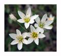
| 03/25/2003 11:07:07 PM | Weedsby one66stangComment: Greetings from the Critique Club
By Inspzil
Composition - Well I see you're somewhere warmer than where I am. We just got rid of the last of our snow and have had milder temperatures for just a few days. Oh the critique, right. The composition of this photo is good. It isn't strong, or extraordinary, but there is nothing wrong with it. I like the background with this shallow DOF. There is a little color here and there to break up any monotony you might have. With the subject you chose, I think you did pretty well. The top flower looks like it might be a little washed out.
Technical - For a macro, its a little soft. I think that might be fixable with a sharpen or two. It might also be a result of the ISO set at 400. Color looks great. DOF is good and exposure is maybe just a touch too long. Nothing really out of place though.
Overall - The composition is good, but really lacks the "wow" factor. The photo is pretty well taken but I think I'd have set the ISO to 100 or less. Nothing about that picture is really wrong, but it doesn't have that little extra that'd make it stand apart from the rest. Hope that helps at least a little. Good luck on future challenges. |
|
Showing 1431 - 1440 of ~3109 |
Home -
Challenges -
Community -
League -
Photos -
Cameras -
Lenses -
Learn -
Help -
Terms of Use -
Privacy -
Top ^
DPChallenge, and website content and design, Copyright © 2001-2025 Challenging Technologies, LLC.
All digital photo copyrights belong to the photographers and may not be used without permission.
Current Server Time: 08/24/2025 08:19:10 AM EDT.
|