| Image |
Comment |
| 04/10/2003 09:14:18 AM |
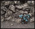
Lonelyby mbardeenComment: excellent contrast with B&W, stones to flowers, and blue to grey. I like the emotive mood set by this pic - 10 |
 Photographer found comment helpful. Photographer found comment helpful. |
| 04/10/2003 09:11:40 AM |
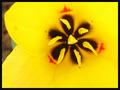
First spring bloomby steveh552Comment: Looks like a pansy. Maybe a little too tight. The focus is on the things in the middle and the outside of the flower is blurry. Good colors but it needs to be a little clearer |
| Photographer found comment helpful. |
| 04/10/2003 09:09:47 AM |
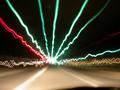
"Rainbow Runners"by Denise CataniaComment: With a little better arrangement this would be a great abstract piece. I don't like the top right corner much but I do like the corner to corner configuration |
| Photographer found comment helpful. |
| 04/10/2003 09:07:05 AM |
House of Lightby WarpComment: Great colors and contrasts. THe color of the water is stunning. Really nice pic from a very advantageous angle. |
| 04/10/2003 08:45:54 AM |
Let's Paintby ThomasComment: Need a little more DOF on this one and it's be much better. LIke the concept and the angle is different than all the other crayon/colored pencil photos. Pretty good though. |
| Photographer found comment helpful. |
| 04/10/2003 08:44:03 AM |
"Arizona Colors"by tfarrell23Comment: Nice sunset. The colors are very rich and vibrant in this picture and I like the way its black all the way around it. Not sure I like the frame though. reminds me of halloween. |
| Photographer found comment helpful. |
| 04/10/2003 08:40:23 AM |
Regal Blueby MaverickComment: Great fish picture. I've been trying to do some of mine and I have a hard time with the big ones. I did get some of one of the fish but of course he died a couple days later. Great job with this photo. |
| Photographer found comment helpful. |
| 04/10/2003 08:36:09 AM |
Sugar Magnoliaby akebonoComment: Interesting abstract. It would've been a lot better if you cropped the shadow out of the bottom |
| 04/10/2003 08:34:36 AM |
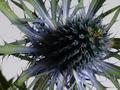
Scottish Rose (a simple Thistle)by illicit_commentComment: Clarity is the issue here more than anything. The lighting doesn't look so great judging by the really harsh shadow left in the bottom left corner. Not really a lot of color either. |
| 04/10/2003 08:33:29 AM |
Beansby fsieradzkiComment: I think this one could've used some beans with a little more color. |
| Photographer found comment helpful. |
Home -
Challenges -
Community -
League -
Photos -
Cameras -
Lenses -
Learn -
Help -
Terms of Use -
Privacy -
Top ^
DPChallenge, and website content and design, Copyright © 2001-2025 Challenging Technologies, LLC.
All digital photo copyrights belong to the photographers and may not be used without permission.
Current Server Time: 08/25/2025 05:25:07 PM EDT.