| Image |
Comment |
| 04/12/2003 05:39:35 AM |
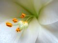
the colour orangeby rjgardnerComment: I think you lose a lot of the beauty of a flower this close. Its like looking up a supermodels nose. |
 Photographer found comment helpful. Photographer found comment helpful. |
| 04/12/2003 05:38:49 AM |
|
| Photographer found comment helpful. |
| 04/12/2003 05:38:21 AM |
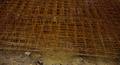
Shades of Flowersby gmacproComment: very unusual concept. I'm not sure if this is legal, but I don't really care. One of the best photos I've seen for this challenge. Good framing, great idea. |
| 04/12/2003 05:30:08 AM |
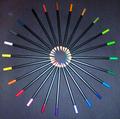
Color Wheelby loz1Comment: Looks like you used flash. If you did, it would've been better to go with available lighting. If you did use other means of lighting, you need to diffuse it more. |
| Photographer found comment helpful. |
| 04/12/2003 05:20:43 AM |
|
| 04/12/2003 05:18:35 AM |
The Last Drop of Colour Todayby MartinComment: Nice silhouette. The only thing I can see that I don't like is that the color looks like it was oversaturated and the sky is a little grainy from it. Awesome colors though. Great capture. |
| Photographer found comment helpful. |
| 04/12/2003 05:12:41 AM |
Little Boy Blueby MaggieGComment: Cute little guy. The framing on this pic, both where you cropped it and with the circle in the background, really work. Nice job |
| 04/12/2003 05:10:23 AM |
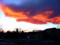
Sunset on a standing wave cloudby cathysappComment: This is very strange. The picture honestly isn't real good but this was one hell of a good find. I can't say I've ever seen anything like this. It does have some awesome colors though. |
| 04/11/2003 12:40:24 PM |
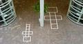
playMetryby svetorComment: Greetings from the Critique Club
By Inspzil
Composition - There definitely is symmetry in the building, but I don't see a lot in terms of the squares on the floor. The little one looks like the junior version of the big one, but still slightly different. I'd say it mostly meets the challenge, so we'll leave it at that. While the photo is not perfectly symmetrical, it is pretty well balanced. I think the plant in the middle is a little distracting, but also a good source of color aside from the floor color. The thing about the composition here is it just doesn't have anything there to grab me. I keep looking around the photo for something that isn't there. Its not a bad composition, just seems to be missing something.
Technical - Good exposure, framing DOF and pretty sharp. Nothing really wrong here but it could be a little sharper.
Overall - Not a lot to say about this one. I like the balance and framing of this picture but I think the symmetry part is a little off and think that adding a couple kids in there or something would detract the attention from that. Maybe put a big kid on the little squares and a little kid on the big squares. But maybe you don't have any kids handy to throw in there. I guess I'm trying to say that I like the idea but it still needs something. Good luck in future challenges - Inspzil |
| 04/11/2003 10:51:07 AM |
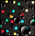
Circles and Circlesby nathaliedooComment: Interesting abstract. I'm not sure what it has to do specifically with pi, but I think its a pretty good pic. Unique and creative. Looks like a good wallpaper pattern. |
| Photographer found comment helpful. |
Home -
Challenges -
Community -
League -
Photos -
Cameras -
Lenses -
Learn -
Help -
Terms of Use -
Privacy -
Top ^
DPChallenge, and website content and design, Copyright © 2001-2025 Challenging Technologies, LLC.
All digital photo copyrights belong to the photographers and may not be used without permission.
Current Server Time: 08/25/2025 08:27:00 PM EDT.