| Image |
Comment |
| 04/18/2003 04:08:18 PM |
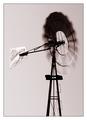
Windby GordonComment: Great vintage looking photo with nice motion. Very well done. The logo on the back of the windmill really sells this picture. 10 |
| 04/18/2003 05:11:22 AM |
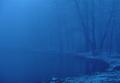
Storm brewingby brentg3Comment: If this wasn't quite os dark it would be much better. Its so hard to see anything under the cloud at all. Almost a fantastic shot |
 Photographer found comment helpful. Photographer found comment helpful. |
| 04/18/2003 05:10:00 AM |
|
| Photographer found comment helpful. |
| 04/18/2003 05:05:00 AM |
ukinazuby akebonoComment: Interesting pattern. I want to say this is a puddle. Good find and a very interesting abstract. |
| 04/18/2003 04:56:23 AM |
into the great abyssby schurgComment: Very cool effect and I really like the color tone of this photo. The reflections in the pond/swamp are really eerie and make this shot. NIce job |
| Photographer found comment helpful. |
| 04/17/2003 11:13:22 PM |
Little Boy Blueby MaggieGComment: Greetings from the Critique Club
By Inspzil
Composition - Nicely composed picture. The boy looks very natural where he is and you've framed him in very well with the blue oval. I think the blue is turned up just a little much because I think the brightness of the colors makes us divert our attention from the boy. Cute little kid though. I wish this were framed on the whole just a little more to the right so he's not so "crowded" on the left side. Also cropping just a sliver off the top would lose the little bit of the hole that is showing.
Technical - Just a touch out of focus, which in here and mean quite a bit in terms of the voters. You can get away with it a little, but only to a point. It seems very hard to get past 6 without being crystal clear. The exposure and DOF and all that stuff look great. I would however not saturate the blues so heavily.
Overall - Cute photo. Not a bad one either. This sort of subject has a scoring cap on it though due to all the "cute haters" out there who think cliche is very bad. Cliche pics are great, if they are done well. I hate to see photos not do as well as they should due to these people. But we all have our opinions. Good work and good luck - Inspzil |
| 04/17/2003 10:55:15 PM |
The Last Drop of Colour Todayby MartinComment: Greetings from the Critique Club
By Inspzil
Composition - Wonderful colors on this one. Really comes thru very well. The color is great, but to me the selling point of this image is the aura of light cast over the large tree. It looks to be glowing. That is the remarkable thing about this photo. The composition on its own is darn near flawless.
Technical - Well framed and exposed. Well taken overall. The only thing I have to say about this picture at all is the grain left in the sky from oversaturation. It may not even be from post processing, but most likely so. In a way it does give it more of a painting look to it more than a photograph, which isn't a bad thing either.
Overall - Loved the shot. Very nice and very well done. Great capture. I think if this were mine I'd be messing around with the artistic renderings of this photo to make it look more like a painting. Good work and good luck in your future challenges - Inspzil |
| 04/17/2003 11:43:16 AM |
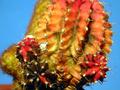
Cactusby pikytoComment: Greetings from the Critique Club
By Inspzil
Composition - The first thing I noticed about this photo when I first saw it was that the angle could've been changed to hide the part in the lower left hand corner that is out of focus. It does add a little to the perspective of the photo but I believe it takes away from the overall composition more. The colors of the photo are great, from the flowers to the sky. Nice detail in this image though. I'm curious as to why the top of it was cut off as well.
Technical - Nice picture quality. Nice and clear with good focus, except for the little blur on the bottom right in the red part. You might've been able to avoid that with a greater F-number. Definitely excellent exposure. Framing is good too with the exception of taking this from a slightly different angle, or cropping that part on the lower left out of the picture. Saturation of the colors is good whether it was out of the camera or post-shot.
Overall - A nice photo but nothing outstanding. The subject just isn't as compelling as I'd like it to be, but that's just my opinion.
The little focus issue on the right side is probably the biggest area of concern and the angle thing is also a slight problem. Overall its fairly well taken. Good luck in future challenges - Inspzil
|
| 04/16/2003 11:32:34 PM |
Pi in the Skyby sagestudioComment: Greetings from the Critique Club
By Inspzil
Composition - I originally gave this photo an 8. I went back and looked just for fun. That's not normal practice for me, but I thought, "what the hell?" It made me look at it a little closer and wonder what I saw exactly to make me vote that way. Well what I see, and obviously most of the voters didn't is the pie symbol that you can see right above your hand, and on every "petal" of this "flower". It does resemble some kind of Mayan Calendar or something sort of mysterious like that. The appeal of this photo to me is the contrast of this cool shape and the white background. If you could've totally silhouetted the hand I think it would've been more mysterious and better as a whole. You had a few comments regarding the hand being there. I'd leave it just like this. How would a picture rate if it looked like a decorative ceramic tile or a wallpaper pattern? I think by keeping the hand you make this more of an obvious photograph and it's unique. Great composition!
Technical - The silhouetting of the hand, I'm not sure how capable your camera would be to do that. The shutter speed is already way fast and the aperture is already pretty small. This photo is very well taken. The silhouetting may be possible to achieve is PS by cranking up the contrast and dropping the brightness a little. But I think its very good the way it is.
Overall - Really a neat picture that I don't think a lot of people totally understood and didn't look at very closely. I think there is more than one way to look at this and conceptualize pi. Very good work! Good job and good luck in future challenges - Inspzil |
| 04/16/2003 08:42:10 PM |
"Rainbow Runners"by Denise CataniaComment: Greetings from the Critique Club
By Inspzil
Composition - Very nice colors in this image. I like it as an abstract piece for the most part. I'd have cropped it tighter so the space on the top right wasn't so vast. The corner to corner framing works very well for this piece and gives it a nice dynamic flow. Because its more of an abstract piece, I have a hard time saying too much about it except for I think its pretty cool.
Technical - Since I have no idea how you did this, I don't really know what to say. I am interested to know though, so you could fill me in any time. I will say that it looks like the area around the light stream is a little pixelated. I don't know if thats from resolution or just the way it worked out, but I don't necessarily think its a bad thing either.
Overall - Your score is not a reflection of the quality of this pic but I think more of a reflection of the criteria the DPC crowd looks for. I think its a fine picture for the most part. I'll leave it at that and bid you good luck in upcoming challenges - Inspzil |
Home -
Challenges -
Community -
League -
Photos -
Cameras -
Lenses -
Learn -
Help -
Terms of Use -
Privacy -
Top ^
DPChallenge, and website content and design, Copyright © 2001-2025 Challenging Technologies, LLC.
All digital photo copyrights belong to the photographers and may not be used without permission.
Current Server Time: 08/25/2025 02:23:33 PM EDT.