| Image |
Comment |
| 04/16/2005 10:45:08 PM |
Refracted Tacksby NordlysComment: How creative! This is beautiful (except that little dark spot in the corner, which I will not hold against you. |
 Photographer found comment helpful. Photographer found comment helpful. |
| 04/16/2005 10:43:25 PM |
Tack Sharpby MontereykiddoComment: Very nice, the worst thing I can think of to say is the shadow is off a tad. Pretty bad, huh? (LOL) You get a silver star. |
| Photographer found comment helpful. |
| 04/16/2005 10:41:40 PM |
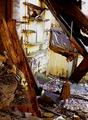
Study in wood and tacksby bpickardComment: This is very good, straight forward. Highlights on the tacks, Maybe a little on the deep sepia side which I think hides details, but I wasn't there, so I don't know but you get top marks from me |
| Photographer found comment helpful. |
| 04/16/2005 06:45:34 PM |
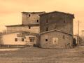
Old Saw Millby drgsoellComment: The color tones make it appear to be a very arid environment (well done if that was your intent) good image.... BUT (of course) the frame would be better if it was less dominent, prhaps the same tone as in the image. |
| Photographer found comment helpful. |
| 04/16/2005 06:42:51 PM |
And then the roof fell in.by ladpupmoeComment: Interesting color adjustments, but the sharpening is overdone to my taste and degradates the image to where it becomes difficult and confused. |
| 04/16/2005 06:40:10 PM |
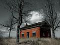
Alone on the Hillby rileyComment: I really like this image, the desaturation of the blues & greens forces the focus on the house, which is not overdone |
| Photographer found comment helpful. |
| 04/16/2005 03:40:51 PM |
Good Ole Days!!by mightythorComment: The sky is a large detraction from the overall. The tone attempts to elicit dispair_which is good for the image, good details. Maybe a little cropping off the top and the white building side would do the trick for me. |
| 04/16/2005 03:36:40 PM |
|
| Photographer found comment helpful. |
| 04/16/2005 03:29:00 PM |
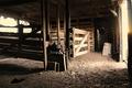
Delapidatedby Prime_TimeComment: The deep sepia obsures the details that are available in this image. By lightening the tone, the detail will emerge and the veiwer doesn't need to work to capture the feel, mood, emotion that should come easily. Heavy sharping, as has been done here, can not replace natural details that are not there or are lost. (By the way, IMO) |
| Photographer found comment helpful. |
| 04/16/2005 03:23:58 PM |
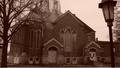
Abandoned Faithby ladyhawk22Comment: The deep sepia obsures the details that are available in this image. By lightening the tone, the detail will emerge and the veiwer doesn't need to work to capture the feel, mood, emotion that should come easily. (By the way, IMO) |
| Photographer found comment helpful. |
Home -
Challenges -
Community -
League -
Photos -
Cameras -
Lenses -
Learn -
Help -
Terms of Use -
Privacy -
Top ^
DPChallenge, and website content and design, Copyright © 2001-2025 Challenging Technologies, LLC.
All digital photo copyrights belong to the photographers and may not be used without permission.
Current Server Time: 08/04/2025 04:05:43 PM EDT.