| Image |
Comment |
| 05/19/2006 11:57:22 AM |
|
 Photographer found comment helpful. Photographer found comment helpful. |
| 05/19/2006 10:52:08 AM |
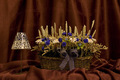
flowers white and blue, and.....by sorayaComment: What a lovely flower arrangement. The composition seems a bit static to me--Iwonder if putting the lamp on a box (under the drape) to raise it higher, and moving it slightly behind the edge of the arrangement of flowers would have helped. It also might help to have a more massive, and taller lamp. Having both items make a fairly straight line across the bottom is what makes the static quality. Colors are lovely. A 5 that could be improved, I think. |
| Photographer found comment helpful. |
| 05/19/2006 10:43:16 AM |
Mother's Day Flowersby saddler116Comment: The elements and color of this image are very attractive. I never know until I acutally see the result, but I wonder how it would look if you lowered the camera toward the floor, so that the pillows in the background were behind the glassware and candles. That might have given some lovely foreground color to the pitcher, and more completely dispersed the flower colors throughout the image. A slightly less severe cropping might also make the picture even better. A lovely combination! 6 |
| 04/19/2006 11:22:39 PM |
|
| Photographer found comment helpful. |
| 04/19/2006 12:19:25 PM |
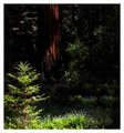
In the Shade of a Giantby mpetersComment: This shot would have worked better for me if you'd cropped about half of the tree trunk. The focus of the picture (the brightly lit undergrowth in the foreground), is NOT in the shadow, by the way. A 6 that might have ended up a 7 or more with different cropping... Lovely photo. |
| Photographer found comment helpful. |
| 04/19/2006 12:11:38 PM |
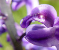
Morning Dewby kusanageComment: I love your colors. This could have worked better for me if you either went for an abstract (cropped way down on one blossom, perhaps) or worked with the whole plant. The picture feels "caught in the middle" between reality and abstraction, without a good focal point. The drop of water doesn't quite catch me as the focus, since the lovely colors compete with it so much... A 4. |
| 04/19/2006 12:06:34 PM |
|
| 04/19/2006 12:02:56 PM |
first bloomby beta_kevinComment: Nicely composed, and a nice surprise to have a "portrait" orientation! Good work. Reminds me of a Georgia O'Keefe painting! :) A 6. |
| 04/19/2006 11:49:57 AM |
Gaze of an Angelby mattmungerComment: Really sweet picture! It might be a bit more effective if you cropped it severely on the left, so that her face was more emphasized. The dazzle of the bright light on the left really pulls me away from the face, which is the real focus of the image for me at least. A 6--maybe could have been a 7 or 8... :) |
| Photographer found comment helpful. |
| 03/04/2006 10:31:12 AM |
My Family's Futureby tateComment: This is a gorgeous photo. The color, texture, and framing are just perfect. I gave it a 7 because it was so lovely, even though it didn't really evoke anything to do woit comfort. What a sweet face! |
| Photographer found comment helpful. |
Home -
Challenges -
Community -
League -
Photos -
Cameras -
Lenses -
Learn -
Help -
Terms of Use -
Privacy -
Top ^
DPChallenge, and website content and design, Copyright © 2001-2025 Challenging Technologies, LLC.
All digital photo copyrights belong to the photographers and may not be used without permission.
Current Server Time: 08/04/2025 03:54:00 AM EDT.