| Image |
Comment |
| 04/16/2005 06:24:12 AM |
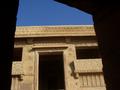
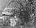
Kundhra - The Abandoned Villageby fredisdeadComment: A doorway through a doorway . . .hmmm. Good color and shape, but I"m struggling with the view. The picture makes me feel like a child on my toes trying to see through the window. It feels like I'm missing something. |
 Photographer found comment helpful. Photographer found comment helpful. |
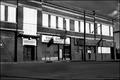
| 04/16/2005 06:21:24 AM |
For Rent?by twm122Comment: Great color. Good composition. It doesn't scream "I'm the winner" but it is a great photo. |
| Photographer found comment helpful. |
| 04/15/2005 11:19:45 PM |
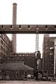
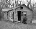
No Longer Neededby jeffzoetComment: For a B&W this is pretty good. Very nice composition with a lot for the eye to look at. |
| Photographer found comment helpful. |
| 04/15/2005 11:18:43 PM |
Abandoned and Abusedby Texas MamaComment: A little too centered for my liking and just a little too much sky. My attention keeps getting drawn upward into the sky. |
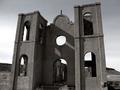
| 04/15/2005 11:16:53 PM |
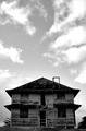
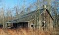
This Old (Spook) Houseby mecomarkComment: Too light. There just isn't enough contrast between light and dark. The building would have been a lot more prominent had you adjusted the black point. I think this is a good photo, but I think it could have been better. |
| Photographer found comment helpful. |
| 04/15/2005 11:14:28 PM |
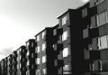
Icelandic blockby leifurComment: Great pattern photo. The one thing I don't like is the way the diagonal almost cuts the photo in half. The building is also a little too B&W. If the sky wouldn't have had so many shades it might of worked. But with this sky, it makes the building look underexposed. |
| Photographer found comment helpful. |
| 04/15/2005 11:11:05 PM |
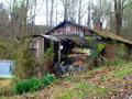
River Ratby TearionComment: With the title of River Rat, I would have shown more of the river. The house is very interesting. I would suggest taking advantage of the 640 pixel limit for size. I'm really squinting to see the detail. |
| Photographer found comment helpful. |
| 04/15/2005 11:09:22 PM |
Forgotten and over grownby PhillydigishooterComment: Very nice. I think you have an excellant composition with this. The trees in front aren't so strong that they detract from the building. Your overall color is very good and so is the contrast. |
| 04/15/2005 11:07:51 PM |
Age-Old Garageby onelenseComment: Good photo. I like the composition. I'm not a fan of B&W but you did a good job with this one. The only thing I don't like is th hard shadow left by the sign right in the middle. It's just a little distracting. |
| 04/15/2005 11:06:04 PM |
The Ruinby SammieComment: Not too bad. I might have veared a little farther away from the symetry by moving to the right just a touch. You handled the contrast pretty good on this though. |
| Photographer found comment helpful. |
Home -
Challenges -
Community -
League -
Photos -
Cameras -
Lenses -
Learn -
Help -
Terms of Use -
Privacy -
Top ^
DPChallenge, and website content and design, Copyright © 2001-2025 Challenging Technologies, LLC.
All digital photo copyrights belong to the photographers and may not be used without permission.
Current Server Time: 08/21/2025 02:15:55 AM EDT.