| Image |
Comment |
| 06/12/2005 04:34:06 PM |
Bathed in Redby mocabelaComment: VERY cool shot! Love the lighting & the "emotion" on the subject's masked face!
I understand why you were anxious to post these... They're definitely worth sharing! |
 Photographer found comment helpful. Photographer found comment helpful. |
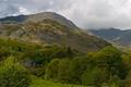
| 06/12/2005 04:31:40 PM |
Langdaleby peeceeComment: WoW! What a magnificent landscape! Is that your house? - What a beautiful setting!
Back to critiquing...
To be quite honest, there's very little I can comment on in a negative/constructive manner. The shot is exquisite. There may be a little too much rose in the overall color, but otherwise what can I say... It's an infrequent moment when I'm speechless, but I think your composition, colors (with the exception of the rose overtones), lighting, sky, detail, are all excellent. You might want to rethink the cropping to remove any animals from the bottom border. Otherwise, this is certainly one for the portfolio. Fantastic job & thanks for sharing it!
|
| Photographer found comment helpful. |
| 06/12/2005 04:15:53 PM |
DC Metroby AutumnCatComment: I like this shot of the subway better than the other one, although I think you could clone out or smart erase the location sign (to make it more universally appealing). The perspective and lines are superb. Composition & lighting are also good, but I'd like to see a little less glare from the foremost overhead light.
I've been on the DC Metro numerous times (as I used to live in the area) and I don't remember it looking so nice, clean, & crisp! Very nice work! |
| Photographer found comment helpful. |
| 06/12/2005 04:13:32 PM |
Metro Trainby AutumnCatComment: I really like the depth & perspective of this shot. The blurriness of the subjects other than the subway is a little distracting (albeit only slightly because you're depicting movement anyway). The colors are good and the lines are excellent - it really draws your eye into the photograph.
Nice work! (My 2 cents as humble as they may be...) |
| Photographer found comment helpful. |
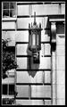
| 06/12/2005 04:10:45 PM |
DC Lanternby AutumnCatComment: Really nice composition and I like the use of B/W. There's good detail and the shot makes me want to know what's happening behind the upstairs window! I think you could reduce some of the glare by reducing backlighting and turning down the contrast a bit. Overall though, I think it's a great shot - and whenever you evoke an emotion from the viewer, you've already won. (And you did!)
|
| Photographer found comment helpful. |
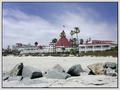
| 06/12/2005 04:08:33 PM |
Hotel del Coronado IIby AutumnCatComment: Very nice shot. I know it may sound trivial, but I'd really like to see the horizon a little more level. Even if the perspective has created the illusion of the image not being level, it could probably be cranked up on the left a hair or two.
The composition is great. I love the rocks in the foreground. I think you could probably turn up the colors & contrast a bit (perhaps reduce backlighting as well) to increase the visible detail of the building & surroundings, as well as make the shot "pop" a little more. You can probably selectively bring out the blues in the sky too - the cloud color and the sand seem to blend a little too much. (If you know what I mean...)
And by no means take my word as an expert! These are just my thoughts and 2 cents worth... It's a really beautiful shot. It's at DisneyWorld, isn't it?
:-) |
| Photographer found comment helpful. |
| 06/12/2005 03:40:57 PM |
Harbourside in Wicklowby PollyBeanComment: Fantastic reflections!! Really nicely composed shot. I think you might be able to selectively bring out a little more blue in the sky and a little more color in the "land/trees" and the water. I would leave the color of the boat alone - it's a very pleasant blue already and any more processing would probably just detract from it.
Is it me or is the horizon slightly off? You may be able to bring the right side up just a hair or two. I realize that the bridge/road is probably slightly arched, but it still seems a little low on the left. Don't get me wrong, we're only talking a few pixels, but to some extremely critical eyes it can make a difference.
Overall a really nice shot - by far my favorite of the two. Had it been in an appropriate challenge, I would probably have scored it a 7-8. |
| Photographer found comment helpful. |
| 06/12/2005 03:36:23 PM |
Shimmeryby PollyBeanComment: Very cool shot. The composition is exquisite. I would go ahead and crop a little more on each side (so as to eliminate the partially visible boats). Also, the glare is a little harsh - detracting from the detail of the water and the boats themselves. And by this I don't mean get rid of the shimmer - I like that a lot. I think though that you could reduce the backlighting enough that it leaves the shimmer, yet allows you to recover some of the lost detail in the water and boats.
I like the overall blue color of the image, but the sky seems a bit grey - maybe a little more "umph" on the colors there. Also, by bringing out more detail in the water & boats, I think you'll find that you can eke out a bit more variation of colors without detracting from the "blue" feel of the shot.
Very nice. Just my 2 cents... |
| Photographer found comment helpful. |
| 06/12/2005 03:25:18 PM |
Ship In The Bayby Travis99Comment: Beautiful shot! I love the composition and colors. It appears very natural - not overprocessed. Nice job. My only criticism would be that far shore in the center. It's very distracting because of the lack of focus. Everything else in the shot is done extremely well (IMHO). Had it been in an appropriate challenge, I would have scored it a 7 (due to the OOF shore). I could easily see a much higher mark if the distant shore was more in focus, because your lighting, composition, crop, colors, and perspective are superb. :-)
Just my 2 cents...
|
| 06/12/2005 02:45:09 PM |
Dark Thoughtsby WawaaComment: I love the colors & the sky fade. In fact, there's really only one thing that bothers me about the shot - the color of the eye. Is there any way to make it more the color of the rest of the pic and still stand out?
I take it back - two things - the other is the object in the bottom left (is that a backpack?). Really cool overall effect and I like the position of the model and the head. You might consider cropping even more from the left... Just my thoughts. Great grab! Message edited by author 2005-06-12 14:45:55. |
| Photographer found comment helpful. |
Home -
Challenges -
Community -
League -
Photos -
Cameras -
Lenses -
Learn -
Help -
Terms of Use -
Privacy -
Top ^
DPChallenge, and website content and design, Copyright © 2001-2025 Challenging Technologies, LLC.
All digital photo copyrights belong to the photographers and may not be used without permission.
Current Server Time: 06/20/2025 05:20:16 PM EDT.