| Image |
Comment |
| 06/12/2005 07:58:04 PM |
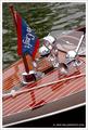
Chris-Craftby cbellerComment: Very nice shot. I like the color & definition on the boat. The water (IMHO) could use a little more zest. I think this is a great shot and I like the crop & composition. Your eye is drawn immediately to the beautiful color & detail of the boat, but then is a little disappointed when it gets to the somewhat dull water. I recognize that the emphasis of the shot is the boat, but I think it could be further accented by a little more clarity & color in the water.
Just my 2 cents... |
 Photographer found comment helpful. Photographer found comment helpful. |
| 06/12/2005 07:55:06 PM |
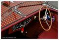
Chris-Craft Interiorby cbellerComment: Magnificent shot! Crisp, clean detail. Beautiful colors & composition. The only thing that really leaps out to me is the lack of "pizzazz" in the water in the upper right. The rest of the photo just jumps out at you with great color & sharpness. The upper left portion of water is just kinda there without any of the same zeal that the rest of the shot has. Perhaps some selective color saturation and/or contrast might bring out more of the hidden appeal of the water.
VERY nice shot though. Great job! |
| Photographer found comment helpful. |
| 06/12/2005 07:52:31 PM |
Bear Gone Fishin'by cbellerComment: Very cute pic. The colors, clarity, & composition are great. The house in the background is a little distracting, but only slightly so. I'd give it a 6-7 in an appropriate challenge. Not sure I can put my finger on exactly what I find disheartening in the photo - sorry. It just doesn't seem to hold my attention very well. Perhaps making the crop a little larger? Making the teddybear still the focus, but more so because of the vastness of the space? Just a guess & suggestion...
My 2 cents worth... (probably not worth a penny!) |
| Photographer found comment helpful. |
| 06/12/2005 07:49:04 PM |
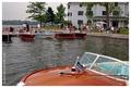
Antique Boat Showby cbellerComment: This one seems to lose focus for me. The other three are very cohesive. Don't get me wrong, I think the use of the partially exposed boat closest to the viewer and the obvious crowd around other boats provides a statement about the activity portrayed in the shot, but I think that your other shots make the argument more definitively.
The colors are good. I'd like to see the horizon a little more perpendicular to the side of the photograph. (I tell ya what, I'd love to own one of those condos pictured!)
Overall a good impression of the shot, but I'd probably give it a 6 in an appropriate challenge - it's just too busy. Message edited by author 2005-06-12 19:49:26. |
| Photographer found comment helpful. |
| 06/12/2005 07:41:52 PM |
Koiby GinaRothfelsComment: BEAUTIFUL shot! I really like the way you used the reflections to create a wavy semblence of the subjects. VERY well done! Thank you for sharing it! |
| Photographer found comment helpful. |
| 06/12/2005 07:17:58 PM |
Alone on Sandy Beachby SunnieeComment: Wow! This image certainly scores high in that regard (the WOW factor). I love the composition and model placement. One of the few (hopefully constructive) criticisms I have is that the water seems a bit washed out. You might try selectively reducing backlighting and/or increasing the contrast there to bring out some of the detail of the water. Otherwise, I think the coloration of the sand & the model's pose/attire are superb. She seems so immune to anything that is possibly going on elsewhere. Really nice shot! Congrats!
Just my 2 cents...
Jimmy |
| Photographer found comment helpful. |
| 06/12/2005 05:53:09 PM |
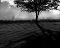
Morningby thatcloudthereComment: * Greetings from the Critique Club *
First of all, I think this is a very nice, emotional shot. It conveys a feeling of warmth and wetness that I think is indicative of a foggy, dewy morning.
I do have a couple of comments regarding the image... I think the lighting is superb. The rays of sunlight are great and the shadows are spectacular. I do think, however, that you might be able to further improve on the image if you were to crop it a bit differently. Some of the bottom shadows are essentially irrelevant to the frame (IMHO), so if you were to cut off some of the shadow of the tree, I think you could bring the viewer's eye closer to the focus of your image (which I assume to be the tree and the sunbeams). The use of B/W is very effective here. I think that the overall effect of almost smoky images is great - and I think that you could further capitalize on that by a slightly different crop. I would suggest experimenting with different crops (always including the tree and the sunbeams, but perhaps minimizing other elements).
Overall, a great shot. Nice work! :-)
|
| Photographer found comment helpful. |
| 06/12/2005 05:45:31 PM |
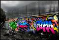
There's Nothing Quite As Beautiful As The Correct Use Of Gramaby mrmorrisComment: * Greetings from the Critique Club! *
First of all, I have to say, WOW!... This certainly has an impactful appeal. I love the use of color & B/W - it really highlights the "graffitti" feel of the image. Exceptionally well done.
The boldness of the color is almost overwhelming - which in this case I think is a good thing. After all, that's what graffitti is all about, right?
I think your use of color vs. B/W is very well conceived. It really adds to the impact of the image's statement.
I'm finding it difficult to say much more about it - other than AWESOME JOB! The clutter in B/W below the color graffitti is great. It's very well cropped and composed. In the appropriate category/challenge theme, I would have scored it a 9-10. (I know that sounds trite, but it's the truth.)
I think you have an extraordinary eye for detail and composition. And I look forward to seeing more of your work!
Just my 2 cents... ;-)
Jimmy
|
| Photographer found comment helpful. |
| 06/12/2005 05:35:27 PM |
Woww..Beautifulby mkirdalComment: *Greetings from the Critique Club!*
I really like the colors and composition of the shot. I think, however, that you may have overprocessed the reds in the shot. Don't get me wrong, I like the overall impression that the reds give me, but I think that you might be able to keep that overall impression by selectively choosing which objects to saturate. For example, I think you could elect NOT to choose the bowl and it's fractured elements to saturate - creating a less "obvious" use of red saturation. This might lead the viewer to interpret the glass bowl and contained kitten as a separate object on its own merit (which I think might be advantageous in this particular instance).
The cropping and composition are great. I like the off-set placement of the subject matter and the direction of the kitten's eyes that lead you to the negative space.
The reflection of the reds in the crevasses of the bowl are a little distracting and the harshness of the processing seems to show a bit around the kitten itself. I think you could probably selectively reduce these a bit and still retain the overall "feel" of warmth created by the rosy colors. You can probably selectively bring out some of the warm golden tones of the kitty by altering the source lighting for that particular object.
Overall, I think this is a really great shot. You've managed to maintain a warm "fuzzy" feeling and presented it in a tastefully artful manner. You've also managed to fuse very unlikely elements in a cohesive manner (the red colors, hard glass, and a furry animal). Well done.
|
| Photographer found comment helpful. |
| 06/12/2005 04:35:52 PM |
An Unpleasant Creatureby mocabelaComment: I like the color version better. Even though the B/W has some definitive plusses - contrast & dark vs. light are excellent! However, I think the dark creature (subject/model) evokes more feeling in color.
Just my 2 cents... GREAT shots BTW! |
| Photographer found comment helpful. |
Home -
Challenges -
Community -
League -
Photos -
Cameras -
Lenses -
Learn -
Help -
Terms of Use -
Privacy -
Top ^
DPChallenge, and website content and design, Copyright © 2001-2025 Challenging Technologies, LLC.
All digital photo copyrights belong to the photographers and may not be used without permission.
Current Server Time: 06/21/2025 06:12:29 AM EDT.