| Image |
Comment |
| 04/15/2005 02:37:54 PM |
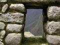
window to the amazonby jellojelloComment: Nice framing. An interesting shot. I wish the view through the doorway was a little clearer. I wonder if it might have looked better if you were able to get some blue sky into the shot with a lower angle? |
| 04/15/2005 02:36:26 PM |
|
 Photographer found comment helpful. Photographer found comment helpful. |
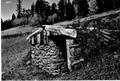
| 04/15/2005 02:30:37 PM |
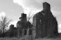
Old Tavernby EOSinComment: I like the building. It looks like a very interesting subject. The focus seems quite soft, I also think there is not enough contrast. Might have looked better in color. |
| 04/15/2005 02:28:33 PM |
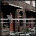
The Forgottenby instepsComment: Nice use of DOF. I like the photo, but the edges of the clothespins look too sharp. They look like they have been cut and pasted in. I don't know if it is due to using unsharp mask, but it just doesn't look quite right. |
| Photographer found comment helpful. |
| 04/15/2005 02:25:49 PM |
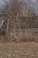
Century Barnby glk5406Comment: The barn you are trying to depict is completely hidden by the tree in the foreground. It looks like an interesting building, I just can't tell with the tree in the way. |
| Photographer found comment helpful. |
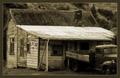
| 04/13/2005 11:04:08 PM |
this old houseby scott photoComment: Picture is too small to see any detail. Please enlarge to 640 pixels for the next challenge so you can get a better judging of your photo. |
| 04/13/2005 02:21:07 PM |
|
| Photographer found comment helpful. |
| 04/13/2005 02:10:25 PM |
Dayton (My First Entry)by jdw_picsComment: A nice well posed portrait. This unfortunately doesn't bring home the subject matter of "Abandoned Building", for me a key part in the judging. I do think the lighting and colors are nice. |
| Photographer found comment helpful. |
| 04/13/2005 01:46:53 PM |
Cute little doer upper...by banditComment: I like the multiple expansions of this house. Looks like at least two additions. I would have moved out a bit and shown more on the right hand side of the house. It kind of looks like the house is "crammed" into the framing of the picture. A little space would have helped. |
| Photographer found comment helpful. |
| 04/13/2005 01:38:41 PM |
|
| Photographer found comment helpful. |
Home -
Challenges -
Community -
League -
Photos -
Cameras -
Lenses -
Learn -
Help -
Terms of Use -
Privacy -
Top ^
DPChallenge, and website content and design, Copyright © 2001-2025 Challenging Technologies, LLC.
All digital photo copyrights belong to the photographers and may not be used without permission.
Current Server Time: 08/05/2025 11:30:23 PM EDT.