| Image |
Comment |
| 12/26/2009 04:07:23 PM |
Wintering Tillamookby skewsmeComment: I'm half tempted to go look at the 197 shots that were supposed to be better than this. Its beautiful and well treated. |
 Photographer found comment helpful. Photographer found comment helpful. |
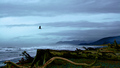
| 12/26/2009 04:05:52 PM |
Who will watch the watchmen?by skewsmeComment: wow. I can't pass this up! Beautiful. Thanks for posting this and the others - I am now settled on traveling the coast both below and above Cannon Beach. |
| Photographer found comment helpful. |
| 12/19/2009 09:40:08 AM |
TowerChurch_Portugal 3oct09.jpgby TemperpolkComment: Honest assessment:
Dark colors recede. In this case, the foreground is dominant, but being a dark, unfathomable shapeless mass, one that is receding in the image none-the-less, it keeps me from entering the image properly. It is like I am held at the gate, so to speak, unable to enjoy what I might find behind it.
Bright colors capture attention. Your orange sky is acceptable but it pulls all the attention away from the buildings. One barely notices they exist because the orange is over powering the subjects of the image. One has to wonder why the buildings are there in the first place, as they supply nothing to the image - the image is all about orange.
The image is flat and static - all images are flat and static at their heart (its the very nature of a photograph) - but a goal in photography is to create the illusion of movement and depth. Here, there is no place for the eye to wander - I don't gain anything by moving around within the frame and only the barest hint of depth is provided in the clouds.
I'm not sure if you will consider this kind, but how can one learn or improve without feedback? This image is not a bad image; it has some potentially interesting elements within it. But it is not a great image either... |
| 09/27/2009 03:01:32 PM |
Aww geez, Daddy!by ahjennyComment: This image will be marked down just because it is smaller than necessary (444X481). You should start with the largest frame possible - 640px on one side. DPC viewers vote smaller images down just as a matter of course. It could also use a basic sharpening and maybe a slight curves adjustment. This is a really cute picture and you captured a moment in time very well. the background is controlled and the lighting is good - natural with no sign of flash. I think this image would be better in black and white so the colors don't over power the message. IN DPC voting, it probably won't fair well as DPCers will tend to consider it a snapshot. there is no reverence for snapshots on DPC unless they look planned (don't ask, I don't get it either). Personally, I like it. I like the spur of the momentness it holds, I like the expression on the kids face, I like the pose. The composition isn't strong, but it works. I think you have a good eye for capturing the moment - don't let DPC discourage you with the scores. |
| Photographer found comment helpful. |
| 09/27/2009 02:48:09 PM |
Lorikeetby ahjennyComment: this is strictly my opinion. For this challenge, the image works - focus on the bird was missed but the bird definitely is the subject. As far as images go, this is a good snap, but the interest doesn't go beyond that. Its a good capture of a moment in time and interesting to glance at, but it has no lasting impact on a viewer. there is nothing to keep one here looking for more than a moment. For DPC in general, the voters are going to mark you down with the indea that the background is too busy. DPC prefers empty backgrounds and likes images simple (just check the majority of challenge winners). For a DPC challenge, if I had been shooting, I would have tried to get much tighter in on the bird, by moving, zooming, and cropping, so there is much less for the viewer to remark upon. You also might hear that you need to straighten your horizon - the vertical lines in the back of the image are slanted to the left. DPC voters hate that. I don't think you'll get the brown - there are many images in the challenge that aren't half as good as this but I don't think you'll score in the top 30 either. In the end, it is a good capture of what you captured, it just doesn't have much value outside the challenge to keep viewer interest. |
| Photographer found comment helpful. |
| 09/27/2009 09:24:23 AM |
Waking Up To The Lightby MsAmbrosiaComment: Looks life this was taken with a softness filter. I like the effect and think you used it well here. Might be a little too unblurry for the masses that vote, but I think it fits the challenge. Well composed, nice soft colors to add to the mood. 8 |
| Photographer found comment helpful. |
| 09/27/2009 09:22:16 AM |
Midsummer Night's Dreamby ErikVComment: Very pretty hues though the light splotch in the thirds spot on the upper right is distracting. The blur works with the image. 6 |
| Photographer found comment helpful. |
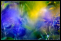
| 09/27/2009 09:21:06 AM |
"Taken under his wing"by tinkie2010Comment: the colors work, though I think you could have pushed them more. The composition is okay. Not sure the blur enhances the subject. |
| Photographer found comment helpful. |
| 09/27/2009 09:19:58 AM |
La Fée Verteby rinacComment: I love the colors. I think the missed focus works. Composed well. 7 |
| Photographer found comment helpful. |
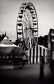
| 09/26/2009 02:57:08 PM |
Midwayby RKTComment: The most intriguing part of this image is the person in the foreground. My only problem is there is so much emphasis on the ferris wheel, that she is lost in the shadow. I would have cut the top half off to force viewer eyes to her - I'm assuming she is the missed focus subject of the image...the ferris wheel just demands too much attention. well seen though, and interesting choice. 6 |
| Photographer found comment helpful. |
Home -
Challenges -
Community -
League -
Photos -
Cameras -
Lenses -
Learn -
Help -
Terms of Use -
Privacy -
Top ^
DPChallenge, and website content and design, Copyright © 2001-2025 Challenging Technologies, LLC.
All digital photo copyrights belong to the photographers and may not be used without permission.
Current Server Time: 09/03/2025 10:18:51 PM EDT.