DPChallenge: A Digital Photography Contest You are not logged in. (log in or register
 
Challenge Entries
This image is not a part of any challenge.
Portfolio Images
This image is not part of a public portfolio.
TowerChurch_Portugal 3oct09.jpg
Temperpolk


Photograph Information Photographer's Comments
Camera: Canon PowerShot A630
Location: Obidos, Portugal
Date: Oct 3, 2009
Aperture: auto
ISO: auto
Shutter: auto
Galleries: Architecture, History
Date Uploaded: Dec 19, 2009

Viewed: 328
Comments: 2
Favorites: 0

An old castle next to a "newish" church. I used Picnik to infuse the colour. The colour was the only editing tool I used in this picture.

Please log in or register to add your comments!

AuthorThread
12/19/2009 09:40:08 AM
Honest assessment:

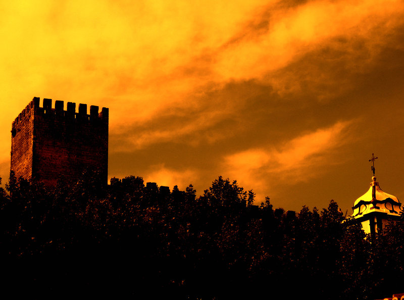
Dark colors recede. In this case, the foreground is dominant, but being a dark, unfathomable shapeless mass, one that is receding in the image none-the-less, it keeps me from entering the image properly. It is like I am held at the gate, so to speak, unable to enjoy what I might find behind it.

Bright colors capture attention. Your orange sky is acceptable but it pulls all the attention away from the buildings. One barely notices they exist because the orange is over powering the subjects of the image. One has to wonder why the buildings are there in the first place, as they supply nothing to the image - the image is all about orange.

The image is flat and static - all images are flat and static at their heart (its the very nature of a photograph) - but a goal in photography is to create the illusion of movement and depth. Here, there is no place for the eye to wander - I don't gain anything by moving around within the frame and only the barest hint of depth is provided in the clouds.

I'm not sure if you will consider this kind, but how can one learn or improve without feedback? This image is not a bad image; it has some potentially interesting elements within it. But it is not a great image either...
12/19/2009 06:55:30 AM
You asked for honest opinions in a forum thread, so here goes:

I'm afraid it doesn't do anything for me.
The yellow is too unnatural, the dark areas are way too dark, the roof is borderline too bright.

The subject is interesting enough, but the composition is awkward. I realize it might be impossible to get into a different spot for a better angle, but the way it is right now, it just doesn't work.


Home - Challenges - Community - League - Photos - Cameras - Lenses - Learn - Prints! - Help - Terms of Use - Privacy - Top ^
DPChallenge, and website content and design, Copyright © 2001-2024 Challenging Technologies, LLC.
All digital photo copyrights belong to the photographers and may not be used without permission.
Current Server Time: 04/24/2024 04:35:37 PM EDT.