| Image |
Comment |
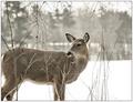
| 03/22/2005 03:03:09 PM |
White-Tailed Deerby Judith PolakoffComment: This is a very nice image and I really like the tones but I think the clipping of the feet and rear/tail takes away from it. I think this is because I can see part of the tail so it really makes the rest of it feel like it is missing more than it would if I couldn�t see any of the tail at all. The same goes for the legs. I think if this were my photo that I would do a much tighter crop and just have the head and shoulders or something along those lines. |
 Photographer found comment helpful. Photographer found comment helpful. |
| 03/22/2005 02:59:43 PM |
Dendrobium Orchidby admart01Comment: This is a very pretty image and I think the white background works here. I really like the color and that the background brightness doesn�t seem to overpower the subject. The only think that I would like to see different (and this is not a big deal) is the bud on the top right corner bothers me. I think the picture would have been better if it were just a stalk trailing out of the picture like the one above it. |
| Photographer found comment helpful. |
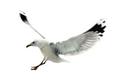
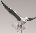
| 03/22/2005 02:56:57 PM |
Soaring Highby Zap228Comment: I like the position of the gull and the way you captured the action in this shot but if this were my image there are a couple of things I would change. First, I think I would give the bird a little more room in front and below for it to fly into. I also am not totally thrilled about the background. I am guessing that you were trying for a white background but the picture just appears (to me) to be just too overexposed and a bit too much detail has been lost. I think this image would be really great if it were in front of a plain background that wasn�t so bright. |
| Photographer found comment helpful. |
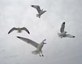
| 03/08/2005 12:51:19 PM |
around we goby DArcy10Comment: This picture was one of my favorites of the group. I like the composition and how all of the birds are in different positions. Very nice capture. |
| Photographer found comment helpful. |
| 03/08/2005 12:48:48 PM |
The rain isn't over untill the fat bird singsby RulerZigzagComment: When I looked at the thumbnail for this picture I really liked what I saw, but when I opened the image I was a bit let down. I think the reason is that the head of the bird really blends into the background. Also I think there is a bit too much detail in the photo. I think a nice smooth tone in the background would have worked better for me. The sign did make me smile though. |
| Photographer found comment helpful. |
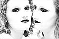
| 03/08/2005 12:46:07 PM |
Felicityby vincedanComment: Overall I like the photo with the exception of the white substance on the woman�s face. For me it ruins a nice photo. |
| Photographer found comment helpful. |
| 03/08/2005 12:40:42 PM |
Soloby buzzrockComment: This is a nice image but would have done a lot more for me if the goose were flying toward me instead of away. It might have also helped if you made the image a bit higher in resolution. |
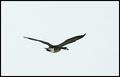
| 03/08/2005 12:38:31 PM |
Clear for Landing!by WylyWireComment: I like the subject but the composition really doesn�t work for me. The wings are clipped at awkward (for me anyway) locations. I don�t like how just the tip of the right wing is cut off, it makes it look like it was accidentally done. The clip on the left wing is very uncomfortable for me since so much of the right wing is showing. I also don�t like how there is so much space behind the bird and so little in front. It really gives the picture (for me anyway) the appearance of being a shot where your focal length was too long and you couldn�t keep the bird in the frame while tracking it. I think the picture might be better if it were cropped a lot tighter so that the right wing was clipped the same amount as the left wing and the space behind the bird was eliminated. I don�t know if it is my screen but it looks like you have some clipped highlights as well along the leading edge of the right wing and right around the eye of the gull. |
| Photographer found comment helpful. |
| 03/08/2005 12:32:39 PM |
LOVE WITHOUT COLORby DDYJRComment: Interesting shot. It was an eye catcher in the thumbnails page. I have always like this style of high-contrast photography, I find that it makes the subjects look very appealing. |
| Photographer found comment helpful. |
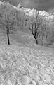
| 03/08/2005 12:30:30 PM |
Powderby adineComment: This is a really neat shot and makes me wish I was there. I really like the designs in the snow, that was the first thing that caught my eye when looking through the tumbnails. |
| Photographer found comment helpful. |
Home -
Challenges -
Community -
League -
Photos -
Cameras -
Lenses -
Learn -
Prints! -
Help -
Terms of Use -
Privacy -
Top ^
DPChallenge, and website content and design, Copyright © 2001-2024 Challenging Technologies, LLC.
All digital photo copyrights belong to the photographers and may not be used without permission.
Current Server Time: 04/27/2024 02:41:51 AM EDT.