| Author | Thread |
|
|
03/15/2005 01:23:40 PM |
Greetings From the Critique Club!!
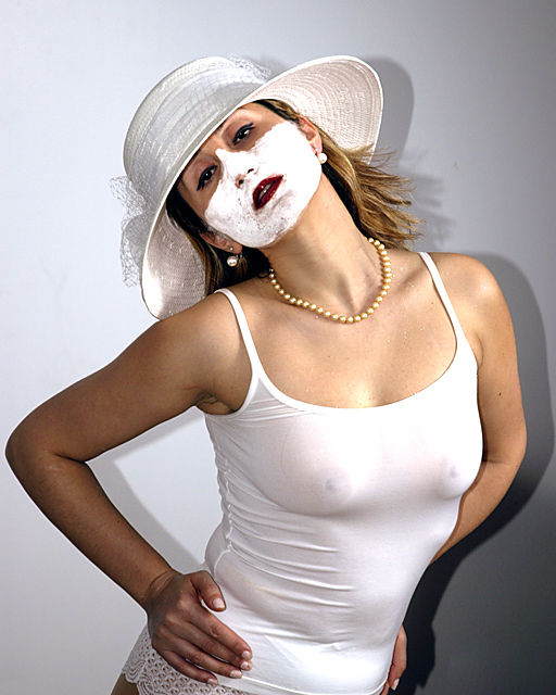
Initial impact: What the f.....?
Meeting the challenge: This meets the challenge but is has a few technical flaws with lighting. Which will hurt the look of a good light on white shot.I will mention those later under lighting.
Clolors: The color is pretty good on most of the photo however her right hand is to dark compared to rest of the body. It just looks akward.
Sharpness. Very nice and crisp image through out the entire shot. Her eyes however could have stood out a bit more.
Lighting: I am very unsatisfied with the lighting. Most of the have been mentioned in earlier critiques but I will go over them again so that you may understand wahat I feel is wrong with the lighting. First you needed to move the model forward a few feet. This would have eleminated her shadow from the back drop some, and also would have changed you DOF enough to possibly hide the blemishes on your backdrop . Second light the background separately, this would have removed the rest of the shadow and also would have removed the dark area on the right side of your backdrop. Now you would have been left with a pure white backdrop. The next part of lighting this shot would have been to place a light on either side of the model, this would have given you and even skin tone, whiter whites, and a smoothed out the some of the fabric. Lighting was by far the worst aspect of this shot. I will assume however you are like me and straped for cash and can't afford all the fancy exras and are pretty much stuck with a standard flash. I found that stand up 500 watt shop light and a role of white paper are affordable and work pretty well.
Composition. I looked at your out takes and feel that the either of the two white shots would have done better. I agree with the others on the white face mask.. it's weird, makes no sence, and is not very attracive to look at. Great model and good pose. Better lighting and no face goo probably would have received a seven or higher from me. The out takes would have received at least a 6. I must admit however that I only gave this one a 4. Due to the things I pointed out. While this probably was not the most encouraging of critiques I hope that you at least find some of it usefull. Youve got talent. Now just get a technique down and will probably be seeing a few ribbons in your profile soon.
Tristalisk |
|
 Photographer found comment helpful. Photographer found comment helpful. |
|
|
03/15/2005 01:59:07 AM |
This was intended to be somewhat sinsister, and ambiguous... the theme was death/ marriage, both implied to me by the color white...I'm aware of the amaturish aspects of the execution, and I wanted to share something I found interesting, rather than aim for general approval.
Thanks for comments.
|
|
Comments Made During the Challenge  |
|
|
03/08/2005 12:46:07 PM |
|
Overall I like the photo with the exception of the white substance on the woman’s face. For me it ruins a nice photo. |
|
| Photographer found comment helpful. |
|
|
03/07/2005 07:33:37 PM |
|
thats disgusting. there are youngsters on this site you know. |
|
|
|
03/07/2005 02:16:44 AM |
|
Her white face really freaks me out. I like it. |
|
| Photographer found comment helpful. |
|
|
03/06/2005 01:23:10 PM |
|
| Photographer found comment helpful. |
|
|
03/05/2005 09:11:30 PM |
|
interesting....creative I must say...maybe you should of tried losing the shirt and putting the paint on the nipples |
|
| Photographer found comment helpful. |
|
|
03/04/2005 09:33:38 PM |
|
This picture is kind of gross. Shadow on the right also bad. |
|
| Photographer found comment helpful. |
|
|
03/04/2005 08:01:29 PM |
|
Always enjoy seeing those. It's a bizzare image. Interested to see what you wanted us to see or feel when you composed your shot. Good luck. |
|
| Photographer found comment helpful. |
|
|
03/04/2005 07:23:44 PM |
|
There's a thing called a bra. Something you wear under your see through white shirt lol. |
|
| Photographer found comment helpful. |
|
|
03/04/2005 05:42:43 AM |
|
Odd...but "titillating." Her paited face is distracting. |
|
| Photographer found comment helpful. |
|
|
03/04/2005 03:40:03 AM |
|
Thiws has the makings but has missed out,why? (a) direct flashis a no no bounce it off the ceiling for soft shadowless lighting (b) move your moel further from the background so shadows are not cast.(c) light background independant of the main light giving it 1 stop more light. 3 |
|
| Photographer found comment helpful. |
|
|
03/02/2005 11:18:19 PM |
|
i cans ee nipples which i dont think is appropriate so u get a 1 |
|
|
|
03/02/2005 05:57:19 PM |
|
This should have been submited in the surreal challenge. I can't understand it and I don't like the shadow. |
|
| Photographer found comment helpful. |
|
|
03/02/2005 03:32:48 PM |
|
Breasts always add a pt would have used a white vail over the Face cream ! |
|
| Photographer found comment helpful. |
|
|
03/02/2005 02:16:50 PM |
|
Great shot. Needs more space between subject and background to eliminate the shadow. |
|
| Photographer found comment helpful. |
|
|
03/02/2005 02:00:54 PM |
|
The tighness of the clothing gives a spare tire effect on the model (see waistline and armpit to right of screen). Perhaps clothing a size larger that hugged her figure versus pulling and squeezing would have made her figure more attractive. THe necklace which accentuates the collarbone, and the hat, are nice touches. |
|
| Photographer found comment helpful. |
|
|
03/02/2005 01:38:49 AM |
|
The facial goop just distracts from the picture. |
|
| Photographer found comment helpful. |
|
|
03/02/2005 01:30:26 AM |
|
Mmm, model is a bit too close to the background: the dark shadow is distracting. Otherwise pleasantly weird. |
|
| Photographer found comment helpful. |
Home -
Challenges -
Community -
League -
Photos -
Cameras -
Lenses -
Learn -
Help -
Terms of Use -
Privacy -
Top ^
DPChallenge, and website content and design, Copyright © 2001-2026 Challenging Technologies, LLC.
All digital photo copyrights belong to the photographers and may not be used without permission.
Current Server Time: 06/30/2026 06:35:35 PM EDT.