| Image |
Comment |
| 04/25/2005 09:21:08 AM |
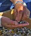
Only the Necessitiesby SnapperLComment: great image, but I'm not sure if you are trying to advertise the ring, the watch or the stones? seashells? |
 Photographer found comment helpful. Photographer found comment helpful. |
| 04/25/2005 09:19:25 AM |
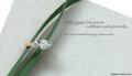
Writing a Love Poemby admart01Comment: Outstanding - one of the top few, I think. Also, one of the few where the text actually compliments the image. My only suggestions would be to get just a bit more sparkle in the diamonds. |
| Photographer found comment helpful. |
| 04/25/2005 09:17:33 AM |
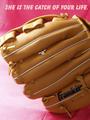
Catch of your lifeby lissylouComment: cute concept. good lighting - one of the few diamonds that actually shine. A suggestion - I don't think the pink background works in this. Perhaps a flat black, and avoiding a seam ? fold? in the foreground. |
| Photographer found comment helpful. |
| 04/25/2005 09:14:34 AM |
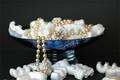
Pearls are imortalby NunoComment: great concept. The stryofoam peanuts don't do it for me however. Perhaps if you had used polished river rocks of about the same size, black ones perhaps, to contrast witht he pearls? |
| Photographer found comment helpful. |
| 04/25/2005 09:12:26 AM |
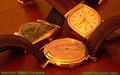
Hamilton Watch Company circa 1958by bcobleComment: the text color was not a great choice for this image. White or black would have been better I think. A slightly deeper DoF to get the right hand watch in sharp focus would also have helped. Very nice, though.- 7 |
| Photographer found comment helpful. |
| 04/25/2005 09:09:47 AM |
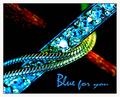
Blue for youby JohannesFrankComment: great colours. I love the red in the background, really makes the blue pop. The only suggestions I have is to remove the overblown highlights opn the one central gem. It seems just a bit too much. Also, the DoF could have been slightly deeper, to avoid the lack of focus in the the bottom left - very nice overall - 7 |
| 04/25/2005 09:06:54 AM |
|
| Photographer found comment helpful. |
| 04/25/2005 09:05:48 AM |
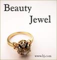
Beauty Jewel...by sfarrell23Comment: IMO, the font distracts from this image, it does not looks "classy" enough I think. Also, I would have tried to get more life and shine into the gems, they look rather dead. perhaps a slightly more "head on" angle to the gems would have helped, instead of looking down on them. |
| Photographer found comment helpful. |
| 04/25/2005 09:02:05 AM |
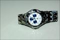
on sale 1,000by gtp1164Comment: Nice colour, good focus, good Dof. The only negative I see is IMO, I would have reversed this image, so that the twelve as on the left. That way it would seem like the watch was point up, instead of down. |
| 04/25/2005 08:58:37 AM |
Glamor girlby sissiComment: focus seems to be on the sunglasses, not the jewelry |
| Photographer found comment helpful. |
Home -
Challenges -
Community -
League -
Photos -
Cameras -
Lenses -
Learn -
Help -
Terms of Use -
Privacy -
Top ^
DPChallenge, and website content and design, Copyright © 2001-2025 Challenging Technologies, LLC.
All digital photo copyrights belong to the photographers and may not be used without permission.
Current Server Time: 08/28/2025 12:34:46 AM EDT.